Scale Font Size Based On Container's Width Or Height - jQuery Fluid Typography
| File Size: | 4.95 KB |
|---|---|
| Views Total: | 1891 |
| Last Update: | |
| Publish Date: | |
| Official Website: | Go to website |
| License: | MIT |
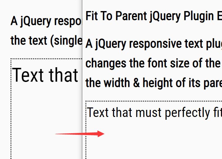
Fluid Typography is a jQuery plugin that dynamically adjusts the font size (or any other CSS properties) of text depending on the container's width or height.
Ideal for responsive web layout that automatically scales text for different screen sizes.
How to use it:
1. Load the jQuery Fluid Typography plugin after jQuery JavaScript library (slim build).
<script src="https://code.jquery.com/jquery-3.3.1.slim.min.js"
        integrity="sha384-q8i/X+965DzO0rT7abK41JStQIAqVgRVzpbzo5smXKp4YfRvH+8abtTE1Pi6jizo"
        crossorigin="anonymous"></script>
<script src="index.js"></script>
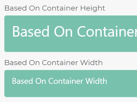
2. Adjust the font size based on the container's height. In this example, we're going to set the font-size of the text to 60% of the height of its container
<div class="demo-container-1">
  <p class="demo-1">Based On Container Height</p>
</div>
var elements = [
    {
      parent: '.demo-container-1',
      target: '.demo-1',
      factor: 0.6
    }
];
3. Adjust the font size based on the container's width. In this example, we're going to set the font size of the text to 2% of the width of its container
<div class="demo-container-2">
  <p class="demo-2">Based On Container Width</p>
</div>
var elements = [
    {
      parent: '.demo-container-2',
      target: '.demo-2',
      factor: 0.02,
      useContainerWidth: true
    },
];
4. Adjust the other CSS property based on the container's width or height. In this example, we're going to set the line-height of the text to 40% of the width of its container
<div class="demo-container-3">
  <p class="demo-3">Adjust Line-height<br>Adjust Line-height</p>
</div>
var elements = [
    {
      parent: '.demo-container-3',
      target: '.demo-3',
      factor: 0.4,
      property: 'line-height'
    }
];
5. Initialize the plugin on document ready.
$(document).ready(function() {
  $.responsiveFonts(elements);
});
6. Re-init the plugin on window resize (OPTIONAL).
$(window).resize(function() {
  $.responsiveFonts(elements);
});
This awesome jQuery plugin is developed by MichaelSpencer1995. For more Advanced Usages, please check the demo page or visit the official website.