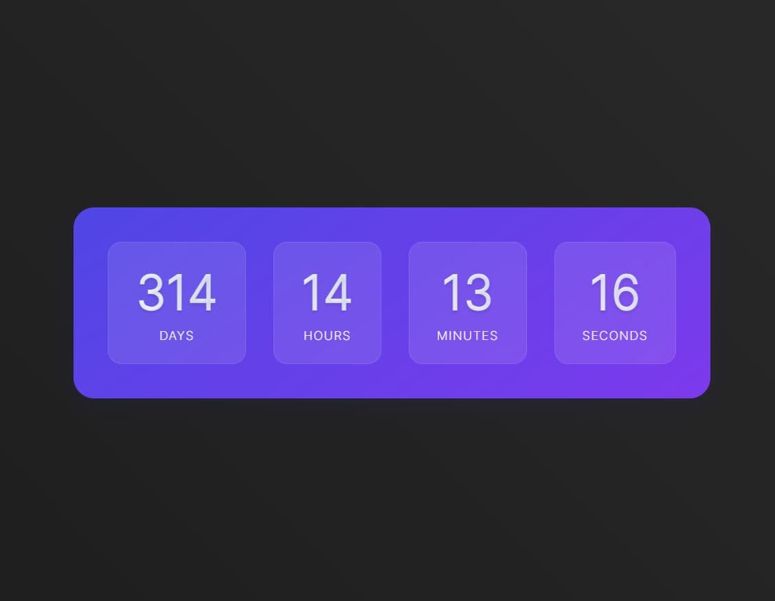
Line Based Clock with jQuery and CSS3 Transitions
| File Size: | 2.12 KB |
|---|---|
| Views Total: | 738 |
| Last Update: | |
| Publish Date: | |
| Official Website: | Go to website |
| License: | MIT |
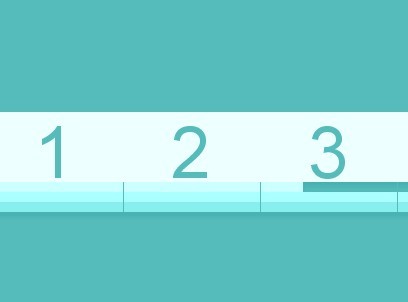
A jQuery & CSS3 transition based responsive clock to display your local time with clock numbers and animated time bars.
How to use it:
1. Create a line clock following the Html structure like this:
<div id="clock">
  <div id="numbers"></div>
  <div id="seconds" class="time_bar"></div>
  <div id="minutes" class="time_bar"></div>
  <div id="hours" class="time_bar"></div>
</div>
2. The required CSS to style the clock.
#clock {
  position: relative;
  width: auto;
  padding: 10px;
  margin-left: auto;
  margin-right: auto;
  border-radius: 10px;
}

#numbers { box-shadow: 0px 5px 5px 0px rgba(70, 177, 177, 0.85); }

@media screen and (max-width: 649px) {

#numbers {
  font-size: 150%;
  font-weight: 100;
  height: 25px;
}

@media screen and (min-width: 650px) {

#numbers {
  font-size: 300%;
  font-weight: 100;
  height: 50px;
}

@media screen and (min-width: 900px) {

#numbers {
  font-size: 450%;
  font-weight: 100;
  height: 70px;
}

.number-box {
  background: #eeffff;
  position: relative;
  display: inline-block;
  width: 8.33333333%;
  height: 100%;
  text-align: center;
}

.number {
  position: relative;
  height: 100%;
  color: #55bbbb;
}

.line {
  position: absolute;
  width: 1px;
  height: 30px;
  background: #55bbbb;
}

.time_bar {
  height: 10px;
  background: white;
  width: 0%;
  -moz-box-shadow: 0px 5px 5px 0px rgba(70, 177, 177, 0.85);
  -webkit-box-shadow: 0px 5px 5px 0px rgba(70, 177, 177, 0.85);
  -ms-box-shadow: 0px 5px 5px 0px rgba(70, 177, 177, 0.85);
  box-shadow: 0px 5px 5px 0px rgba(70, 177, 177, 0.85);
}

#seconds {
  background: #ccffff;
  -moz-transition: width 0.2s linear;
  -webkit-transition: width 0.2s linear;
  -ms-transition: width 0.2s linear;
  transition: width 0.2s linear;
}

#minutes {
  background: #aaffff;
  -moz-transition: width 0.5s linear;
  -webkit-transition: width 0.5s linear;
  -ms-transition: width 0.5s linear;
  transition: width 0.5s linear;
}

#hours {
  background: #88eeee;
  -moz-transition: width 1s linear;
  -webkit-transition: width 1s linear;
  -ms-transition: width 1s linear;
  transition: width 1s linear;
}
3. Include the latest version of jQuery library at the bottom of your web page so the pages loads faster.
<script src="//ajax.googleapis.com/ajax/libs/jquery/1.11.1/jquery.min.js"></script>
4. Setup clock's numbers.
for (var i = 0; i < 12; i++){
  if (i != 0){
    $("#numbers").append("<span id="+i+" class=\'number-box\'><div class=\'number\'>"+i+"</div><div class=\'line\'></div></span>");
  }
  else{
    $("#numbers").append("<span id="+12+" class=\'number-box\'><div class=\'number\'>"+12+"</div></span>");
  }
}
5. Setup clock's time bars.
var d, ms, s, m, h;
var clock = $("#clock");
var secondBar = $("#seconds");
var SPM = 60; // Seconds Per Minute

var seconds = setInterval(function(){
  d = new Date();
  ms = d.getMilliseconds();
  s = (d.getSeconds() + (ms / 1000));

  sWidth = (s / 60) * 100; //Percentage of seconds
  $("#seconds").width(sWidth+'%'); // Set width of bar
}, 200)

var minutes = setInterval(function(){
  m = d.getMinutes();
  mWidth = ((m + (sWidth / 100)) / 60) * 100; //Percentage of seconds
  $("#minutes").width(mWidth+'%');
}, 500)

var hours = setInterval(function(){
  h = d.getHours() % 12;
  hWidth = ((h + (mWidth / 100)) / 12) * 100; //Percentage of seconds
  $("#hours").width(hWidth+'%');
}, 1000)
This awesome jQuery plugin is developed by kstensland. For more Advanced Usages, please check the demo page or visit the official website.