Responsive Flexible jQuery Modal Plugin - flexModal
| File Size: | 18.7 KB |
|---|---|
| Views Total: | 1838 |
| Last Update: | |
| Publish Date: | |
| Official Website: | Go to website |
| License: | MIT |
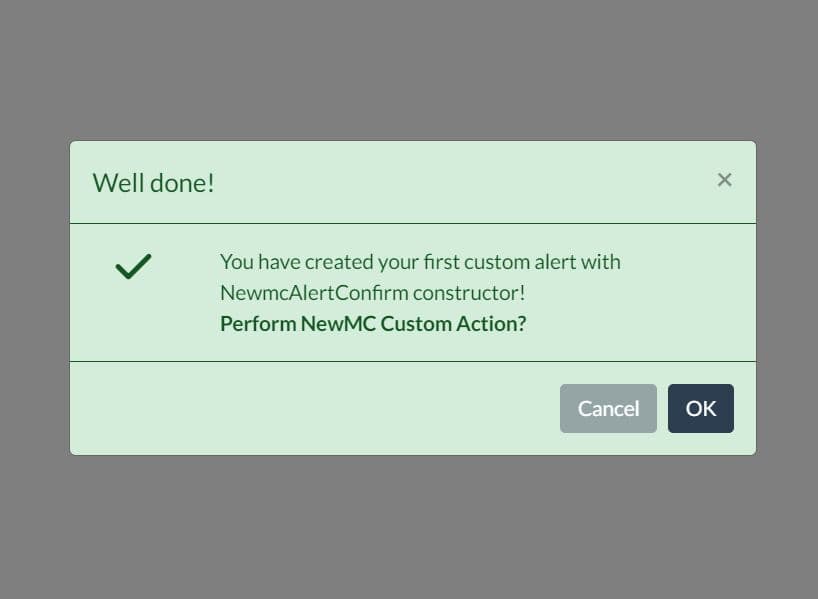
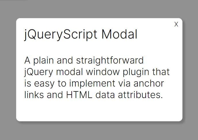
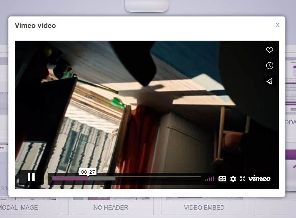
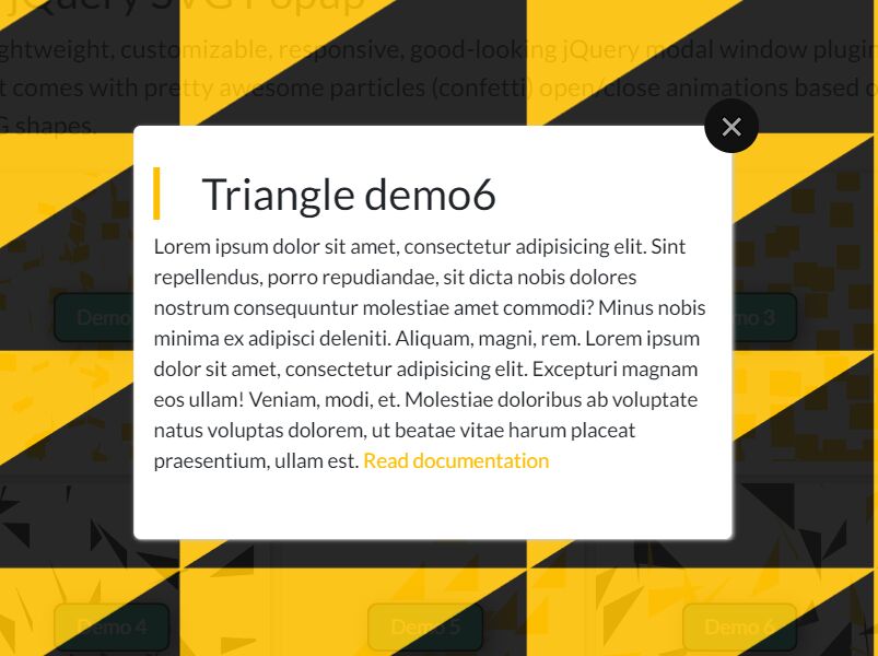
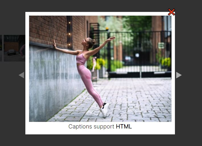
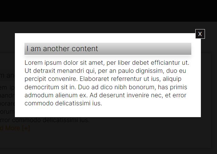
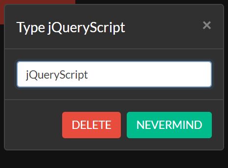
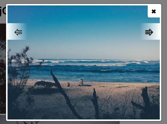
flexModal is a jQuery plugin for creating responsive & flexible modal box that supports any Html contents like text, iFrame, Video, etc. The plugins is developed for responsive design so that it can auto resize to adapt to any screen size and resolution.
More features:
- Fully customizable by passing options via both
data-*attributes or Javascript. - Supports multiple attributes.
- Always appears in the center of the screen following the golden ratio.
- Custom trigger events.
- Overlay, close button, etc...
- Cross browsers and platforms.
Basic Usage:
1. Include the required jQuery flexModal plugin's stylesheet file in the header.
<link rel="stylesheet" href="css/flexModal.css">
2. Include the jQuery flexModal plugin's script after jQuery library before closing body tag.
<script src="http://ajax.googleapis.com/ajax/libs/jquery/1.11.0/jquery.min.js"></script>
<script src="js/flexModal.plugin.js"></script>
3. Create an Html element to trigger a modal window. Use href attribute to specify the container ID of the modal content. Use data-modal attribute to set the options.
<a href="#my-content" data-modal='{"closebutton" : "true"}'>Click Me</a>
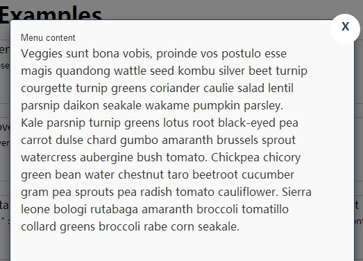
4. Create the modal content in an DIV container with CSS class of ''modal__container' and a specified ID you just defined in the previous step.
<div id="my-content" class="modal__container">
<h3 class="modal__header"> Menu content</h3>
<div class="modal__content">
Your content goes here
</div>
</div>
4. Call the plugin on the elements with data-modal attribute.
<script type="text/javascript">
$('[data-modal]').flexModal();
</script>
This awesome jQuery plugin is developed by paceaux. For more Advanced Usages, please check the demo page or visit the official website.