Versatile jQuery Popup Window Plugin - jBox
| File Size: | 330 KB |
|---|---|
| Views Total: | 40034 |
| Last Update: | |
| Publish Date: | |
| Official Website: | Go to website |
| License: | MIT |
jBox is a flexible, modular, robust jQuery plugin to implement a wide variety of popup windows on your web page & application.
With jBox plugin, you can create:
- Draggable modal box
- Animated notification
- Nice-looking tooltip
- Image gallery lightbox
How to use it:
1. Include the jQuery library and the jBox plugin's script & stylesheet in your document.
<!-- Include jQuery -->
<script src="//code.jquery.com/jquery.min.js"></script>

<!-- Include jBox -->
<link href="jBox.all.css" rel="stylesheet">
<script src="jBox.all.js"></script>
2. Create a tooltip for an element.
// Tooltip above and centered, this is the default setting
$('.demo').jBox('Tooltip');
3. Create a default notification.
function demoNoticeDefault() {
  new jBox('Notice', {
    content: 'I\'m up here!'
  });
}
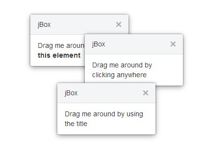
4. Create a draggable modal window.
new jBox('Modal', {
  attach: $('#modalDragOnTitle'),
  width: 200,
  title: 'jBox',
  overlay: false,
  content: 'Drag me around by using the title',
  draggable: 'title',
  repositionOnOpen: false,
  repositionOnContent: false
});
5. Global options.
// jBox ID
id: null,                    // Choose a unique id, otherwise jBox will set one for you (jBox1, jBox2, ...)

// Dimensions
width: 'auto',               // The width of the content area, e.g. 'auto', 200, '80%'
height: 'auto',              // The height of the content area
minWidth: null,              // Minimal width
minHeight: null,             // Minimal height
maxWidth: null,              // Maximal width
maxHeight: null,             // Maximal height

// Responsive dimensions
responsiveWidth: true,       // Adjusts the width to fit the viewport
responsiveHeight: true,      // Adjusts the height to fit the viewport
responsiveMinWidth: 100,     // Don't adjust width below this value (in pixel)
responsiveMinHeight: 100,    // Don't adjust height below this value (in pixel)

// Attach
attach: null,                // A jQuery selector to elements that will open and close your jBox, e.g. '.tooltip'
trigger: 'click',            // The event to open or close your jBox, use 'click', 'touchclick' or 'mouseenter'
preventDefault: false,       // Prevent the default event when opening jBox, e.g. don't follow the href in a link

// Content
content: null,               // You can use HTML or a jQuery element, e.g. jQuery('#jBox-content'). The elements will be appended to the content element and then made visible, so hide them with style="display: none" beforehand
getContent: null,            // Get the content from an attribute when jBox opens, e.g. getContent: 'data-content'. Use 'html' to get the attached elements HTML as content
title: null,                 // Adds a title to your jBox
getTitle: null,              // Get the title from an attribute when jBox opens, e.g. getTitle: 'data-title'
footer: null,                // Adds a footer to your jBox
isolateScroll: true,         // Isolates scrolling to the content container

// AJAX
ajax: {                      // Setting an URL will make an AJAX request when jBox opens. Optional you can add any jQuery AJAX option (http://api.jquery.com/jquery.ajax/)
  url: null,                 // The URL to send the AJAX request to
  data: '',                  // Data to send with your AJAX request, e.g. {id: 82, limit: 10}
  reload: false,             // Resend the AJAX request when jBox opens. Use true to send the AJAX request only once for every attached element or 'strict' to resend every time jBox opens
  getURL: 'data-url',        // The attribute in the source element where the AJAX request will look for the URL, e.g. data-url="https://ajaxresponse.com"
  getData: 'data-ajax',      // The attribute in the source element where the AJAX request will look for the data, e.g. data-ajax="id=82&limit=10"
  setContent: true,          // Automatically set the response as new content when the AJAX request is finished
  loadingClass: true,        // Add a class to the wrapper when jBox is loading, set to class name or true to use the default class name 'jBox-loading'
  spinner: true,             // Hides the current content and adds a spinner while loading. You can pass HTML content to add your own spinner, e.g. spinner: '<div class="mySpinner"></div>'
  spinnerDelay: 300,         // Milliseconds to wait until spinner appears
  spinnerReposition: true    // Repositions jBox when the spinner is added or removed
},
cancelAjaxOnClose: true,     // Cancels the ajax call when jBox closes and it hasn't finished loading yet

// Position
target: null,                // The jQuery selector to the target element where jBox will be opened. If no element is found, jBox will use the attached element as target
position: {
  x: 'center',               // Horizontal position, use a number, 'left', 'right' or 'center'
  y: 'center'                // Vertical position, use a number, 'top', 'bottom' or 'center'
},
outside: null,               // Use 'x', 'y', or 'xy' to move your jBox outside of the target element
offset: 0,                   // Offset to final position, you can set different values for x and y with an object, e.g. {x: 20, y: 10}
attributes: {                // Note that attributes can only be 'left' or 'right' when using numbers for position, e.g. {x: 300, y: 20}
  x: 'left',                 // Horizontal position, use 'left' or 'right'
  y: 'top'                   // Vertical position, use 'top' or 'bottom'
},
fixed: false,                // Your jBox will stay on position when scrolling
adjustPosition: true,        // Adjusts your jBoxes position if there is not enough space, use 'flip', 'move' or true for both. This option overrides the reposition options
adjustTracker: false,        // By default jBox adjusts its position when it opens or when the window size changes, set to true to also adjust when scrolling
adjustDistance: 5,           // The minimal distance to the viewport edge while adjusting. Use an object to set different values, e.g. {top: 50, right: 5, bottom: 20, left: 5}
reposition: true,            // Calculates new position when the window-size changes
repositionOnOpen: true,      // Calculates new position each time jBox opens (rather than only when it opens the first time)
repositionOnContent: true,   // Calculates new position when the content changes with .setContent() or .setTitle()
holdPosition: true,          // Keeps current position if space permits. Applies only to 'Modal' type.

// Pointer
pointer: false,              // Your pointer will always point towards the target element, so the option outside needs to be 'x' or 'y'. By default the pointer is centered, set a position to move it to any side. You can also add an offset, e.g. 'left:30' or 'center:-20'
pointTo: 'target',           // Setting something else than 'target' will add a pointer even if there is no target element set or found. Use 'top', 'right', 'bottom' or 'left'

// Animations
fade: 180,                   // Fade duration in ms, set to 0 or false to disable
animation: null,             // Animation when opening or closing, use 'pulse', 'zoomIn', 'zoomOut', 'move', 'slide', 'flip', 'tada' (CSS inspired from Daniel Edens Animate.css: http://daneden.me/animate)

// Appearance
theme: 'Default',            // Set a jBox theme class
addClass: null,              // Adds classes to the wrapper
overlay: false,              // Adds an overlay to hide page content when jBox opens (adjust color and opacity with CSS)
zIndex: 10000,               // Use a high z-index, or set to 'auto' to bring to front on open

// Delays
delayOpen: 0,                // Delay opening in ms. Note that the delay will be ignored if your jBox didn't finish closing
delayClose: 0,               // Delay closing in ms. Nnote that there is always a closing delay of at least 10ms to ensure jBox won't be closed when opening right away

// Closing
closeOnEsc: false,           // Close jBox when pressing [esc] key
closeOnClick: false,         // Close jBox with mouseclick. Use true (click anywhere), 'box' (click on jBox itself), 'overlay' (click on the overlay), 'body' (click anywhere but jBox)
closeOnMouseleave: false,    // Close jBox when the mouse leaves the jBox area or the area of the attached element
closeButton: false,          // Adds a close button to your jBox. Use 'title', 'box', 'overlay' or true (true will add the button to the overlay, title or the jBox itself, in that order if any of those elements can be found)

// Other options
appendTo: jQuery('body'),    // The element your jBox will be appended to. Any other element than jQuery('body') is only useful for fixed positions or when position values are numbers
createOnInit: false,         // Creates jBox and makes it available in DOM when it's being initialized, otherwise it will be created when it opens for the first time
blockScroll: false,          // Blocks scrolling when jBox is open
blockScrollAdjust: true,     // Adjust page elements to avoid content jumps when scrolling is blocked. See more here: https://github.com/StephanWagner/unscroll
draggable: false,            // Make your jBox draggable (use 'true', 'title' or provide an element as handle) (inspired from Chris Coyiers CSS-Tricks http://css-tricks.com/snippets/jquery/draggable-without-jquery-ui/)
dragOver: true,              // When you have multiple draggable jBoxes, the one you select will always move over the other ones
autoClose: false,            // Time in ms when jBox will close automatically after it was opened
delayOnHover: false,         // Delay auto-closing while mouse is hovered
showCountdown: false,        // Display a nice progress-indicator when autoClose is enabled

// Audio                     // You can use the integrated audio function whenever you'd like to play an audio file, e.g. onInit: function () { this.audio('url_to_audio_file_without_file_extension', 75); }
preloadAudio: true,          // Preloads the audio files set in option audio. You can also preload other audio files, e.g. ['src_to_file.mp3', 'src_to_file.ogg']
audio: null,                 // The URL to an audio file to play when jBox opens. Set the URL without file extension, jBox will look for an .mp3 and .ogg file. To play audio when jBox closes, use an object, e.g. {open: 'src_to_audio1', close: 'src_to_audio2'}
volume: 100,                 // The volume in percent. To have different volumes for opening and closeing, use an object, e.g. {open: 75, close: 100}

// Events                    // Note that you can use 'this' in all event functions, it refers to your jBox object (e.g. onInit: function () { this.open(); })
onInit: null,                // Fired when jBox is initialized
onAttach: null,              // Fired when jBox attached itself to elements, the attached element will be passed as a parameter, e.g. onAttach: function (element) { element.css({color: 'red'}); }
onPosition: null,            // Fired when jBox is positioned
onCreated: null,             // Fired when jBox is created and availible in DOM
onOpen: null,                // Fired when jBox opens
onOpenComplete: null,        // Fired when jBox is completely open (when fading finished)
onClose: null,               // Fired when jBox closes
onCloseComplete: null,       // Fired when jBox is completely closed (when fading is finished)
onDragStart: null,           // Fired when dragging starts
onDragEnd: null              // Fired when dragging finished
6. Default options for the default plugins.
// Default options for tooltips
'Tooltip': {
getContent: 'title',
trigger: 'mouseenter',
position: {
x: 'center',
y: 'top'
},
outside: 'y',
pointer: true
},
// Default options for mouse tooltips
'Mouse': {
responsiveWidth: false,
responsiveHeight: false,
adjustPosition: 'flip',
target: 'mouse',
trigger: 'mouseenter',
position: {
x: 'right',
y: 'bottom'
},
outside: 'xy',
offset: 5
},
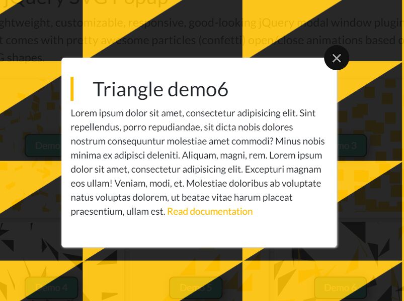
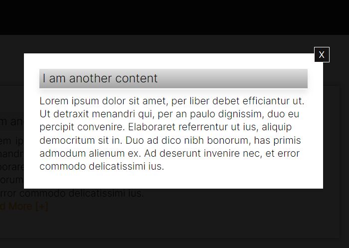
// Default options for modal windows
'Modal': {
target: jQuery(window),
fixed: true,
blockScroll: true,
closeOnEsc: true,
closeOnClick: 'overlay',
closeButton: true,
overlay: true,
animation: 'zoomIn'
},
7. Default options for the notice plugin.
new jBox('Notice', {
    color: null,      // Add a color to your notices, use 'gray' (default), 'black', 'red', 'green', 'blue' or 'yellow'
    stack: true,      // Set to false to disable notice-stacking
    stackSpacing: 10, // Spacing between notices when they stack
    autoClose: 6000,  // Time in ms after which the notice will disappear
    attributes: {     // Defines where the notice will pop up
      x: 'right',     // 'left' or 'right'
      y: 'top'        // 'top' or 'bottom'
    },
    position: {       // Defines the distance to the viewport boundary
      x: 15,
      y: 15
    },
    responsivePositions: {  // Responsive positions
      500: {                // The key defines the maximum width of the viewport, the values will replace the default position options
        x: 5,               // Start with the lowest viewport
        y: 5
      },
      768: {
        x: 10,
        y: 10
      }
    },
    target: window,
    fixed: true,
    animation: 'zoomIn',
    closeOnClick: 'box',
    zIndex: 12000,
});
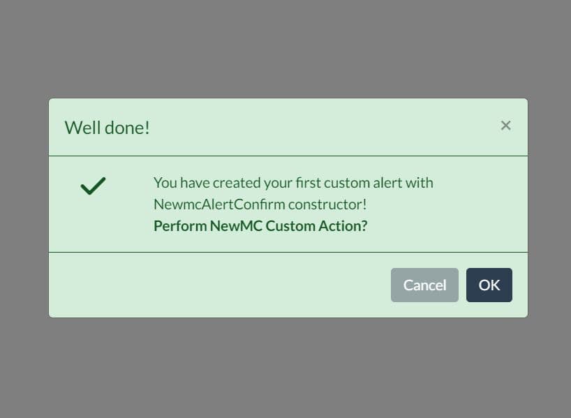
8. Default options for the confirm plugin.
new jBox('Confirm', {
    confirmButton: 'Submit',  // Text for the submit button
    cancelButton: 'Cancel',   // Text for the cancel button
    confirm: null,            // Function to execute when clicking the submit button. By default jBox will use the onclick or href attribute in that order if found
    cancel: null,             // Function to execute when clicking the cancel button
    closeOnConfirm: true,     // Close jBox when the user clicks the confirm button
    target: window,
    addClass: 'jBox-Modal',
    fixed: true,
    attach: '[data-confirm]',
    getContent: 'data-confirm',
    content: 'Do you really want to do this?',
    minWidth: 360,
    maxWidth: 500,
    blockScroll: true,
    closeOnEsc: true,
    closeOnClick: false,
    closeButton: false,
    overlay: true,
    animation: 'zoomIn',
    preventDefault: true,
});
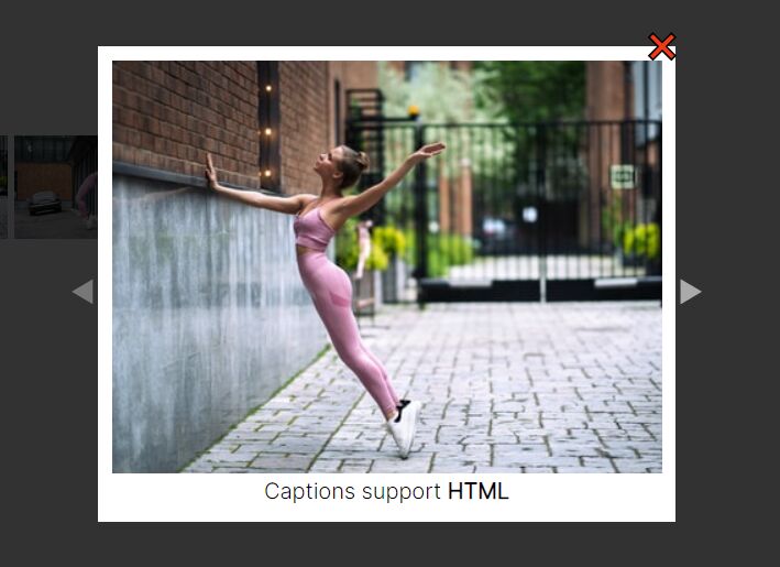
9. Default options for the image plugin.
new jBox('Image', {
    src: 'href',                // The attribute where jBox gets the image source from, e.g. href="/path_to_image/image.jpg"
    gallery: 'data-jbox-image', // The attribute to set the galleries, e.g. data-jbox-image="gallery1"
    imageLabel: 'title',        // The attribute where jBox gets the image label from, e.g. title="My label"
    imageFade: 360,             // The fade duration for images in ms
    imageSize: 'contain',       // How to display the images. Use CSS background-position values, e.g. 'cover', 'contain', 'auto', 'initial', '50% 50%'
    imageCounter: false,        // Set to true to add an image counter, e.g. 4/20
    imageCounterSeparator: '/', // HTML to separate the current image number from all image numbers, e.g. '/' or ' of '
    target: window,
    attach: '[data-jbox-image]',
    fixed: true,
    blockScroll: true,
    closeOnEsc: true,
    closeOnClick: 'button',
    closeButton: true,
    overlay: true,
    animation: 'zoomIn',
    preventDefault: true,
    width: '100%',
    height: '100%',
    downloadButton: false,
    downloadButtonText: null,
    downloadButtonUrl: null,
    adjustDistance: {
      top: 40,
      right: 5,
      bottom: 40,
      left: 5
    },
});
10. API methods.
// opens the jBox
instance.open(options);

// closes the jBox
instance.close(options);

// toggles the jBox
instance.toggle(options);

// sets the width
instance.setWidth(value);

// sets the height
instance.setHeight(value);

// sets the title
instance.setTitle(title);

// sets the content
instance.setContent(content);

// attaches the jBox to elements
instance.attach(jQuery selector);

// removes the jBox from elements
instance.detach(jQuery selector);

// reloads the AJAX request
instance.ajax(options);

// plays an audio
instance.audio(url, volume);

// repositions the jBox
instance.position(options);

// animates the jBox
instance.animate(animation, options);

// disables the jBox
instance.disable();

// enables the jBox
instance.enable();

// hides the jBox
instance.hide();

// shows the jBox
instance.show();

// destroys the jBox
instance.destroy();
Changelog:
v1.3.3 (2021-06-22)
- Fix for TypeScript error
- Version bump
v1.3.2 (2021-04-25)
- Fix typo in jBox.d.ts
v1.3.1 (2021-04-22)
- Re-add custom animation function
v1.3.0 (2021-04-22)
- Bugfixes
- Added event onOpenComplete
v1.2.14 (2021-03-19)
- Minor bugfix
v1.2.13 (2021-03-03)
- Fix closing on mobile devices when draggable
v1.2.8 (2021-02-27)
- Minor bugfix in plugin "Image".
v1.2.7 (2021-02-15)
- Minor bugfix
v1.2.2 (2021-01-29)
- Fixed: el.css is not a function on Notice
- Fixed: 2 Uncaught TypeError: el.css is not a function - Conflict with nanogallery2
v1.2.1 (2020-12-28)
- Bugfix tap events
v1.2.0 (2020-04-19)
- Fix overlapping image labels
v1.1.0 (2020-04-19)
- Added swipe events for jBox type "Image"
v1.0.9 (2020-02-24)
- Fixed Dont work correctly with es6 modules when jquery is external depency
v1.0.8 (2020-02-12)
- Fix hide and show methods
v1.0.7 (2020-02-05)
- Bugfix for methods setWidth and setHeight
v1.0.6 (2019-10-21)
- Minor bug fix
- Minor version bump
- Fixed dev dependency vulnerabilities
v1.0.5 (2019-07-10)
- Source elements are now exposed as attribute in options cancel and submit in type jBox Confirm.
v1.0.4 (2019-07-07)
- Aborted AJAX requests due to jBox closing will now be reloaded when jBox opens the next time.
v1.0.3 (2019-06-19)
- Minor fix to prevent error logs when plugin not loaded
v1.0.2 (2019-05-12)
- Minor style fixes
v1.0.1 (2019-05-11)
- Fixed scrolling bug in safari
- Refactored umd wrapper to work with plugins
v0.8.1 (2019-05-10)
- Refactor demo
- Beautify SCSS
- Add new option overlayClass
- Bugfix for option downloadButton (type Image)
v0.8.0 (2019-05-09)
- Add options onDragStart and onDragEnd
- Add touch support for option draggable
v0.7.9 (2019-05-07)
- Add fix for closing jBox on touch devices
v0.6.4 (2019-04-30)
- Various bugfixes and improvements
v0.6.3 (2019-04-25)
- Minor fixes and improvements
v0.6.2 (2019-03-24)
- Minor bugfixes & improvements
v0.6.1 (2019-03-11)
- Add option for responsive images
v0.6.0 (2019-03-07)
- Add package unscroll to handle option blockScroll
- Add option blockScrollAdjust
- Bugfix for attaching images in runtime
2019-02-28
- v0.5.4: Fix modal jump when overlay has close button
2019-01-14
- Add new option loadingClass
2019-01-01
- Add option cancelAjaxOnClose
2018-12-10
- v0.5.3
2018-12-06
- Add value 'auto' to option zIndex
2018-12-05
- Add holdPosition option for draggable jBox
2018-11-18
- Add option for download button
- DOC updated
2018-11-03
- Reorganise themes
2018-10-26
- v0.5.0
2017-10-16
- Updated jBox.Image.js
2017-10-13
- Fix missing close button when closeButton = true and title (or getTitle) set
2017-09-04
- Added options: delayOnHover and showCountdown mainly targeted at notices, though probably functional for other types too.
2017-05-05
- Update jBox.js
2017-03-08
- Bugfixes and improvements for plugin Image
2016-12-27
- New theme TooltipError
2016-12-16
- JS update
2016-12-09
- v0.4.6: bugfix
2016-12-01
- JS update
2016-11-30
- Bugfix for draggable jBox
2016-11-29
- Update jBox.js
2016-11-25
- bugfix
2016-11-24
- Version 0.4.2
2016-11-21
- Improved positioning
2016-11-20
- Improvements jBox.Notice.js
2016-11-15
- bugfixes
2016-11-14
- Update jBox.js
2015-03-24
- Update jBox.js
2015-03-05
- Bug-fix
2014-12-22
- Update jBox.css
2014-11-29
- Update jBox.min.js
2014-11-26
- Update jBox.js
This awesome jQuery plugin is developed by stephanwagner. For more Advanced Usages, please check the demo page or visit the official website.