Bootstrap 4 Modal Optimized For Mobile - bootstrap-modal-ios.js
| File Size: | 7.45 KB |
|---|---|
| Views Total: | 7307 |
| Last Update: | |
| Publish Date: | |
| Official Website: | Go to website |
| License: | MIT |
bootstrap-modal-ios.js is an extension for Bootstrap 4 that prevents body scrolling and automatically adjusts background overlay when the Bootstrap 4 modal is opened on mobile devices.
Features:
- Detects whether the element is at the top or the bottom of their scroll and prevent the user from scrolling beyond.
- Smooth modal scrolling for long content.
- Auto adjusts the modal window according to the Safari toolbar.
How to use it:
1. Insert the stylesheet bootstrap-modal-ios.css and JavaScript bootstrap-modal-ios.js into your Bootstrap page.
<!-- Bootstrap 4 Stylehsheet -->
<link rel="stylesheet"
      href="https://stackpath.bootstrapcdn.com/bootstrap/4.1.3/css/bootstrap.min.css"
      integrity="sha384-MCw98/SFnGE8fJT3GXwEOngsV7Zt27NXFoaoApmYm81iuXoPkFOJwJ8ERdknLPMO"
      crossorigin="anonymous">
<!-- Bootstrap Modal iOS Stylehsheet -->
<link rel="stylesheet" href="bootstrap-modal-ios.css">

<!-- Bootstrap 4 + jQuery -->
<script src="https://code.jquery.com/jquery-3.3.1.slim.min.js"
        integrity="sha384-q8i/X+965DzO0rT7abK41JStQIAqVgRVzpbzo5smXKp4YfRvH+8abtTE1Pi6jizo"
        crossorigin="anonymous">
</script>
<script src="https://cdnjs.cloudflare.com/ajax/libs/popper.js/1.14.3/umd/popper.min.js"
        integrity="sha384-ZMP7rVo3mIykV+2+9J3UJ46jBk0WLaUAdn689aCwoqbBJiSnjAK/l8WvCWPIPm49"
        crossorigin="anonymous">
</script>
<script src="https://stackpath.bootstrapcdn.com/bootstrap/4.1.3/js/bootstrap.min.js"
        integrity="sha384-ChfqqxuZUCnJSK3+MXmPNIyE6ZbWh2IMqE241rYiqJxyMiZ6OW/JmZQ5stwEULTy"
        crossorigin="anonymous">
</script>
<!-- Bootstrap Modal iOS Stylehsheet -->
<script src="bootstrap-modal-ios.js"></script>
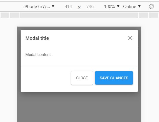
2. Create a regular Bootstrap 4 modal and done.
<div class="modal fade" id="exampleModalShort" tabindex="-1" role="dialog" aria-labelledby="exampleModalLabel" aria-hidden="true">
<div class="modal-dialog" role="document">
<div class="modal-content">
<div class="modal-header">
<h5 class="modal-title" id="exampleModalShortLabel">Modal title</h5>
<button type="button" class="close" data-dismiss="modal" aria-label="Close">
<span aria-hidden="true">×</span>
</button>
</div>
<div class="modal-body">
<p>Modal content</p>
</div>
<div class="modal-footer">
<button type="button" class="btn btn-secondary" data-dismiss="modal">Close</button>
<button type="button" class="btn btn-primary">Save changes</button>
</div>
</div>
</div>
</div>
This awesome jQuery plugin is developed by radogado. For more Advanced Usages, please check the demo page or visit the official website.