Responsive & Accessible jQuery Modal Plugin - Popup Overlay
| File Size: | 62.9 KB |
|---|---|
| Views Total: | 65259 |
| Last Update: | |
| Publish Date: | |
| Official Website: | Go to website |
| License: | MIT |
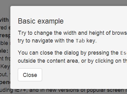
Popup Overlay is a responsive, mobile-friendly, accessible, highly configurable and cross-browser jQuery modal window solution.
Features:
- Popups a clean modal window with fullscreen overlay.
- Responsive design that adapts to any screen size and orientation.
- Highly configurable with lots of built-in options, methods and callback events.
- Works with all the modern browsers and IE7/8/9.
- Accessible Rich Internet Applications (WAI-ARIA) supported.
- Also can be used as a tooltip plugin that the tooltip content will be positioned relative to the opening link.
- Easy to implement on your web page/app with one js call.
View More Modal Plugins At:
Basic Usage:
1. Create a link with href attribute pointing to the target modal content.
<a class="demo_open" href="#demo">Click me</a>

<div id="demo">
<h4>Title</h4>
<p>Your Content</p>
<button class="demo_close">Close</button>
</div>
2. Include the jQuery javascript library 1.x and jQuery popup overlay plugin in the page.
<script src="http://ajax.googleapis.com/ajax/libs/jquery/1.10.2/jquery.min.js"></script>
<script src="jquery.popupoverlay.js"></script>
3. Call the plugin with all the default options.
<script>
$(document).ready(function () {
$('#demo').popup();
});
</script>
4. Available options.
$('#demo').popup({
// Sets popup type to overlay or tooltip.
type: 'overlay',

// Shows the popup when initialized.
autoopen: false,

// Enables background cover.
background: true,

// Disable background cover and keep background elements active.
backgroundactive: false,

// Sets background color.
color: 'black',

// Sets background opacity.
opacity: '0.5',

// Sets horizontal position.
horizontal: 'center',

// Sets vertical position.
vertical: 'middle',

// Sets top offset to tooltip.
offsettop: 0,

// Sets left offset to tooltip.
offsetleft: 0,

// Closes the popup when Escape key is pressed.
escape: true,

// Closes the popup when clicked outside of it.
blur: true,

// Sets elements which will be ignored in blur option, even if they are outside.
blurignore: null,

// Sets default z-index to the popup (2001) and to the background (2000).
setzindex: true,

// Sets highest z-index on the page to the popup.
autozindex: false,

// Disables scrolling of background content while the popup is visible.
scrolllock: false,

// Displays close button
closebutton: false,

// Html markup for close button
closebuttonmarkup: null,

// Lock keyboard focus inside of popup. Recommended to be enabled.
keepfocus: true,

// Enables you to specify the element which will be focused upon showing the popup.
// By default, the popup element #my_popup will recieve the initial focus.
focuselement: null,

// Sets a delay in milliseconds before focusing an element.
// This is to prevent page scrolling during opening transition,
// as browsers will try to move the viewport to an element which received the focus.
focusdelay: 50,

// Shows a default browser outline on popup element when focused.
outline: false,

// Sets a page container (to help screen reader users).
// Page container should be the element that surrounds all the content on the page
// (e.g. '.container' in the case of this very page).
pagecontainer: null,

// Removes popup element from the DOM after closing transition.
detach: false,

// Enables you to define custom element which will open the popup on click.
// By default, in our case it's set to .my_popup_open.
openelement: null,

// Enables you to define custom element which will close the popup on click.
// By default, in our case it's set to .my_popup_close.
closeelement: null,

// Sets CSS transition when showing and hiding a popup.
transition: null,

// Sets an element to be an anchor for tooltip position.
tooltipanchor: null,

// executed before the popup is opened.
beforeopen: null,

// executed when the popup starts to close.
onclose: null,

// executed when the popup starts to open.
onopen: null,

// executed after the opening CSS transition is over,
// only if transition actually occurs and if supported by the browser.
opentransitionend: null,

// execute after the closing CSS transition is over,
// only if transition actually occurs and if supported by the browser.
closetransitionend: null

});
5. Public methods.
// Manually opens a popup.
$('#demo').popup('show');

// Manually hides a popup.
$('#demo').popup('hide');

// Manually toggles a popup.
$('#demo').popup('toggle');
Changelog:
2019-11-08
- v2.1.3: Don't close when the click originated from inside the popup
2018-12-12
- v2.1.1: Fix: Popup div scrollbar can’t be dragged with mouse if background:false is used
2018-12-12
- v2.1.0: New: Add option 'blurignore'
2018-12-10
- v2.0.1
2017-05-31
- Checks for undefined, null
2016-04-05
- v1.7.13
2015-08-31
- v1.7.8
2015-08-21
- v1.7.7
2014-12-25
- v1.7.6
2014-12-24
- v1.7.5
2014-12-05
- Fixed typo effecting array size. Most browsers will auto correct this, but IE7 will not.
2014-11-10
- v1.7.4
2014-07-02
- v1.7.3
2014-07-01
- Add option `action: hover` for tooltips.
2014-06-30
- v1.7.1
2014-04-23
- update;
2014-04-17
- Added feature detection of CSS3 transitions;
- Removed 'notransitiondetach' option;
- Fixed jumping of the scrollbar with 'scrolllock';
2014-04-14
- Fixed touch devices not to open links below the popup on click outside of it.
2014-03-14
- Added option "triggerevent" to support multiple opening links for the same tooltip.
This awesome jQuery plugin is developed by vast-engineering. For more Advanced Usages, please check the demo page or visit the official website.
