Easy Responsive Modal Dialog In jQuery - simple-modal
| File Size: | 7.63 KB |
|---|---|
| Views Total: | 5545 |
| Last Update: | |
| Publish Date: | |
| Official Website: | Go to website |
| License: | MIT |
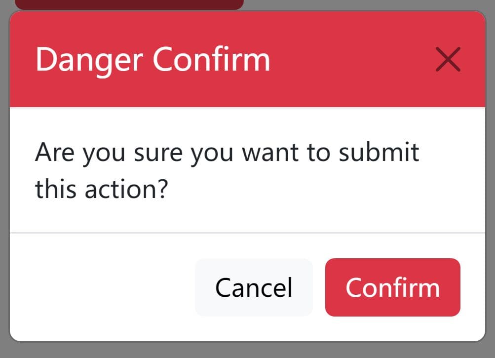
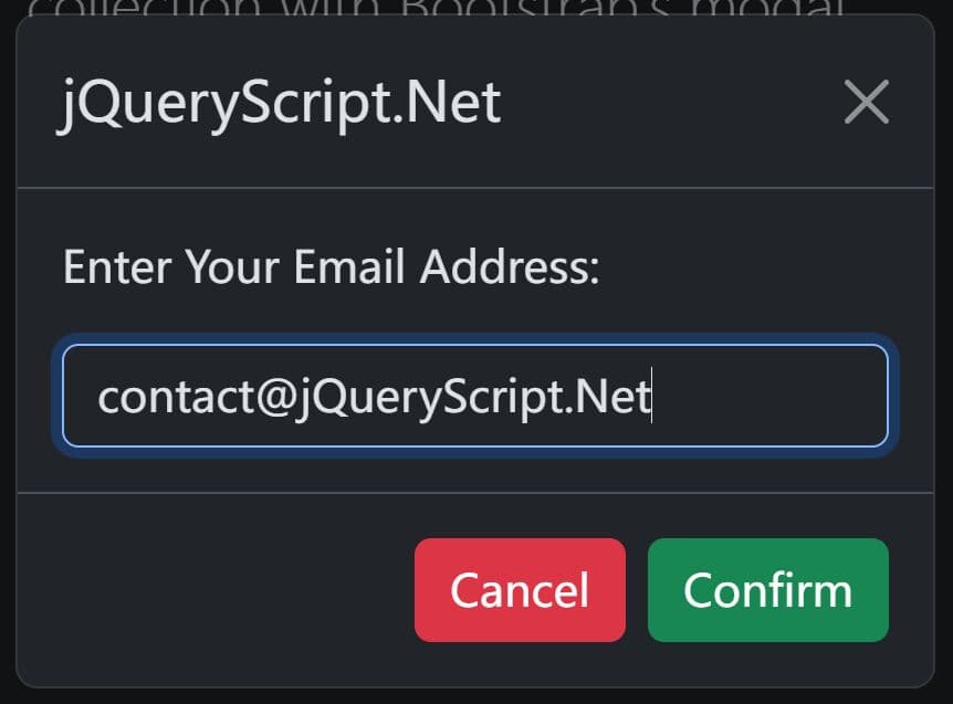
This is a simple, lightweight, responsive jQuery modal & dialog plugin that loads content from inline content within the document.
Dead simple to use and fully customizable using your own CSS.
How to use it:
1. Load the minified version of the jQuery simple-modal plugin in the document after loading jQuery library.
<link rel="stylesheet" href="simple-modal.min.css">
<script src="https://code.jquery.com/jquery-3.3.1.min.js"
        integrity="sha384-tsQFqpEReu7ZLhBV2VZlAu7zcOV+rXbYlF2cqB8txI/8aZajjp4Bqd+V6D5IgvKT"
        crossorigin="anonymous"></script>
<script src="simple-modal.min.js"></script>
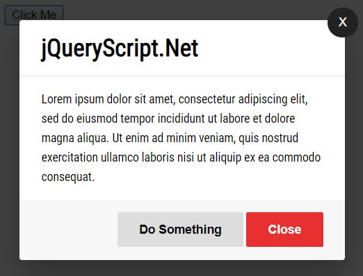
2. Create the modal content & trigger element using the following data attributes:
- data-modal: Add this attribute to the top container of the modal.
- data-modal="close-modal": Specify the close element.
- data-modal="open-modal": Specify the trigger element
<div class="modal" data-modal>
  <div class="modal-content">
    <button role="button" class="close-icon" data-modal="close-modal">X</button>
    <div class="modal-header">
      <h2 class="modal-title">Modal Title</h2>
    </div>
    <div class="modal-body">
      <p>Modal Content</p>
    </div>
    <div class="modal-footer">
      <button role="button">Custom Action Button</button>
      <button role="button" class="close-button" data-modal="close-modal">Close</button>
    </div>
  </div>
</div>

<button role="button" data-modal="open-modal">Launch</button>
3. The example CSS to style the modal.
.modal-content {
  position: relative;
  border-radius: 3px;
  box-shadow: 0 15px 50px rgba(0,0,0,.25);
}

.modal-header,
.modal-body,
.modal-footer {
  padding: 15px 25px;
}

/* Modal Header */

.modal-header {
  border-bottom: 1px solid rgba(0,0,0,.1);
}

.modal-title {
  font-size: 1.75em;
  font-weight: 600;
}

/* Modal Body */

.modal-body {
  line-height: 1.65;
}

.modal-body p {
  font-size: 14px;
  margin-top: 0;
}

.modal-body p:last-child {
  margin-bottom: 0;
}

/* Modal Footer */

.modal-footer {
  background: rgba(0,0,0,.03);
  text-align: right;
}

/* Modal Buttons */

.close-icon {
  webkit-appearance: none;
  appearance: none;
  position: absolute;
  top: -15px;
  right: -15px;
  width: 35px;
  height: 35px;
  color: #fff;
  font-size: 14px;
  background: #222;
  border: none;
  outline: none;
  border-radius: 50%;
  cursor: pointer;
  vertical-align: middle;
}

.modal-footer button {
  webkit-appearance: none;
  appearance: none;
  padding: 0 25px;
  height: 40px;
  font-size: 14px;
  font-weight: bold;
  border: none;
  outline: none;
  border-radius: 2px;
  cursor: pointer;
}

.modal-footer .close-button {
  color: #fff;
  background: #e83030;
}

.modal-footer .close-button:hover
.modal-footer .close-button:focus {
  background: #e62121;
}
This awesome jQuery plugin is developed by vmcdesign. For more Advanced Usages, please check the demo page or visit the official website.