Flexible Multi-item Carousel Plugin For Bootstrap - ResCarousel
| File Size: | 94.6 KB |
|---|---|
| Views Total: | 41115 |
| Last Update: | |
| Publish Date: | |
| Official Website: | Go to website |
| License: | MIT |
Just another jQuery extension for Bootstrap that allows to present multiple slide items in your responsive Bootstrap carousel component. The plugin will automatically adjust the number of items per slide depending on the browser's width. Also allows you to specify how many slide items to slide at a time.
View more:
How to use it:
1. Add jQuery library, Twitter Bootstrap framework and the jQuery ResCarousel plugin's script to your webpage.
<!-- Dependencies -->
<link rel="stylesheet" href="/path/to/bootstrap.min.css">
<script src="/path/to/jquery.min.js"></script>
<script src="/path/to/bootstrap.min.js"></script>

<!-- jQuery ResCarousel -->
<script src="/path/to/resCarousel.js"></script>
2. You might need to load the Font Awesome iconic font for the carousel navigation buttons.
<link rel="stylesheet" href="/path/to/fontawesome.min.css">
3. Insert your own content to the Bootstrap carousel. You're able to config the carousel with the following data attributes:
- data-items: how many items to show on different screen sizes (data-items="xs,sm,md,lg").
- data-slide: how many item(s) to slide at a time.
- data-interval: the auto sliding of items with value of milli seconds.
- data-speed: control the speed of the moving items.
- data-animator: give some animation to sliding items.
- data-load: intimate that the slider is going to touch the end
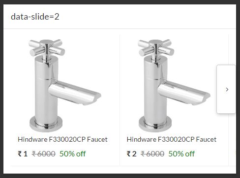
<div class="resCarousel" data-items="2,4,5,6" data-slide="1">

  <div class="resCarousel-inner" >
    <div class="item">
      <div class="col-xs-12 col-sm-12 col-lg-12">
          <img src="1.jpg" class="img-responsive">
      </div>
    </div>

    <div class="item">
      <div class="col-xs-12 col-sm-12 col-lg-12">
          <img src="2.jpg" class="img-responsive">
      </div>
    </div>

    <div class="item">
      <div class="col-xs-12 col-sm-12 col-lg-12">
          <img src="3.jpg" class="img-responsive">
      </div>
    </div>

    ...

  </div>
  <button class='btn btn-default leftLst'><i class="fa fa-fw fa-angle-left"></i></button>
  <button class='btn btn-default rightLst'><i class="fa fa-fw fa-angle-right"></i></button>

</div>
4. The required CSS styles for the ResCarousel plugin.
.outt { display: none; }

.leftLs, .leftLst {
  position: absolute;
  margin: auto;
  top: 0;
  bottom: 0;
  z-index: 100;
  left: 0;
  width: 40px;
  height: 100px;
  box-shadow: 1px 2px 10px -1px rgba(0,0,0,.3);
}

.rightLs, .rightLst {
  position: absolute;
  margin: auto;
  top: 0;
  right: 0;
  bottom: 0;
  z-index: 100;
  width: 40px;
  height: 100px;
  box-shadow: 1px 2px 10px -1px rgba(0,0,0,.3);
}

.resCarousel {
  float: left;
  overflow: hidden;
  padding: 0 15px;
  width: 100%;
}

.resCarousel-inner {
  transition: 1s ease all;
  float: left;
}

.resCarousel-inner .item { float: left; }
Change log:
2017-06-15
- Added the data-animation and data-load. and huge performance improvements.
2017-06-12
- performance Improvement
2017-06-10
- Added the loop of the items and also added data-speed to control the speed of the moving item. also made some changes to the scroll method(from transform to scrollLeft to take the advantage of the scroll on mobiles and even more coming soon
2017-03-04
- change code for moving items based on their width and data-slide
This awesome jQuery plugin is developed by sheikalthaf. For more Advanced Usages, please check the demo page or visit the official website.