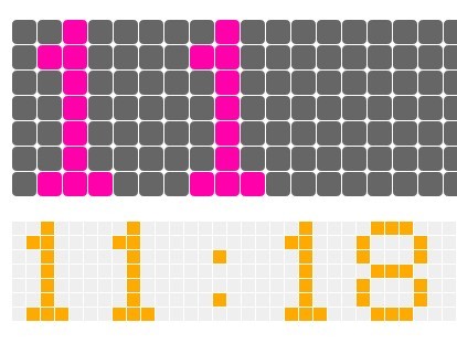
Creating A Pretty Pantone Clock with jQuery and CSS3
| File Size: | 3.06 KB |
|---|---|
| Views Total: | 1972 |
| Last Update: | |
| Publish Date: | |
| Official Website: | Go to website |
| License: | MIT |
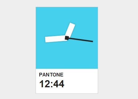
A simple, nice-looking pantone clock built on top of jQuery and CSS3 transforms. Great for adding a clock widget to your website or mobile App.
How to use it:
1. Include the necessary jQuery javascript library on the web page.
<script src="//ajax.googleapis.com/ajax/libs/jquery/1.11.1/jquery.min.js"></script>
2. Create the Html for a pantone clock.
<div id="clock-container">
  <div id="clock">
    <div id="hour-container" class="center default-rotation">
      <div id="hour" class="hand"></div>
    </div>
    <div id="minute-container" class="center default-rotation">
      <div id="minute" class="hand"></div>
    </div>
    <div id="second-container" class="center default-rotation">
      <div id="second" class="hand"></div>
      <div id="second-base" class="hand"></div>
    </div>
  </div>
  <div id="time-container"> PANTONE
    <div id="time">0:00</div>
  </div>
</div>
3. Make sure to include the clock.js after jQuery library.
<script src="clock.js"></script>
4. The required CSS to style the pantone clock. Feel free to change the styles to your taste.
#clock-container {
  width: 200px;
  position: absolute;
  top: 50%;
  left: 50%;
  margin-top: -141px;
  margin-left: -101px;
  border: 1px solid #ccc;
  background-color: rgb(69, 208, 238);
}

#clock {
  width: 200px;
  height: 200px;
  margin: 0 auto;
  position: relative;
}

.center {
  position: absolute;
  top: 50%;
  left: 50%;
}

.default-rotation {
  transform: rotate(0);
  -moz-transform: rotate(0);
  -o-transform: rotate(0);
  -webkit-transform: rotate(0);
}

.hand {
  width: 100%;
  height: 50%;
}

#hour-container {
  width: 9%;
  height: 50%;
  margin-left: -4.5%;
  margin-top: -25%;
}

#minute-container {
  width: 9%;
  height: 70%;
  margin-left: -4.5%;
  margin-top: -35%;
}

#second-container {
  width: 2%;
  height: 85%;
  margin-left: -1%;
  margin-top: -42.5%;
}

#hour-container .hand,
#minute-container .hand {
  background-color: #fff;
  -moz-box-shadow: 0 0 4px 2px rgba(0, 0, 0, 0.1);
  -webkit-box-shadow: 0 0 4px 2px rgba(0, 0, 0, 0.1);
  box-shadow: 0 0 4px 2px rgba(0, 0, 0, 0.1);
}

#second-container .hand {
  background-color: #222;
  -moz-box-shadow: 0 0 2px 1px rgba(0, 0, 0, 0.1);
  -webkit-box-shadow: 0 0 2px 1px rgba(0, 0, 0, 0.1);
  box-shadow: 0 0 2px 1px rgba(0, 0, 0, 0.1);
}

#second-base {
  width: 300%;
  height: 7%;
  margin-left: -100%;
  margin-top: -150%;
}

#time-container {
  height: 60px;
  padding: 10px;
  background-color: #fff;
}

#time { font-size: 2em; }
This awesome jQuery plugin is developed by sconstantinides. For more Advanced Usages, please check the demo page or visit the official website.