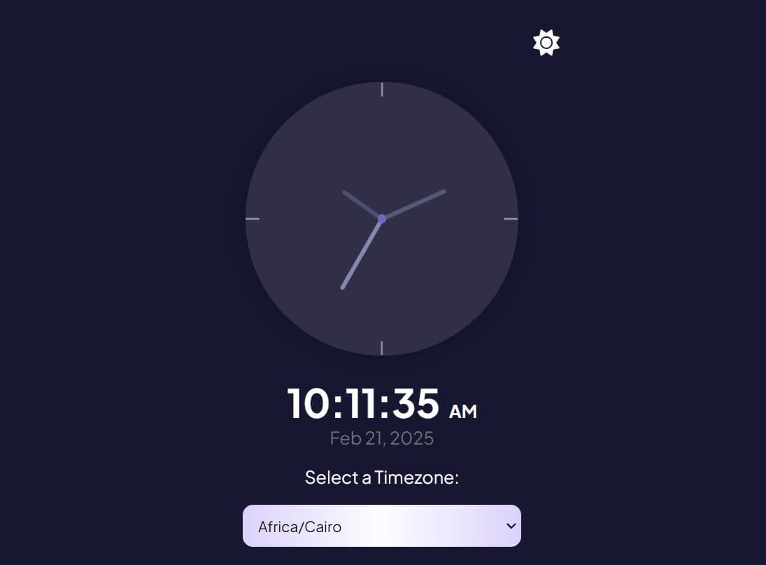
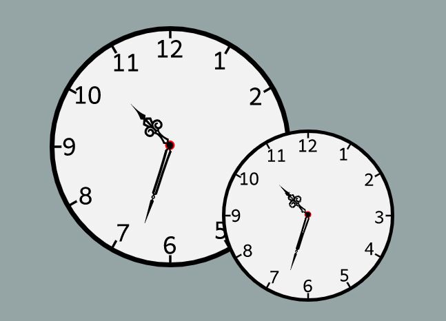
Minimal Clean Analog Clock With jQuery And CSS3
| File Size: | 359 KB |
|---|---|
| Views Total: | 891 |
| Last Update: | |
| Publish Date: | |
| Official Website: | Go to website |
| License: | MIT |

A simple, stylish, responsive analog clock that uses CSS3 2D transforms to rotate hands.
See Also:
How to use it:
1. Create the HTML for the analog clock.
<div id="clockContainer">
  <div id="hour"></div>
  <div id="minute"></div>
  <div id="second"></div>
</div>
2. Style the hands and clock face in the CSS.
#clockContainer {
  top: 3vw;
  position: relative;
  width: 40vw;
  height: 40vw;
  background: url(clock.png) no-repeat;
  background-size: 100%;
  margin: auto;
  opacity: 0.8;
}

#hour, #minute, #second {
  position: absolute;
  background-color: black;
  border-radius: 10px;
  transform-origin: bottom;
}

#hour {
  height: 26%;
  width: 1.8%;
  top: 24%;
  left: 48.9%;
  opacity: 1;
  background-color: rgb(7, 1, 61);
}

#minute {
  height: 32%;
  width: 1.2%;
  top: 17%;
  left: 49%;
  opacity: 0.7;
  background-color: rgb(7, 1, 61);
}

#second {
  background-color: red;
  height: 38%;
  width: 0.8%;
  top: 12%;
  left: 49.4%;
  opacity: 0.7;
}
3. Load the latest jQuery library (slim build is recommended) in the document.
<script src="/path/to/cdn/jquery.slim.min.js"></script>
4. Activate the analog clock.
setInterval(() => {
  date= new Date();
  h=date.getHours();
  m=date.getMinutes();
  s=date.getSeconds();
  console.log(h+":"+m+":"+s);

  hrotation= 30*h + m/2;
  mrotation= 6*m;
  srotation= 6*s;
  console.log(hrotation+":"+mrotation+":"+srotation);

  $("#hour").css("transform", `rotate(${hrotation}deg)`);
  $("#minute").css("transform", `rotate(${mrotation}deg)`);
  $("#second").css("transform", `rotate(${srotation}deg)`);

}, 1000);
This awesome jQuery plugin is developed by SudhanshuBlaze. For more Advanced Usages, please check the demo page or visit the official website.