Google Material Design Ripple Effects with jQuery and CSS3
| File Size: | 3.86 KB |
|---|---|
| Views Total: | 2687 |
| Last Update: | |
| Publish Date: | |
| Official Website: | Go to website |
| License: | MIT |
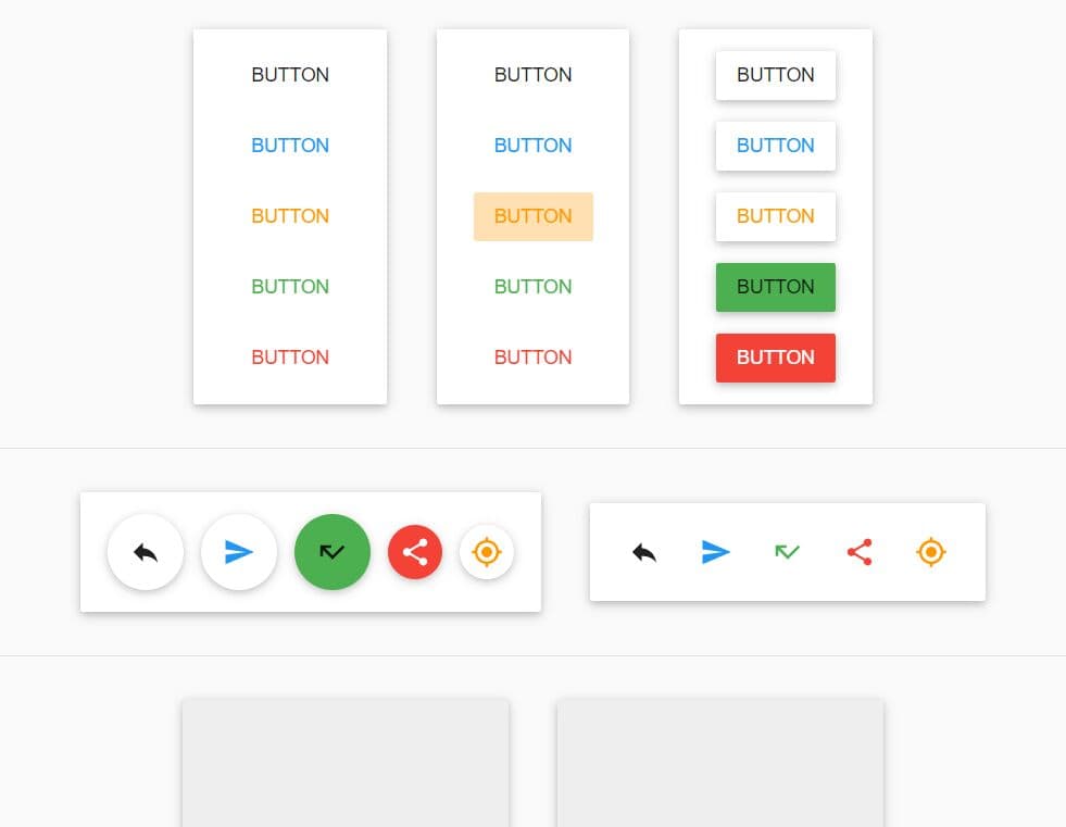
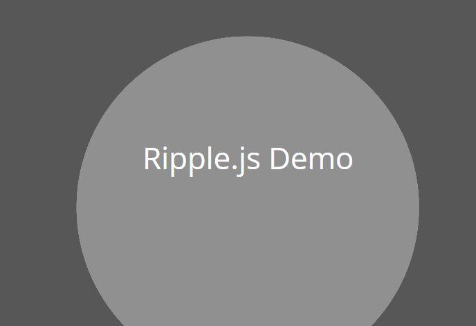
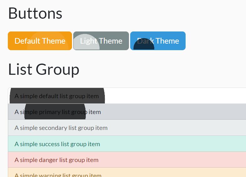
With CSS3 animations and a little jQuery magic, you can apply Google Material Design inspired ripple effects on any Html tag when clicked on.
Features:
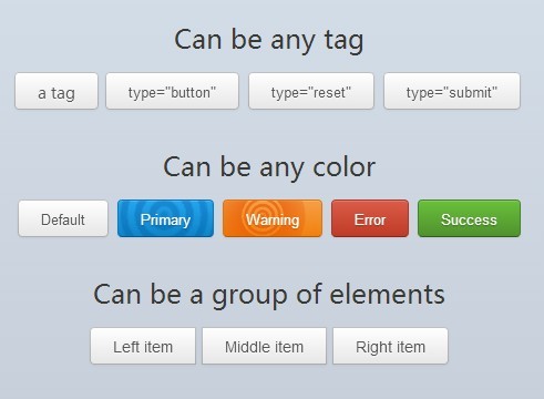
- Can be any Html tag like
a,input,button, etc... - Can be any color defined in CSS.
- Can be a group of elements.
See also:
- Hamburger Button Transition Effect with jQuery and CSS3
- Material Design Action Button Transition Effect with jQuery and CSS3
- Google Material Design Concept UI Button with jQuery and CSS3
Basic Usage:
1. Add data-ripplecator as an attribute to your element.
<a data-ripplecator class="ripple-btn" href="#"><span>I'm a button</span></a>
2. Add helper classes to style the ripple effect.
<a data-ripplecator class="ripple-btn dark-ripples" href="#"><span>I'm a button</span></a>
3. The required CSS/CSS3 styles.
.ripple-btn {
  position: relative;
  display: inline-block;
  -webkit-box-sizing: border-box;
  -moz-box-sizing: border-box;
  box-sizing: border-box;
  outline: none;
  overflow: hidden;
  vertical-align: middle;
  height: 34px;
  line-height: 34px;
  padding: 0 20px;
  color: #555;
  text-align: center;
  text-decoration: none;
  text-shadow: 0 1px 1px rgba(255, 255, 255, 0.75);
  -webkit-background-origin: border-box;
  background-origin: border-box;
  border: 1px solid rgba(0, 0, 0, 0.25);
  border-radius: 4px;
  cursor: pointer;
  -webkit-box-shadow: inset 0 1px 0 rgba(255, 255, 255, 0.2), 0 1px 2px rgba(0, 0, 0, 0.05);
  box-shadow: inset 0 1px 0 rgba(255, 255, 255, 0.2), 0 1px 2px rgba(0, 0, 0, 0.05);
  background-image: -webkit-gradient(linear, left top, left bottom, from(#ffffff), to(#e6e6e6));
  background-image: -webkit-linear-gradient(top, #ffffff, #e6e6e6);
  background-image: linear-gradient(to bottom, #ffffff, #e6e6e6);
}

.ripple-btn span {
  position: relative;
  z-index: 3;
}

.ripple-btn:hover:before {
  background: -webkit-radial-gradient(farthest-corner, rgba(255, 255, 255, 0.18), rgba(255, 255, 255, 0.03));
  background: radial-gradient(farthest-corner, rgba(255, 255, 255, 0.18), rgba(255, 255, 255, 0.03));
}

.ripple-btn:active {
  -webkit-box-shadow: inset 0 2px 4px rgba(0, 0, 0, 0.15), 0 1px 2px rgba(0, 0, 0, 0.05);
  box-shadow: inset 0 2px 4px rgba(0, 0, 0, 0.15), 0 1px 2px rgba(0, 0, 0, 0.05);
}

.dark-ripples > .circle {
  background-image: -webkit-radial-gradient(center, ellipse, rgba(51, 51, 51, 0.2) 0%, rgba(51, 51, 51, 0) 5%, rgba(51, 51, 51, 0.2) 6%, rgba(51, 51, 51, 0.2) 10%, rgba(51, 51, 51, 0) 11%, rgba(51, 51, 51, 0) 15%, rgba(51, 51, 51, 0.2) 16%, rgba(51, 51, 51, 0.2) 20%, rgba(51, 51, 51, 0) 21%, rgba(51, 51, 51, 0) 25%, rgba(51, 51, 51, 0.2) 26%, rgba(51, 51, 51, 0.2) 30%, rgba(51, 51, 51, 0) 31%, rgba(51, 51, 51, 0) 34%, rgba(51, 51, 51, 0.2) 35%, rgba(51, 51, 51, 0) 100%);
  background-image: radial-gradient(ellipse at center, rgba(51, 51, 51, 0.2) 0%, rgba(51, 51, 51, 0) 5%, rgba(51, 51, 51, 0.2) 6%, rgba(51, 51, 51, 0.2) 10%, rgba(51, 51, 51, 0) 11%, rgba(51, 51, 51, 0) 15%, rgba(51, 51, 51, 0.2) 16%, rgba(51, 51, 51, 0.2) 20%, rgba(51, 51, 51, 0) 21%, rgba(51, 51, 51, 0) 25%, rgba(51, 51, 51, 0.2) 26%, rgba(51, 51, 51, 0.2) 30%, rgba(51, 51, 51, 0) 31%, rgba(51, 51, 51, 0) 34%, rgba(51, 51, 51, 0.2) 35%, rgba(51, 51, 51, 0) 100%);
}

@-webkit-keyframes
scale-circle {  0 {
 -webkit-transform: scale(0.2);
 transform: scale(0.2);
 opacity: 0.4;
}
 70% {
 -webkit-transform: scale(2.5);
 transform: scale(2.5);
 opacity: 0;
}
 100% {
 -webkit-transform: scale(2);
 transform: scale(2);
 opacity: 0;
}
}
@keyframes
scale-circle {  0 {
 -webkit-transform: scale(0.2);
 transform: scale(0.2);
 opacity: 0.4;
}
 70% {
 -webkit-transform: scale(2.5);
 transform: scale(2.5);
 opacity: 0;
}
 100% {
 -webkit-transform: scale(2);
 transform: scale(2);
 opacity: 0;
}
}
3. Include the jQuery library at the bottom of your web page.
<script src="//ajax.googleapis.com/ajax/libs/jquery/1.11.1/jquery.min.js"></script>
4. Active the ripple effect as you click on the element.
(function (window, $) {

$(function() {

$('[data-ripplecator]').bind('click', function (event) {


var $div = $('<div/>'),
btnOffset = $(this).offset(),
  xPos = event.pageX - btnOffset.left,
  yPos = event.pageY - btnOffset.top;

$div
.addClass('circle')
.css({
top: yPos - 65,
left: xPos - 65
})
.appendTo($(this));

window.setTimeout(function(){
$div.remove();
}, 1500);
event.preventDefault();
});

});

})(window, jQuery);
This awesome jQuery plugin is developed by SomeStuffer. For more Advanced Usages, please check the demo page or visit the official website.