Responsive Equal Height Columns With jQuery - MagicHeight
| File Size: | 19.3 KB |
|---|---|
| Views Total: | 1496 |
| Last Update: | |
| Publish Date: | |
| Official Website: | Go to website |
| License: | MIT |

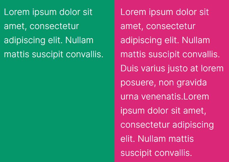
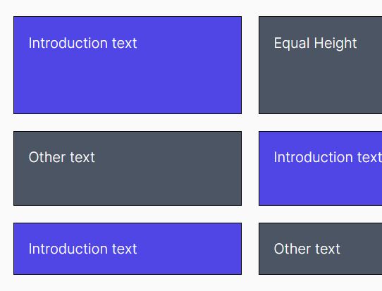
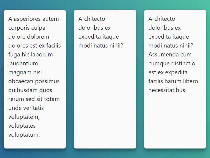
MagicHeight is a simple, responsive jQuery equal height plugin to make all the columns in the same row have the same height.
The equal height columns will automatically update on window resize for responsive web layout.
Installation:
# NPM
$ npm install magic-height --save

# Bower
$ bower install magic-height --save
How to use it:
1. Insert jQuery library and the jQuery MagicHeight plugin into the document.
<script src="https://code.jquery.com/jquery-1.12.4.min.js"
        integrity="sha384-nvAa0+6Qg9clwYCGGPpDQLVpLNn0fRaROjHqs13t4Ggj3Ez50XnGQqc/r8MhnRDZ"
        crossorigin="anonymous">
</script>
<script src="jquery.magic-height.min.js"></script>
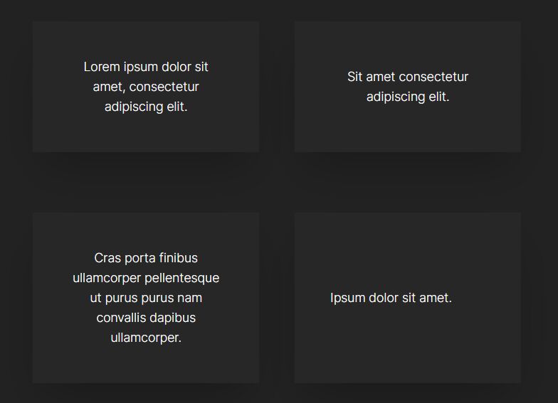
2. Assume that you have a grid layout consist of several columns.
<div class="container">
  <article class="item">
    Grid item 1
  </article>
  <article class="item">
    Grid item 2
  </article class="item">
  <article>
    Grid item 3
  </article>
  <article class="item">
    Grid item 4
  </article>
  <article class="item">
    Grid item 5
  </article>
  <article class="item">
    Grid item 6
  </article>
  ...
</div>
3. Call the function on the top container and specify the item selector as follows.
$(function () {
  $('.container').magicHeight({
    itemClass: '.item'
  });
});
4. Decide whether to recalculate the height of elements and automatically update the layout on window resize/load.
$(function () {
  $('.container').magicHeight({
    itemClass: '.item',
    resize: true,
    load: true
  });
});
This awesome jQuery plugin is developed by kyrare. For more Advanced Usages, please check the demo page or visit the official website.