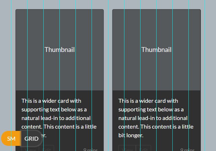
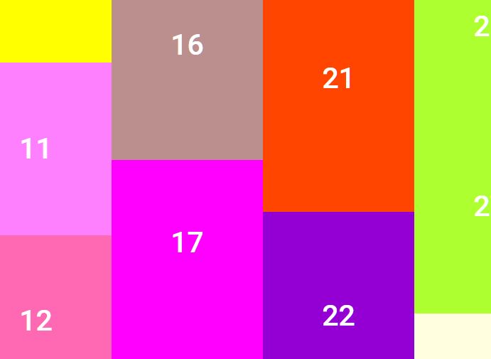
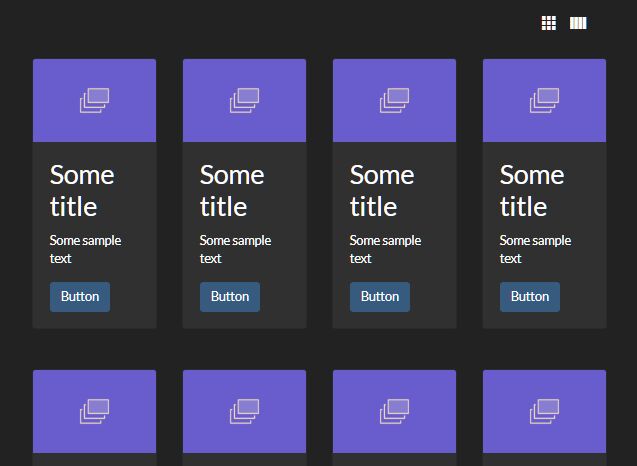
Responsive Masonry/Pinterest Like Grid Layout For Bootstrap 4/3
| File Size: | 8.82 KB |
|---|---|
| Views Total: | 13405 |
| Last Update: | |
| Publish Date: | |
| Official Website: | Go to website |
| License: | MIT |
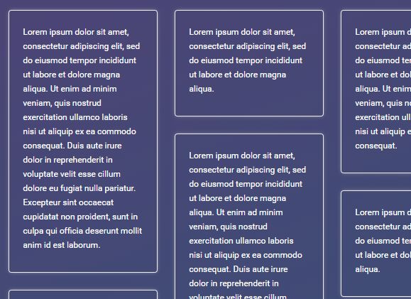
The bootstrap.masonry.js jQuery plugin transforms the regular Bootstrap 4 or Bootstrap 3 grid system into a responsive, fluid grid layout similar to the Pinterest or Masonry.
How to use it:
1. Include the needed jQuery JavaScript library and Bootstrap 4 or Bootstrap 3 framework on the webpage.
<link rel="stylesheet" href="/path/to/cdn/bootstrap.min.css" />
<script src="/path/to/cdn/jquery.slim.min.js"></script>
2. Load the bootstrap.masonry.js script after jQuery library.
<script src="bootstrap.masonry.min.js"></script>
3. Create a Bootstrap grid system with the following attributes:
- data-target: the selector of grid items
- data-col-xs: the number of columns on extra small devices (phones)
- data-col-sm: the number of columns on small devices (tablets)
- data-col-md: the number of columns on medium devices (desktops)
<div class="row masonry"
     data-target=".item"
     data-col-xs="12"
     data-col-sm="4"
     data-col-md="3">
  <div class="col-xs-12 col-sm-4 col-md-3">
    <div class="item">
      Item 1
    </div>
  </div>
  <div class="col-xs-12 col-sm-4 col-md-3">
    <div class="item">
      Item 2
    </div>
  </div>
  <div class="col-xs-12 col-sm-4 col-md-3">
    <div class="item">
      Item 3
    </div>
  </div>
  ...
</div>
4. Enable the Masonry/Pinterest layout by calling the function on the top container.
$(function() {
  $('.masonry').masonry();
});
Changelog:
2020-05-13
- updated column height comparation
2020-05-13
- Fixed issues when the screen size is smaller than 576px
2018-04-29
- Updated for Bootstrap 4
This awesome jQuery plugin is developed by gustavoconci. For more Advanced Usages, please check the demo page or visit the official website.