Responsive Full Width Grid Layout with Pure CSS
| File Size: | 22.1 KB |
|---|---|
| Views Total: | 7381 |
| Last Update: | |
| Publish Date: | |
| Official Website: | Go to website |
| License: | MIT |
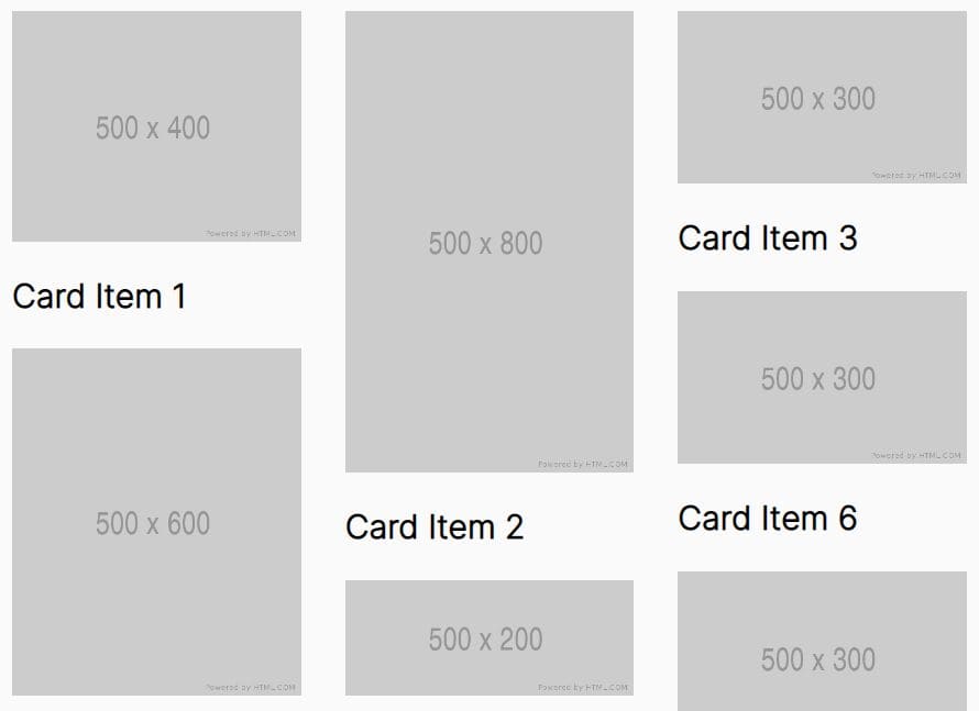
In this tutorial we're going to create a responsive full width grid layout with PURE CSS. It will detect the window's size and auto adjust the items shown per row.
You might also like:
- Pinterest Like Glowing Input Fields with CSS3
- Pinterest-Like Dynamic & Responsive Grid Layout Plugin - BlocksIt
- Pinterest-Like Dynamic Grid Layout Plugin with jQuery - Wookmark
- Pinterest-Like Web Layout Plugin
- Pinterest Style Dynamic Layout jQuery Plugin - Masonry
- jQuery Plugin For Rearranging Boxes In Grid Layout - boxes2fullwidth
How to use it:
1. Markup html structure
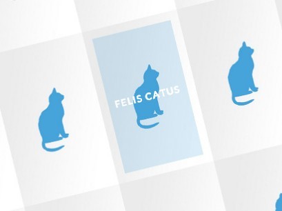
<ul class="cbp-rfgrid">
<li><a href="#"><img src="images/1.jpg" /><div><h3>Title 1</h3></div></a></li>
<li><a href="#"><img src="images/2.jpg" /><div><h3>Title 2</h3></div></a></li>
<li><a href="#"><img src="images/3.jpg" /><div><h3>Title 3</h3></div></a></li>
<li><a href="#"><img src="images/4.jpg" /><div><h3>Title 4</h3></div></a></li>
<li><a href="#"><img src="images/5.jpg" /><div><h3>Title 5</h3></div></a></li>
...
</ul>
2. The CSS
.cbp-rfgrid {
margin: 35px 0 0 0;
padding: 0;
list-style: none;
position: relative;
width: 100%;
}
.cbp-rfgrid li {
position: relative;
float: left;
overflow: hidden;
width: 16.6666667%; /* Fallback */
width: -webkit-calc(100% / 6);
width: calc(100% / 6);
}
.cbp-rfgrid li a, .cbp-rfgrid li a img {
display: block;
width: 100%;
cursor: pointer;
}
.cbp-rfgrid li a img {
max-width: 100%;
}
/* Flexbox is used for centering the heading */
.cbp-rfgrid li a div {
position: absolute;
left: 20px;
top: 20px;
right: 20px;
bottom: 20px;
background: rgba(71,163,218,0.2);
display: -webkit-flex;
display: -moz-flex;
display: -ms-flex;
display: flex;
-webkit-align-items: center;
-moz-align-items: center;
-ms-align-items: center;
align-items: center;
text-align: center;
opacity: 0;
}
.cbp-rfgrid li a:hover div {
opacity: 1;
}
.cbp-rfgrid li a div h3 {
width: 100%;
color: #fff;
text-transform: uppercase;
font-size: 1.4em;
letter-spacing: 2px;
padding: 0 10px;
}

/* Example for media query: change number of items per row */

@media screen and (max-width: 1190px) {
.cbp-rfgrid li {
width: 20%; /* Fallback */
width: -webkit-calc(100% / 5);
width: calc(100% / 5);
}
}
 @media screen and (max-width: 945px) {
.cbp-rfgrid li {
width: 25%; /* Fallback */
width: -webkit-calc(100% / 4);
width: calc(100% / 4);
}
}
 @media screen and (max-width: 660px) {
.cbp-rfgrid li {
width: 33.3333333%; /* Fallback */
width: -webkit-calc(100% / 3);
width: calc(100% / 3);
}
}
 @media screen and (max-width: 660px) {
.cbp-rfgrid li {
width: 33.3333333%; /* Fallback */
width: -webkit-calc(100% / 3);
width: calc(100% / 3);
}
}
 @media screen and (max-width: 400px) {
.cbp-rfgrid li {
width: 50%; /* Fallback */
width: -webkit-calc(100% / 2);
width: calc(100% / 2);
}
}
 @media screen and (max-width: 300px) {
.cbp-rfgrid li {
width: 100%;
}
}
This awesome jQuery plugin is developed by MARY LOU. For more Advanced Usages, please check the demo page or visit the official website.