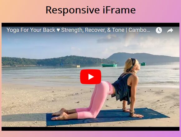
jQuery Plugin For Responsive Flexible Iframes - Flexy
| File Size: | 62.1 KB |
|---|---|
| Views Total: | 1155 |
| Last Update: | |
| Publish Date: | |
| Official Website: | Go to website |
| License: | MIT |

Flexy is a lightweight jQuery plugin designed for responsive, cross-browser website that automatically scales the iframes to make them adapt to any screen size. Suitable for any iframe elements like Youtube and Vimeo vidoe players.
See also:
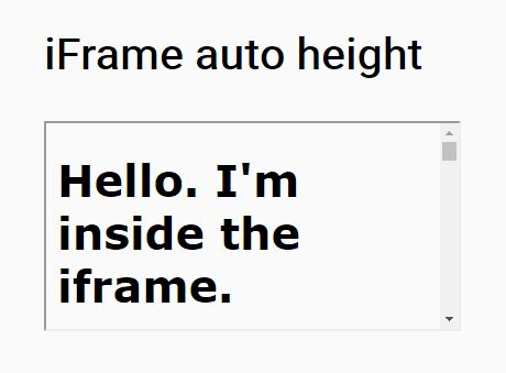
- jQuery Plugin For Auto Resizing iFrame - iframe Auto Height
- Lightweight jQuery Responsive iFrame Plugin - FitFrame.js
- Responsive IFrames Plugin For jQuery
- Auto Resizing iFrame with jQuery rIframe Plugin
- jQuery Plugin For Auto Resizing iFrame - iFrame Resizer
Basic usage:
1. Load jQuery JavaScript library and the jQuery flexy plugin at the bottom of the html page.
<script src="//code.jquery.com/jquery-1.11.3.min.js"></script>
<script src="flexy.js"></script>
2. Just call the flexy() method on the iframe element within the document and we're done.
$('iframe').flexy({
  addcss: true,
  classname: 'flexy-wrapper',
  widescreen: true
});
3. Available options.
$('iframe').flexy({

  // Enables default flexy inline CSS
  addcss: true,

  // CSS class applied to wrapper
  classname: 'flexy-wrapper',

  // Enables wide screen format (16/9).
  // Made especially for Vimeo embed
  widescreen: true

});
Change log:
2016-10-12
- bugfix.
This awesome jQuery plugin is developed by crewstyle. For more Advanced Usages, please check the demo page or visit the official website.