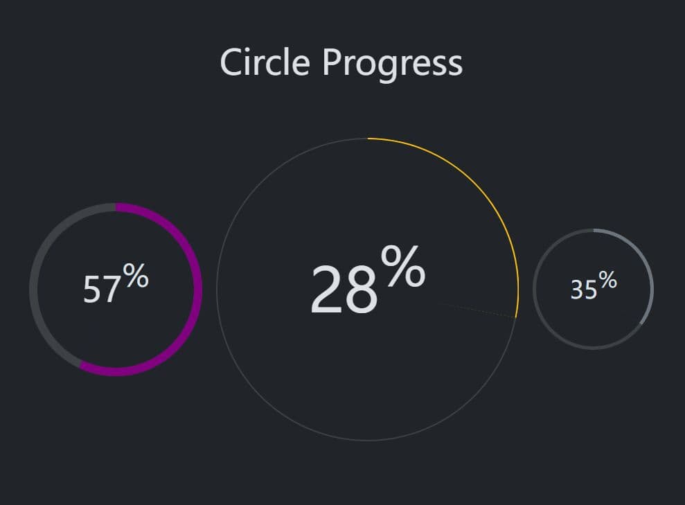
Display Percentage/Progress Values As Gauges - Circle Progress
| File Size: | 56.9 KB |
|---|---|
| Views Total: | 5131 |
| Last Update: | |
| Publish Date: | |
| Official Website: | Go to website |
| License: | MIT |
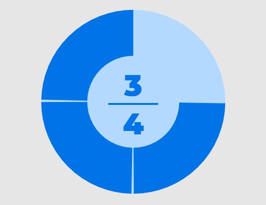
Circle Progress is a web component that creates lightweight, responsive, and accessible circular progress bars for modern web applications.
It allows you to generate animated SVG-based progress indicators that work across all major browsers.
|
Circle Progress has been completely rewritten! It's rebuilt as a modern, lightweight web component. If you used the old version, here's what's new:
|
Features:
- Web Component Architecture: Circle Progress is built as a custom element, following modern web standards for native browser support.
- Lightweight Performance: The library weighs less than 5kB when minified and gzipped, with minimal impact on loading times.
- CSS Customization: Style the progress bar using CSS
::part()selectors to target specific SVG elements like the track, value arc, and text . - Animation System: Choose from 15+ built-in easing functions or implement custom animation timing for progress updates.
- Accessibility Focus: The component includes proper ARIA attributes and supports screen readers out of the box.
- Text Formatting: Display values as fractions, percentages, or custom formats, including the option to show values directly on the progress arc.
See also:
How to use it:
1. Install and import 'js-circle-progress' with NPM.
# NPM
$ npm install js-circle-progress
import 'js-circle-progress';
2. Or link directly to the library from a CDN in your HTML.
<script src="https://cdn.jsdelivr.net/npm/js-circle-progress/dist/circle-progress.min.js" type="module"></script>
3. Or download the script and host it yourself.
<script src="/dist/circle-progress.min.js" type="module"></script>
4. Once the script is loaded, you can use the custom element directly in your HTML:
<circle-progress value="50" max="100"></circle-progress>
5. You can configure the component by setting its properties in JavaScript or as attributes in HTML. Property names are camelCase, while attribute names are kebab-case.
const myCircle = document.querySelector('circle-progress');
myCircle.startAngle = 90;
<circle-progress start-angle="90"></circle-progress>
6. The library also provides a chainable attr method for setting multiple properties at once
circleProgress.attr({
  max: 200,
  value: 75,
  startAngle: -90,
});
await circleProgress.updateComplete;
// The animation is now finished.
7. For programmatic control, create instances via JavaScript:
import CircleProgress from 'js-circle-progress'

const progress = new CircleProgress({
  value: 45,
  max: 100,
  startAngle: -90,
  animation: 'easeOutCubic'
})

document.body.appendChild(progress)
8. All available properties (options).
value: The current numerical value of the progress bar. The component is indeterminate if this is not set.min: The minimum value of the progress range. Defaults to0.max: The maximum value of the progress range. Defaults to1.startAngle: The angle where the progress arc begins, measured in degrees. A value of0corresponds to the top of the circle.anticlockwise: A boolean that reverses the direction of the progress arc when set totrue. Defaults tofalse(clockwise).unconstrained: A boolean that, whenfalse, clamps thevalueto stay within theminandmaxrange. Iftrue, the arc can draw beyond a full circle. Defaults tofalse.indeterminateText: The string to display in the center when thevalueis not set. Defaults to'?'.textFormat: Controls the text display. It can be a keyword ('horizontal','vertical','percent','value','valueOnCircle','none') or a custom function that returns an HTML string.animation: The easing function for the fill animation. It accepts a keyword for one of the many built-in easings (like'easeInOutCubic') or a custom function. Set to'none'to disable animation.animationDuration: The duration of the fill animation in milliseconds. Defaults to600.
9. Circle Progress includes these predefined easing options:
linear, easeInQuad, easeOutQuad, easeInOutQuad, easeInCubic, easeOutCubic, easeInOutCubic, easeInQuart, easeOutQuart, easeInOutQuart, easeInQuint, easeOutQuint, easeInOutQuint, easeInSine, easeOutSine, easeInOutSine, easeInExpo, easeOutExpo, easeInOutExpo, easeInCirc, easeOutCirc, easeInOutCirc
10. For custom easing, provide a function that calculates the current angle based on elapsed time:
progress.animation = (time, startAngle, angleDiff, duration) => {
  const t = time / duration
  const eased = t * t * (3 - 2 * t) // smoothstep
  return startAngle + angleDiff * eased
}
11. Circle Progress exposes its internal SVG elements as CSS parts, which you can target with the ::part() pseudo-element.
circle-progress::part(base) {
  width: 200px;
  height: 200px;
}

circle-progress::part(circle) {
  stroke: #e0e0e0;
  stroke-width: 8;
}

circle-progress::part(value) {
  stroke: #4caf50;
  stroke-width: 8;
  stroke-linecap: round;
}

circle-progress::part(text) {
  font-size: 24px;
  font-weight: bold;
  fill: #333;
}
Changelog:
v1.0.0 (2025-10-27)
- Circle Progress is a now a web component
- Updated doc
v0.2.4 (2022-05-16)
- Fix text value for valueOnCircle and no animation
v0.2.3 (2022-03-13)
- Bugfix
v0.2.2 (2022-01-16)
- Support NPM.
v0.2.0 (2020-08-23)
- Add UMD support
v0.1.2 (2020-05-02)
- Replace SVG innerHTML polyfill
v0.1.1 (2020-04-27)
- Extend animation capabilities
v0.1.0 (2019-10-05)
- Add CSS class to the SVG element
This awesome jQuery plugin is developed by tigrr. For more Advanced Usages, please check the demo page or visit the official website.