Animated Gradient Progress Bar With Counter
| File Size: | 4.04 KB |
|---|---|
| Views Total: | 3425 |
| Last Update: | |
| Publish Date: | |
| Official Website: | Go to website |
| License: | MIT |
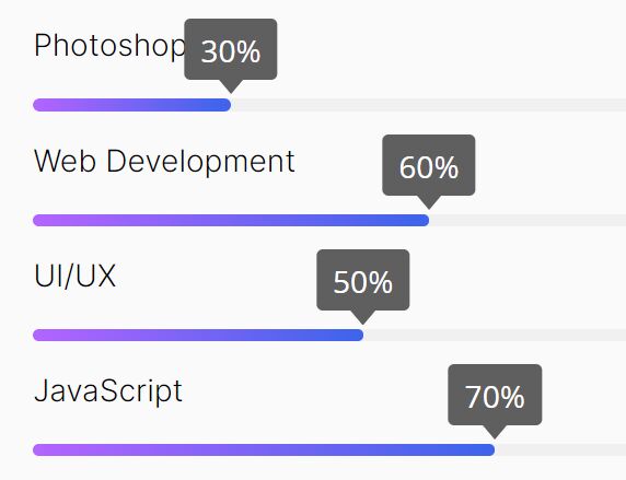
A super tiny and pretty nice progress bar jQuery plugin that displays a percentage value as an animated linear bar with a counter.
See Also:
How to use it:
1. Import the stylesheet animated-counter-prograssbar.css and JavaScript animated-counter-prograssbar.js into the HTML document.
<link rel="stylesheet" href="animated-counter-prograssbar.css" />
<script src="/path/to/cdn/jquery.min.js"></script>
<script src="animated-counter-prograssbar.js"></script>
2. Add the progress-bar attribute to the progress bar container and define the percentage value using the data-percentage attribute:
<div class="progressbar-item">
  <h4 class="progress-title">Photoshop</h4>
  <div progress-bar data-percentage="80%">
    <div class="progress-number">
      <div class="progress-number-mark">
        <span class="percent"></span>
        <span class="down-arrow"></span>
      </div>
    </div>
    <div class="progress-bg">
      <div class="progress-fill"></div>
    </div>
  </div>
</div>

<div class="progressbar-item">
  <h4 class="progress-title">Web Development</h4>
  <div progress-bar data-percentage="60%">
    <div class="progress-number">
      <div class="progress-number-mark">
        <span class="percent"></span>
        <span class="down-arrow"></span>
      </div>
    </div>
    <div class="progress-bg">
      <div class="progress-fill"></div>
    </div>
  </div>
</div>

<div class="progressbar-item">
  <h4 class="progress-title">UI/UX</h4>
  <div progress-bar data-percentage="50%">
    <div class="progress-number">
      <div class="progress-number-mark">
        <span class="percent"></span>
        <span class="down-arrow"></span>
      </div>
    </div>
    <div class="progress-bg">
      <div class="progress-fill"></div>
    </div>
  </div>
</div>
3. Override the default CSS to create your own progressbar styles.
.progressbar-item {
  margin-bottom: 15px;
}

.progress-bar {
  margin: 0 0 10px;
  overflow: visible;
  background: transparent;
}

.progress-number {
  padding-bottom: 7px;
  position: relative;
  margin: 5px 0;
  font-family: Montserrat, sans-serif;
  font-size: 15px;
  line-height: 15px;
  font-weight: 400;
  color: #2e2e2e;
}

.progress-title {
  z-index: 100;
  font-size: 15px;
  font-weight: 400;
  margin: 0;
}

.progress-number-mark {
  font-family: var(--progress-font, "Open Sans", sans-serif);
  font-weight: var(--fw-500);
  font-size: var(--fs-16);
  line-height: 1;
  padding: 8px 8px 7px;
  border-radius: 3px;
  color: var(--progress-number-color, #fff);
  margin-bottom: 4px;
  border-radius: 3px;
  background: var(--progress-number-bg, #5f5f5f);
  position: absolute;
  bottom: 0;
  transform: translateX(-50%);
}

.down-arrow {
  border-left: 6px solid transparent;
  border-right: 6px solid transparent;
  border-top: 7px solid var(--progress-number-bg, #5f5f5f);
  position: absolute;
  left: 50%;
  top: 100%;
  transform: translateX(-50%);
}

.progress-bg {
  height: 6px;
  background: var(--progressbar-bg, #f0f0f0);
  overflow: hidden;
  border-radius: 6px;
}

.progress-fill {
  height: 6px;
  background: var(--progressbar-fill, linear-gradient(to right, #B464FF 0%, #3C64EB 100%));
  width: 0%;
  border-radius: 6px;
}
This awesome jQuery plugin is developed by shakibdshy. For more Advanced Usages, please check the demo page or visit the official website.