Customizable Progressbars That Fill Up When Visible - Absolute
| File Size: | 234 KB |
|---|---|
| Views Total: | 2189 |
| Last Update: | |
| Publish Date: | |
| Official Website: | Go to website |
| License: | MIT |
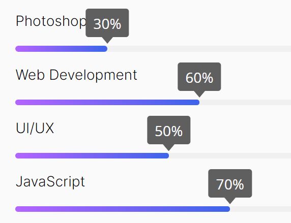
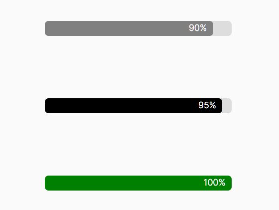
A tiny (~3kb minified) jQuery plugin for creating highly customizable linear progress bars that fill up when they're scrolled into view.
Useful to visualize progress or completion like skills, experiences, loading status, and much more.
Features:
- Auto-generates progressbars based on percentages defined in the
data-valueattribute. - All customization options can be passed via HTML data attributes.
- With or without progress bar title.
- Supports RTL (Right To Left).
- Custom easing functions and animation speed.
- Beautiful & animated tooltips.
See Also:
- 10 Best Circular/Radial Progress Bar JavaScript Plugins
- 10 Best Progress Bar (Linear) Components In JavaScript & CSS
How to use it:
1. Load the minified version of the jQuery Absolute ProgressBar plugin in the document.
<script src="/path/to/cdn/jquery.min.js"></script>
<script src="/path/to/dist/js/progressBar.min.js"></script>
2. Load the waypoint.js library if you want to animate the progress bar when visible on the screen. OPTIONAL.
<script src="https://cdnjs.cloudflare.com/ajax/libs/waypoints/3.0.0/noframework.waypoints.min.js"></script>
3. Load the latest jQuery easing library for additional easing functions. OPTIONAL.
<script src="https://cdnjs.cloudflare.com/ajax/libs/waypoints/3.0.0/noframework.waypoints.min.js"></script>
4. To create a basic progressbar, add the data-progress attribute to a container with the CSS class of 'ab-progress', and determine the percentage value in the data-value attribute as follows.
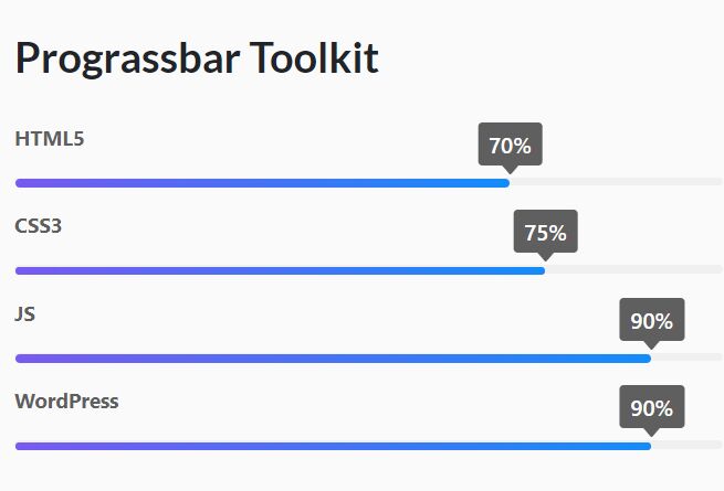
<div class="ab-progress" data-progress data-value="70"></div>
<div class="ab-progress" data-progress data-value="75"></div>
<div class="ab-progress" data-progress data-value="90"></div>
<div class="ab-progress" data-progress data-value="90"></div>
5. That's it. You can also initialize the progress bar by calling the function on the target container element.
<div class="ab-progress example"></div>
$(".testing").progressBar({
  value: "70" // 70%
});
6. Add a title to the progress bar.
<div class="ab-progress example" data-progress data-value="70" data-title="HTML5"></div>
// Or
$(".example").progressBar({
  value: "70",
  title: "HTML5",
});
7. Enable/disable tooltips. Default: 'inline'.
<div class="ab-progress example" data-progress data-value="70" data-tooltip="true"></div>
// Or
$(".example").progressBar({
  value: "70",
  tooltip: true,
});
8. Apply an easing function to the animation. Default: 'swing'.
<div class="ab-progress example" data-progress data-value="70" data-easing="easeInBounce"></div>
// Or
$(".example").progressBar({
  value: "70",
  easing: "easeInBounce",
});
9. Determine the duration of the animation. Default: 1500.
<div class="ab-progress example" data-progress data-value="70" data-duration="10000"></div>
// Or
$(".example").progressBar({
  value: "70",
  duration: 10000,
});
10. Enable & disable autoplay. Default: 1500.
<div class="ab-progress example" data-progress data-value="70" data-autoplay="true"></div>
// Or
$(".example").progressBar({
  value: "70",
  autoplay: true,
});
11. Determine whether to use the waypoint library to detect the scroll position and animate the progress bar when it is within the viewport. Default: true.
<div class="ab-progress example" data-progress data-value="70" data-waypoint="true" data-waypoint-offset="bottom-in-view"></div>
// Or
$(".example").progressBar({
  value: "70",
  waypoint-offset: "bottom-in-view",
});
12. More configurations.
$(".example").progressBar({
  // data-value
  value: "70",

  // shows title
  showTitle: true,

  // data-radius
  radius: 6,

  // data-height
  height: 6,

  // data-bg
  bg: "transparent",

  // data-border
  border: "#eee",

  // is RTL
  isRtl: document.dir,

});
13. Available callback functions.
$(".example").progressBar({
  value: "70",
  onInit: function () {
    // do something
  },
  onAnimatinStart: function () {
    // do something
  },
  onProgress: function () {
    // do something
  },
  onAfterProgress: function () {
    // do something
  },
  onComplete: function () {
    // do something
  },
  onError: function () {
    // do something
  },
  onEnd: function () {
    // do something
  },
});
14. Customize the styles of the progress bar using your own CSS.
:root {
  --clr-lightgreen: linear-gradient(to right, #84ffc9 0%, #aab2ff 100%);
  --clr-dark-green: linear-gradient(to right, #4a9b7f 0%, #0a3431 100%);
  --clr-light-pink: linear-gradient(to right, #7c65a9 0%, #96d4ca 100%);
  --clr-light-lime: linear-gradient(to right, #8de9d5 0%, #32c4c0 100%);
}
<div class="ab-progress" data-progress data-value="70" data-fill="var(--clr-lightgreen)" data-height="35" data-title="HTML5"></div>
Changelog:
2021-09-12
- Add New Data Attributes
This awesome jQuery plugin is developed by AbsolutePlugins. For more Advanced Usages, please check the demo page or visit the official website.