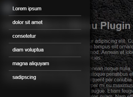
Blurry Full-size Navigation with jQuery and CSS3
| File Size: | 4.34 KB |
|---|---|
| Views Total: | 8395 |
| Last Update: | |
| Publish Date: | |
| Official Website: | Go to website |
| License: | MIT |
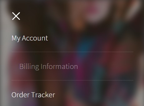
A modern navigation concept that helps you creates a full-sized navigation menu and blurs the background using CSS blur filter. jQuery is used only to toggle CSS classes as the navigation is opened or closed.
How to use it:
1. The html structure to create a navigation for your website.
<div class="screen">

  <header>
    <a class="target-burger">
      <ul class="buns">
        <li class="bun"></li>
        <li class="bun"></li>
      </ul>
      <!--buns-->
    </a>
  </header>

  <nav class="main-nav" role="navigation">
    <ul>
      <li><a href="#"><span>Menu Item 1</span></a></li>
      <li><a href="#"><span>Menu Item 2</span></a></li>
      <li><a href="#"><span>Menu Item 3</span></a></li>
      <li><a href="#"><span>Menu Item 4</span></a></li>
      <li><a href="#"><span>Menu Item 5</span></a></li>
    </ul>
  </nav>

  <div class="container">
    Main Content Goes Here
  </div>

</div>
2. The main CSS / CSS3 style.
.container {
  position: relative;
  -webkit-transition: all 0.5s ease;
  -moz-transition: all 0.5s ease;
  -o-transition: all 0.5s ease;
  transition: all 0.5s ease;
}

.container.toggled {
  -webkit-filter: blur(8px);
  -moz-filter: blur(8px);
  -o-filter: blur(8px);
  -ms-filter: blur(8px);
  filter: blur(8px);
  -webkit-transition: all 0.5s ease;
  -moz-transition: all 0.5s ease;
  -o-transition: all 0.5s ease;
  transition: all 0.5s ease;
}

div.screen {
  margin: 0 auto;
  width: 23.5em;
  height: 35.250em;
  overflow: hidden;
  position: relative;
  top: 10%;
  background-color: #333333;
  -webkit-box-shadow: 0px 0px 10px rgba(0, 0, 0, 0.25);
  -moz-box-shadow: 0px 0px 10px rgba(0, 0, 0, 0.25);
  box-shadow: 0px 0px 10px rgba(0, 0, 0, 0.25);
}

div.screen nav.main-nav {
  position: absolute;
  left: 0;
  top: 0;
  z-index: 0;
  height: 100%;
  width: 100%;
  padding: 2em;
  -webkit-opacity: 0;
  -moz-opacity: 0;
  opacity: 0;
  -webkit-transform: scale(0.85);
  -ms-transform: scale(0.85);
  transform: scale(0.85);
  -webkit-transition: all 0.5s ease;
  -moz-transition: all 0.5s ease;
  -o-transition: all 0.5s ease;
  transition: all 0.5s ease;
}

div.screen nav.main-nav.toggled {
  display: block;
  z-index: 10;
  -webkit-transform: scale(1);
  -ms-transform: scale(1);
  transform: scale(1);
  -webkit-opacity: 1;
  -moz-opacity: 1;
  opacity: 1;
  -webkit-transition: all 0.5s ease;
  -moz-transition: all 0.5s ease;
  -o-transition: all 0.5s ease;
  transition: all 0.5s ease;
}

div.screen nav.main-nav ul { padding: 2em 0 0 0; }

div.screen nav.main-nav ul li { border-bottom: 1px solid rgba(255, 255, 255, 0.15); }

div.screen nav.main-nav ul li a {
  font-size: 1.250em;
  color: #fff;
  padding: 1em 0;
  font-weight: 300;
  display: block;
  -webkit-transition: all 0.5s ease;
  -moz-transition: all 0.5s ease;
  -o-transition: all 0.5s ease;
  transition: all 0.5s ease;
}

div.screen nav.main-nav ul li a:last-child { border: none; }

div.screen nav.main-nav ul li a:hover {
  -webkit-opacity: 0.45;
  -moz-opacity: 0.45;
  opacity: 0.45;
  -webkit-transition: all 0.5s ease;
  -moz-transition: all 0.5s ease;
  -o-transition: all 0.5s ease;
  transition: all 0.5s ease;
  padding: 1em;
}

div.screen header {
  position: absolute;
  top: 0;
  z-index: 15;
}

div.screen header a.target-burger {
  margin: 1.125em;
  width: 3.250em;
  height: 3.250em;
  position: absolute;
  display: block;
  -webkit-transition: all 0.5s ease;
  -moz-transition: all 0.5s ease;
  -o-transition: all 0.5s ease;
  transition: all 0.5s ease;
}

div.screen header a.target-burger:hover {
  cursor: pointer;
  -webkit-opacity: 0.45;
  -moz-opacity: 0.45;
  opacity: 0.45;
}

div.screen header a.target-burger.toggled ul.buns li.bun {
  -webkit-transform: rotate(45deg) translateZ(0);
  transform: rotate(45deg) translateZ(0);
}

div.screen header a.target-burger.toggled ul.buns li.bun:last-child {
  -webkit-transform: rotate(-45deg) translateZ(0);
  transform: rotate(-45deg) translateZ(0);
}

div.screen header a.target-burger ul.buns {
  width: 1.625em;
  height: 1.625em;
  list-style: none;
  margin: -0.8125em 0 0 -0.8125em;
  padding: 0;
  position: absolute;
  top: 50%;
  left: 50%;
  -webkit-transition: -webkit-transform 1s cubic-bezier(0.23, 1, 0.32, 1), color 1s cubic-bezier(0.23, 1, 0.32, 1);
  transition: transform 1s cubic-bezier(0.23, 1, 0.32, 1), color 1s cubic-bezier(0.23, 1, 0.32, 1);
  -webkit-transform: translateZ(0);
  transform: translateZ(0);
  color: #fff;
}

div.screen header a.target-burger ul.buns li.bun {
  width: 100%;
  height: 2px;
  background-color: #fff;
  position: absolute;
  top: 50%;
  margin-top: -0.75px;
  -webkit-transform: translateY(-3.75px) translateZ(0);
  transform: translateY(-3.75px) translateZ(0);
  -webkit-transition: -webkit-transform 1s cubic-bezier(0.23, 1, 0.32, 1), background-color 1s cubic-bezier(0.23, 1, 0.32, 1);
  transition: transform 1s cubic-bezier(0.23, 1, 0.32, 1), background-color 1s cubic-bezier(0.23, 1, 0.32, 1);
}

div.screen header a.target-burger ul.buns li.bun:last-child {
  -webkit-transform: translateY(3.75px) translateZ(0);
  transform: translateY(3.75px) translateZ(0);
}
3. Include the latest version of jQuery JavaScript library at the bottom of the web page.
<script src="//code.jquery.com/jquery-1.11.3.min.js"></script>
4. A little jQuery script to active the navigation.
$(document).ready(function () {
  $('a.target-burger').click(function (e) {
      $('div.container, nav.main-nav, a.target-burger').toggleClass('toggled');
      e.preventDefault();
  });
});
This awesome jQuery plugin is developed by GrahamWilsdon. For more Advanced Usages, please check the demo page or visit the official website.