Load Appopriate Image Based On Device Width - image-responsive.js
| File Size: | 3.67 KB |
|---|---|
| Views Total: | 699 |
| Last Update: | |
| Publish Date: | |
| Official Website: | Go to website |
| License: | MIT |

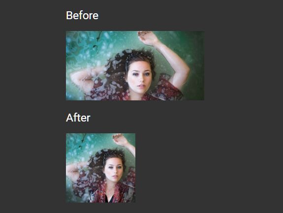
Yet another responsive image delivery jQuery plugin for modern web app to save bandwidth and improve the page load time.
The plugin detects the screen resize event and dynamically loads the appropriate version of your image depending on the current viewport width.
How to use it:
1. To use this plugin, first load the jQuery image-responsive.js script after the latest jQuery library.
<script src="https://code.jquery.com/jquery-3.3.1.slim.min.js"
        integrity="sha384-q8i/X+965DzO0rT7abK41JStQIAqVgRVzpbzo5smXKp4YfRvH+8abtTE1Pi6jizo"
        crossorigin="anonymous">
</script>
<script src="src/jquery-image-responsive.js"></script>
2. Initialize the plugin on the img tag and we're ready to go.
$(function () {
  $("img").responsive();
});
3. Insert the orignal image into the page and define the different image sources in the data-src-BREAKPOINT attributes. Default breakpoint:
- lg: 1200px
- md: 992px
- sm: 768px
- xs: 576px
<img data-src-lg="large.jpg"
     data-src-md="md.jpg"
     data-src-sm="sm.jpg"
     data-src-xs="xs.jpg"
     data-src="original.jpg"
>
4. Customize the breakpont:
$(function () {
  $("img").responsive({
    lgSize: 1200,
    mdSize: 992,
    smSize: 768,
    xsSize: 576,
  });
});
5. Override the default data attributes:
$(function () {
  $("img").responsive({
    lgName: "data-src-lg",
    mdName: "data-src-md",
    smName: "data-src-sm",
    xsName: "data-src-xs",
    defaultName: "data-src",
  });
});
This awesome jQuery plugin is developed by ngohieutp. For more Advanced Usages, please check the demo page or visit the official website.