Resize & Re-center Image To Fit Its Container - jQuery resizeImageToParent.js
| File Size: | 5.59 KB |
|---|---|
| Views Total: | 4997 |
| Last Update: | |
| Publish Date: | |
| Official Website: | Go to website |
| License: | MIT |

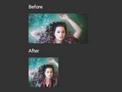
resizeImageToParent.js is a cross-browser responsive <img> jQuery plugin which dynamically stretches or cuts off images to fill its parent container on window resize, while maintaining aspect ratio and maintaining centering. Similar to the background-size: cover for background images.
How to use it:
1. Wrap your image into a container as this:
<div class="imageContainer">
  <img src="sample.jpg" class="image">
</div>
2. Hide the overflowing edge of the image when resizing.
.imageContainer {
  overflow: hidden;
}
3. The image container should have a dynamic width.
.imageContainer {
  max-width: 600px;
  height: 450px;
  ...
}
4. Put jQuery JavaScript library and the jQuery resizeImageToParent.js script at the bottom of the web page.
 <script src="https://code.jquery.com/jquery-1.12.4.min.js"
         integrity="sha384-nvAa0+6Qg9clwYCGGPpDQLVpLNn0fRaROjHqs13t4Ggj3Ez50XnGQqc/r8MhnRDZ"
         crossorigin="anonymous">
</script>
<script src="jquery.resizeimagetoparent.min.js"></script>
5. Attach the plugin to the image and done.
$(function() {

  $('.image').resizeToParent();

});
This awesome jQuery plugin is developed by levymetal. For more Advanced Usages, please check the demo page or visit the official website.

