jQuery Based Viewport Size And isTouch Checker - viewportInfo
| File Size: | 3.07 KB |
|---|---|
| Views Total: | 602 |
| Last Update: | |
| Publish Date: | |
| Official Website: | Go to website |
| License: | MIT |
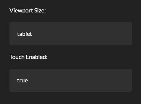
viewportInfo is a jQuery plugin that detects the current viewport size (Desktop, Mobile, Tablet) and checks if the current device is touchable.
See also:
- jQuery Plugin To Detect The Version Of Web Browsers - getBrowser
- Easy Browser/Device/Feature Detection Plugin For jQuery - checkit.js
- jQuery Plugin To Display Client's Browser Information - Browser.js
- jQuery Browser and Mobile Device Detector Plugin - jQuery Browser
- jQuery Plugin For Client Browser and OS Detector - jQuery Browsers
How to use it:
1. Load the JavaScript file viewportInfo.js after jQuery library and the viewportInfo is read for use.
<script src="//code.jquery.com/jquery-3.2.1.slim.min.js"></script>
<script src="viewportInfo.js"></script>
2. Create the html elements to display the results.
<div id="viewport-size">Viewport Size: <span class="label"></span></div>
<div id="touch-info">Touch Enabled: <span class="label"></span></div>
3. Initialize the plugin and set the screen resolutions as follow.
viewportInfo.init({
  viewports: {
    mobile: 767,
    tablet: 959,
    desktop: 1159
  }
})
4. The plugin provides a callback function which will be fired on viewport change.
viewportInfo.init({
  viewports: {
    mobile: 767,
    tablet: 959,
    desktop: 1159
  }
}).onChange(function(viewport,isTouch){
  $('#viewport-size .label').text(viewport);
  $('#touch-info .label').text(isTouch);
},true)
This awesome jQuery plugin is developed by faraazmalak. For more Advanced Usages, please check the demo page or visit the official website.