Minimal Carousel/Gallery With CSS3 Clip Animation - ClipCarousel
| File Size: | 41.1 KB |
|---|---|
| Views Total: | 1768 |
| Last Update: | |
| Publish Date: | |
| Official Website: | Go to website |
| License: | MIT |
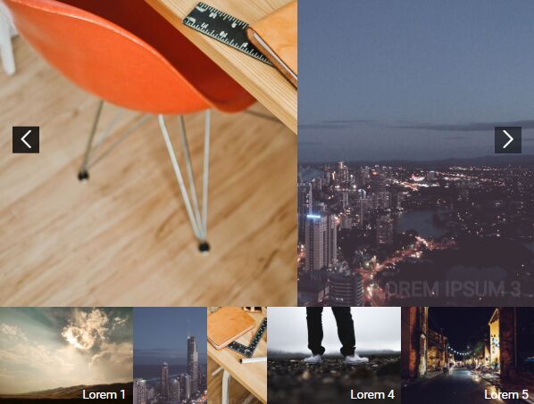
ClipCarousel is a jQuery plugin for creating a compact, fully responsive slider/carousel/gallery with a subtle clip animation using TweenMax.js library and CSS3 clip property.
Users are able to loops through the images by clicking the next/prev buttons or by clicking the thumbnails under the Clip Carousel.
How to use it:
1. Load the needed jQuery and TweenMax JavaScript libraries at the bottom of the document.
<script src="https://cdnjs.cloudflare.com/ajax/libs/gsap/1.20.3/TweenMax.min.js"></script>
<script src="https://code.jquery.com/jquery-3.3.1.min.js" integrity="sha384-tsQFqpEReu7ZLhBV2VZlAu7zcOV+rXbYlF2cqB8txI/8aZajjp4Bqd+V6D5IgvKT" crossorigin="anonymous"></script>
2. Load the jQuery ClipCarousel plugin after jQuery but before the closing body tag.
<script src="clip_carousel.js"></script>
3. Load an iconic font for the navigation arrows (OPTIONAL).
<link rel="stylesheet" href="https://use.fontawesome.com/releases/v5.0.13/css/all.css" integrity="sha384-DNOHZ68U8hZfKXOrtjWvjxusGo9WQnrNx2sqG0tfsghAvtVlRW3tvkXWZh58N9jp" crossorigin="anonymous">
4. Add images (as backgrounds), thumbnails, navigation controls to the slider as these:
<section class="section-intro">
  <div class="container">
    <div class="photo-slider-wrap">

      <!-- slider -->
      <div class="photo-slider">
        <div class="back-img active" style="background-image: url('1.jpg')">
          <div class="caption">
              Lorem ipsum 1
          </div>
        </div>
        <div class="back-img" style="background-image: url('2.jpg')">
          <div class="caption">
              Lorem ipsum 2
          </div>
        </div>
        <div class="back-img" style="background-image: url('3.jpg')">
          <div class="caption">
              Lorem ipsum 3
          </div>
        </div>
        ...
      </div>

      <!-- navigation -->
      <div class="slider-arrow slide-next" id="slide-next">
          <i class="icon icon-right-open-big"></i>
      </div>
      <div class="slider-arrow slide-prev" id="slide-prev">
          <i class="icon icon-left-open-big"></i>
      </div>
    </div>

    <!-- thumbnails -->
    <div class="photo-slider-thumb">
      <div>
        <div class="back-img" style="background-image: url('1.jpg')">
          <div class="caption">
            Lorem 1
          </div>
        </div>
      </div>
      <div>
        <div class="back-img" style="background-image: url('2.jpg')">
          <div class="caption">
            Lorem 2
          </div>
        </div>
      </div>
      <div>
        <div class="back-img" style="background-image: url('3.jpg')">
          <div class="caption">
            Lorem 3
          </div>
        </div>
      </div>
    </div>

  </div>
</section>
5. That's it. The example CSS for the clip carousel.
.back-img {
  background-size: cover;
  background-position: center;
  background-repeat: no-repeat;
}

.container { margin: auto; }

.rect-outer { position: relative; }

.rect-outer .rect-inner {
  position: absolute;
  top: 0;
  left: 0;
  right: 0;
  bottom: 0;
}

.section-intro .container {
  max-width: 800px;
  margin: auto;
}

.section-intro .photo-slider-wrap { position: relative; }

.section-intro .slider-arrow {
  position: absolute;
  top: 50%;
  -ms-transform: translateY(-50%);
  transform: translateY(-50%);
  color: white;
  font-size: 30px;
  z-index: 3;
  transition: .5s;
  cursor: pointer;
  padding: 5px;
  background: rgba(0, 0, 0, 0.5);
}

.section-intro .slider-arrow:hover { background: rgba(0, 0, 0, 0.8); }

.section-intro .slider-arrow.slide-next { right: 20px; }

.section-intro .slider-arrow.slide-prev { left: 20px; }

.section-intro .photo-slider {
  width: 100%;
  height: 500px;
  position: relative;
}

.section-intro .photo-slider .caption {
  font-size: 30px;
  color: white;
  transition: .5s;
  font-weight: 700;
  text-transform: uppercase;
}

.section-intro .photo-slider > div {
  position: absolute;
  left: 0;
  top: 0;
  width: 100%;
  height: 100%;
  z-index: 1;
  opacity: 0;
  display: -ms-flexbox;
  display: flex;
  -ms-flex-pack: end;
  justify-content: flex-end;
  -ms-flex-align: end;
  align-items: flex-end;
  padding: 20px;
}

.section-intro .photo-slider > div.active {
  z-index: 3;
  opacity: 1;
}

.section-intro .photo-slider > div.prev .caption {
  opacity: 0;
  -ms-transform: translateY(10px);
  transform: translateY(10px);
}

.section-intro .photo-slider > div.next {
  z-index: 2;
  opacity: 1;
}

.section-intro .photo-slider > div.next .caption {
  opacity: 0;
  -ms-transform: translateY(10px);
  transform: translateY(10px);
}

.section-intro .photo-slider-thumb {
  display: -ms-flexbox;
  display: flex;
  width: 100%;
  -ms-flex-wrap: wrap;
  flex-wrap: wrap;
}

.section-intro .photo-slider-thumb .caption {
  color: white;
  transition: .5s;
}

.section-intro .photo-slider-thumb > div {
  width: 25%;
  height: 150px;
  position: relative;
  z-index: 2;
  cursor: pointer;
}
 @media (max-width: 700px) {

.section-intro .photo-slider-thumb > div { width: 50%; }
}

.section-intro .photo-slider-thumb > div:hover > div:before { opacity: 1; }

.section-intro .photo-slider-thumb > div > div {
  position: absolute;
  left: 0;
  top: 0;
  width: 100%;
  height: 100%;
  z-index: 2;
  display: -ms-flexbox;
  display: flex;
  -ms-flex-pack: end;
  justify-content: flex-end;
  -ms-flex-align: end;
  align-items: flex-end;
  padding: 10px;
}

.section-intro .photo-slider-thumb > div > div.prev .caption {
  opacity: 0;
  -ms-transform: translateY(10px);
  transform: translateY(10px);
}

.section-intro .photo-slider-thumb > div > div.next {
  z-index: 2;
  opacity: 1;
}

.section-intro .photo-slider-thumb > div > div.next .caption {
  opacity: 0;
  -ms-transform: translateY(10px);
  transform: translateY(10px);
}

.section-intro .photo-slider-thumb > div > div:before {
  position: absolute;
  left: 0;
  top: 0;
  right: 0;
  bottom: 0;
  background: rgba(0, 0, 0, 0.7);
  opacity: 0;
  transition: .5s;
}

.section-intro .photo-slider-thumb > div > div.next { z-index: 1; }
This awesome jQuery plugin is developed by lemehovskiy. For more Advanced Usages, please check the demo page or visit the official website.


