Customizable & Touch Optimized jQuery Slider Plugin - Ice Slider
| File Size: | 127 KB |
|---|---|
| Views Total: | 1380 |
| Last Update: | |
| Publish Date: | |
| Official Website: | Go to website |
| License: | MIT |
Ice Slider is a jQuery plugin for creating a fully responsive, highly customizable and touch optimized content slider with following features:
- Multi-touch gestures support with hammer.js
- Swipe and mouse drag supported.
- Easy to implement with plain Html markup.
- Fully responsive design for both desktop & mobile devices.
- CSS3 animations with fallback for older browsers.
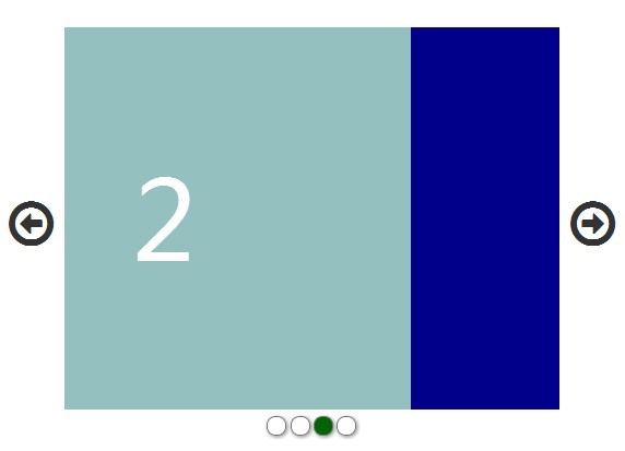
- Arrows and dots navigation.
- Auto rotation with pause-on-hover support.
- Fully stylable via CSS.
- Lots of options to create your own styles.
How to use it:
1. Include the required CSS files and modernizr.js in the head section of your page. Font Awesome 4 is required for the navigation arrows.
<link rel="stylesheet" href="http://netdna.bootstrapcdn.com/font-awesome/4.1.0/css/font-awesome.min.css">
<link rel="stylesheet" href="css/iceSlider.css">
<script src="http://cdnjs.cloudflare.com/ajax/libs/modernizr/2.8.2/modernizr.js"></script>
2. Include the jQuery javascript library together with hammer.js and iceSlider.js at the end of your page.
<script src="http://ajax.googleapis.com/ajax/libs/jquery/1.11.1/jquery.min.js"></script>
<script src="js/vendor/hammer.js"></script>
<script src="js/iceSlider.js"></script>
3. Create the html for a content slider.
<div id="slider1Holder">
  <a href="#" id="slider1ArrowL" class="fa fa-arrow-circle-o-left"> </a>
  <a href="#" id="slider1ArrowR" class="fa fa-arrow-circle-o-right"> </a>
  <div id="slider1Wrapper">
    <div id="slider1Container">
      <article class="slider1Item">
        <p>1</p>
      </article>
      <article class="slider1Item">
        <p>2</p>
      </article>
      <article class="slider1Item">
        <p>3</p>
      </article>
      <article class="slider1Item">
        <p>4</p>
      </article>
    </div>
  </div>
</div>
4. Create a dots navigation at the bottom of the content slider.
<div id="slider1Dots"> </div>
5. The sample CSS to style the content slider and its controls.
#slider1Holder { position: relative; }

#slider1Wrapper {
  width: 80%;
  overflow: hidden;
  position: relative;
  margin: 0 auto;
}

#slider1Container {
  position: relative;
  height: 350px;
  overflow-y: hidden;
}

#slider1Container:after,
#slider1Container:before {
  content: " ";
  display: block;
  clear: both;
  visibility: hidden;
  line-height: 0;
  height: 0;
}

#slider1Container .slider1Item {
  position: relative;
  display: block;
  float: left;
  width: 100%;
  overflow-y: hidden;
  opacity: 0.6;
  background-color: black;
  -webkit-transition: opacity 0.4s;
  -moz-transition: -moz-transform opacity 0.4s;
  -o-transition: -o-transform opacity 0.4s;
  transition: transform opacity 0.4s;
}

#slider1Container .slider1Item p {
  line-height: 350px;
  font-size: 100px;
  width: 100%;
  text-align: center;
  margin: 0;
  color: white;
}

#slider1Container .slider1Item.active { opacity: 1; }

#slider1Container .slider1Item:nth-child(odd) { background-color: darkblue; }

#slider1Container .slider1Item:nth-child(even) { background-color: darkgreen; }

#slider1ArrowL,
#slider1ArrowR {
  position: absolute;
  display: block;
  text-decoration: none;
  color: #333;
  font-size: 2em;
  top: 45%;
}

#slider1ArrowL { left: 0; }

#slider1ArrowR { right: 0; }

#slider1ArrowR.inactive,
#slider1ArrowL.inactive { color: #888; }

#slider1 #slider1Dots {
  text-decoration: none;
  text-align: center;
  margin: 0.4em 0;
}

#slider1Dots a {
  display: inline-block;
  margin: 0 0.1em;
}

#slider1Dots a span {
  color: #000;
  border-radius: 10px;
  -moz-border-radius: 10px;
  -webkit-border-radius: 10px;
  border: 1px solid #777;
  width: 1em;
  height: 1em;
  display: block;
  -moz-box-shadow: 1px 1px 5px #888;
  -webkit-box-shadow: 1px 1px 5px #888;
  box-shadow: 1px 1px 5px #888;
}

#slider1Dots a.slider1-currentDot span { background: darkgreen; }
 @media only screen and (min-width: 640px) {

#slider1ArrowL { left: 1%; }

#slider1ArrowR { right: 1%; }

#slider1ArrowL,
 #slider1ArrowR { font-size: 3em; }
}
 @media only screen and (min-width: 1000px) {

#slider1Container .slider1Item p { line-height: 500px; }

#slider1Container {
  position: relative;
  height: 500px;
  overflow-y: hidden;
}

#slider1ArrowL,
 #slider1ArrowR { font-size: 4em; }
}
 @media only screen and (min-width: 1400px) {

#slider1ArrowL { left: 3%; }

#slider1ArrowR { right: 3%; }
}
6. Initialize the content slider with options.
var slider1;

$(document).ready(function() {
slider1 = new iceSlider.hammerSlider({
wrapper : '#slider1Wrapper',
container : '#slider1Container',
item : '.slider1Item',
itemActiveClass : 'active',
leftArrow : '#slider1ArrowL',
rightArrow : '#slider1ArrowR',
arrowInactiveClass : 'inactive',
dots : '#slider1Dots',
dotActiveClass : 'slider1-currentDot',
autoSlide : true,
setTime : 5000
});
slider1.init();
});
This awesome jQuery plugin is developed by mv2sa. For more Advanced Usages, please check the demo page or visit the official website.