Elastic Full-window Page Slider With jQuery And CSS3
| File Size: | 2.38 KB |
|---|---|
| Views Total: | 3599 |
| Last Update: | |
| Publish Date: | |
| Official Website: | Go to website |
| License: | MIT |
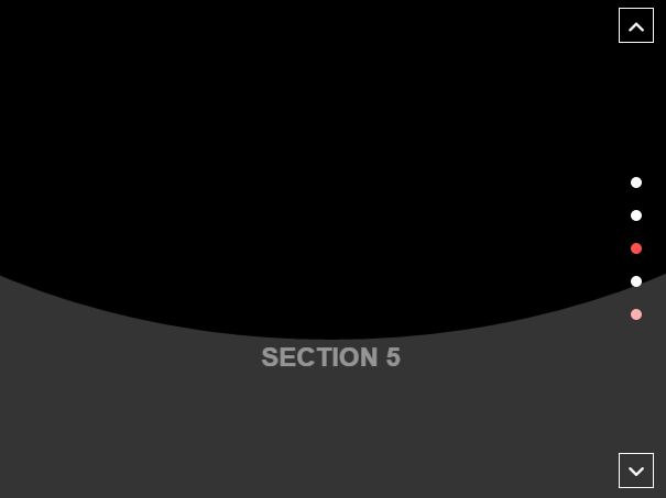
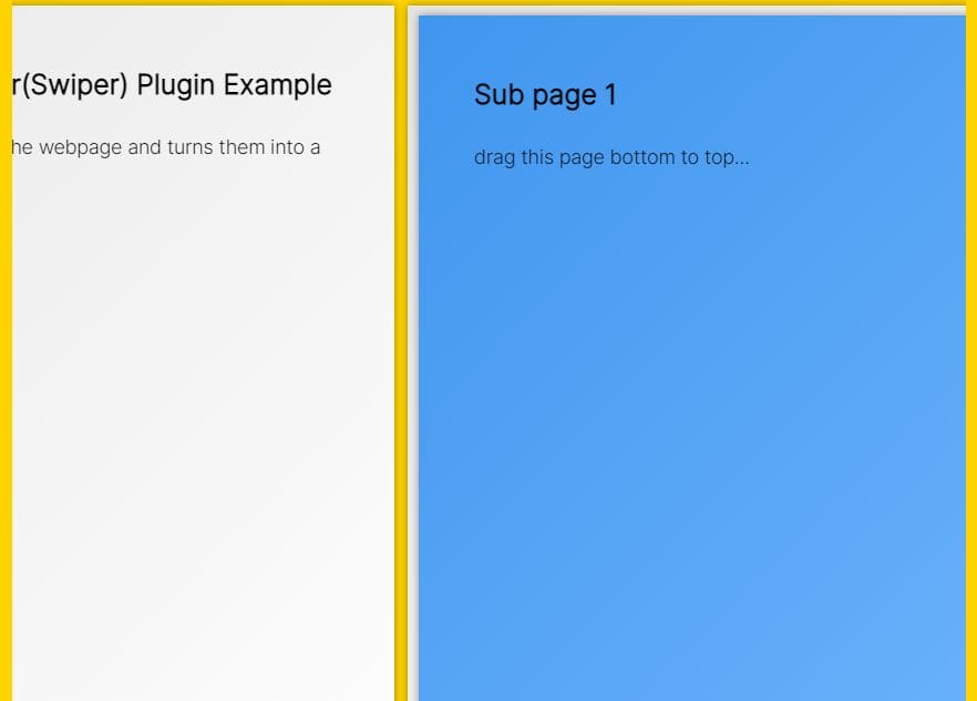
A cool jQuery & CSS3 based slider which allows the user to scroll vertically through full-window page sections with a subtle elastic bounce effect.
How to use it:
1. Insert page sections together with side navigation & pager into the slider:
<div class="page-slider">
<div class="prev-btn">Up</div>
<div class="next-btn">Down</div>
<div class="nav-dots">
<div data-slide="1" class="nav-dot">
</div>
<div data-slide="2" class="nav-dot">
</div>
<div data-slide="3" class="nav-dot">
</div>
</div>
<div data-slide="1" class="panel">
<div id="layer-1" class="trans-layer"></div>
<section id="section-1" class="section">
<div class="section-content">
<h1>Vertical slider</h1>
</div>
</section>
</div>
<div data-slide="2" class="panel">
<div id="layer-2" class="trans-layer"></div>
<section id="section-2" class="section">
<div class="section-content">
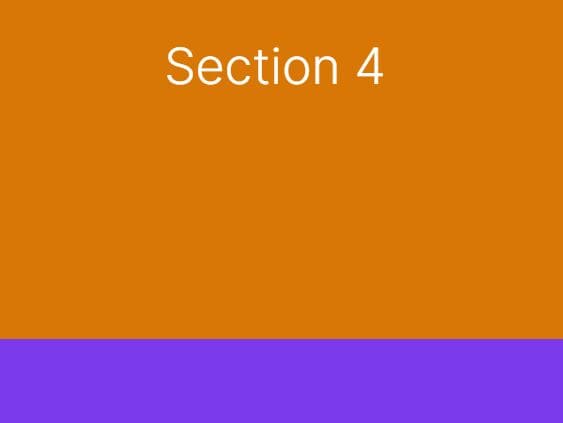
<h1>Section 2</h1>
</div>
</section>
</div>
<div data-slide="3" class="panel">
<div id="layer-3" class="trans-layer"></div>
<section id="section-3" class="section">
<div class="section-content">
<h1>Section 3</h1>
</div>
</section>
</div>
</div>
2. The primary CSS styles for the page slider.
.page-slider {
  position: relative;
  top: 0;
  width: 100vw;
  height: 100vh;
  max-width: 100%;
  max-height: 100%;
  background: deepskyblue;
  overflow: hidden;
}

.panel {
  position: absolute;
  width: 100%;
  height: 100%;
  top: 0;
  left: 0;
  bottom: 0;
  right: 0;
  margin: auto;
}

.panel._active { z-index: 10; }

.section-content {
  display: flex;
  flex-flow: column;
  width: 100%;
  height: 100%;
  justify-content: center;
  align-items: center;
  color: #fff;
  font-family: arial;
  text-transform: uppercase;
  opacity: 0;
  transform: translateY(30px);
  transition: all 500ms ease;
  transition-delay: 0s;
}

.section {
  transform: translateY(100%);
  transition: all 500ms ease-in-out;
  transition-delay: 0ms;
  background: #343434;
}
3. The core CSS/CSS3 rules for the elastic bounce effect when transitioning between page sections.
.trans-layer, .section {
  position: absolute;
  width: 100%;
  height: 100%;
  top: 0;
  left: 0;
  bottom: 0;
  right: 0;
}

.trans-layer {
  background: #000;
  transform: translateY(-100%) skew(0) rotate(0) scale(2);
  border-radius: 50%;
  transition: all 500ms ease-in-out;
  transition-delay: 500ms;
}

._active .trans-layer {
  transform: translateY(0) skew(0) rotate(0) scale(2);
  transition-delay: 0ms;
}

._active .section {
  transform: translateY(0);
  transition-delay: 500ms;
}

._active .section-content {
  opacity: 1;
  transform: translateY(0px);
  transition-delay: 1000ms;
}
4. Style & position the side navigation buttons and pagination dots.
.nav-dots {
  position: absolute;
  top: 50%;
  right: 10px;
  transform: translateY(-50%);
  z-index: 20;
  width: 40px;
}

.nav-dot {
  width: 10px;
  height: 10px;
  margin: 20px auto;
  border-radius: 50%;
  background: #fff;
  cursor: pointer;
  transition: all 300ms ease-out;
}

.nav-dot.active { background: red; }

.next-btn, .prev-btn {
  width: 30px;
  height: 30px;
  position: absolute;
  z-index: 20;
  border: 1px solid #fff;
  color: #fff;
  line-height: 30px;
  text-align: center;
  font-size: 24px;
  cursor: pointer;
}

.next-btn {
  bottom: 10px;
  right: 14px;
}

.prev-btn {
  top: 10px;
  right: 14px;
}
5. The core jQuery script for the slider. Make sure to insert the following JavaScript snippets after you've loaded jQuery.
<script src="//code.jquery.com/jquery-3.1.0.slim.min.js"></script>
(function() {

  var svgModal = {
    showOverlay: $('.btn--show-overlay'),
    closeOverlay: $('#modal__close'),
    modal: $('#modal'),
    svgWrapper: $("#svg-wrapper"),
    pathElement: undefined,
    modalOpen: false,
    btnHovered: false,
    paths: {
      default: $('#svg-path').attr('d'),
      active: $("#svg-wrapper").data('btn-hovered'),
      modalOpen: $('#svg-wrapper').data('modal-open')
    },
    init: function() {

      var s = Snap("#svg");

      svgModal.pathElement = s.select('path');
      this.events();
    },
    events: function() {
      svgModal.showOverlay.on('mouseenter', this.btnHover);
      svgModal.showOverlay.on('mouseleave', this.btnHover);
      svgModal.showOverlay.on('click', this.toggleModal);
      svgModal.closeOverlay.on('click', this.toggleModal);
    },
    btnHover: function(e) {
      e.preventDefault();

      var $this = $(this);

      if (!svgModal.modalOpen) {

        svgModal.pathElement.stop().animate({

          'path': svgModal.btnHovered ? svgModal.paths.default : svgModal.paths.active

        }, 250, mina.easeout);

        svgModal.btnHovered = !svgModal.btnHovered;

      }
    },
    toggleModal: function(e) {
      e.preventDefault();

      var $this = $(this);

      setTimeout(function() {
        $('body').toggleClass('modal--active');
      }, 100);

      svgModal.pathElement.stop().animate({

        'path': svgModal.paths.modalOpen

      }, 300, mina.easeout, function() {

        svgModal.pathElement.stop().animate({
          'path': svgModal.modalOpen ? svgModal.paths.active : svgModal.paths.default
        }, svgModal.modalOpen ? 800 : 300, svgModal.modalOpen ? mina.elastic : mina.easeout);

      });

      svgModal.btnHovered = false;

      svgModal.modalOpen = !svgModal.modalOpen;

    }
  };
  svgModal.init();

})();
This awesome jQuery plugin is developed by simonpatrat. For more Advanced Usages, please check the demo page or visit the official website.