Responsive Customizable jQuery Content Slider Plugin - Zenith.js
| File Size: | 4.69 MB |
|---|---|
| Views Total: | 1797 |
| Last Update: | |
| Publish Date: | |
| Official Website: | Go to website |
| License: | MIT |
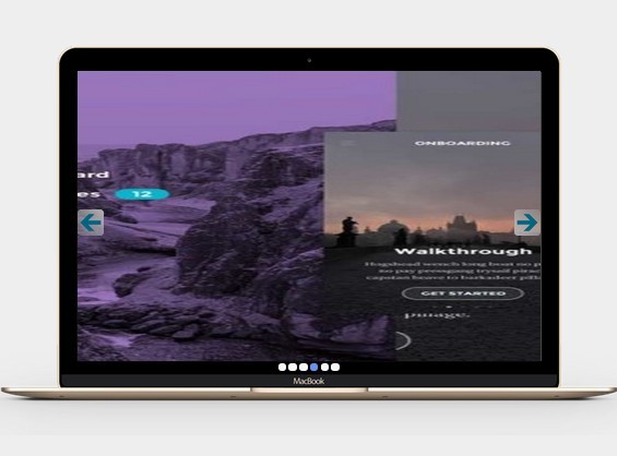
Zenith.js is a full featured jQuery slider plugin which enables you to create a responsive, mobile-friendly and fully customizable content slider for your website / web app.
Features:
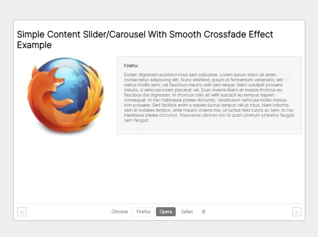
- 4 built-in layouts for any devices: default, hand, screen, slider.
- Fully responsive and touch events support.
- CSS3 animations based on animate.css.
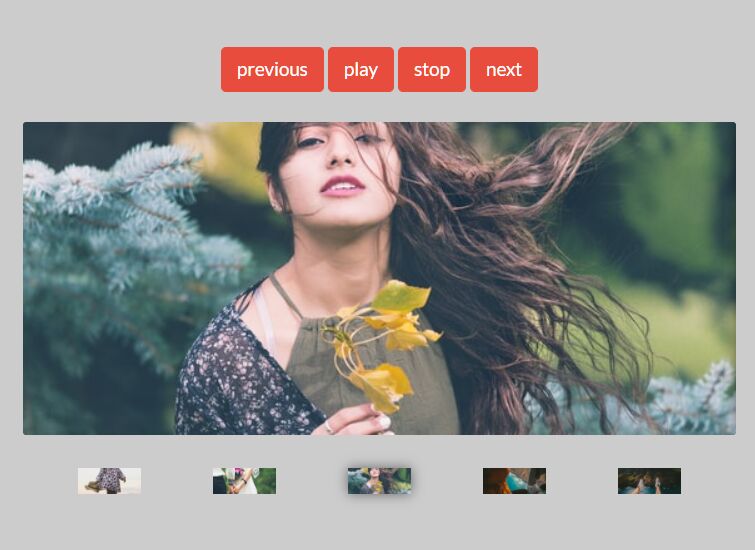
- Autoplay with pause on hover.
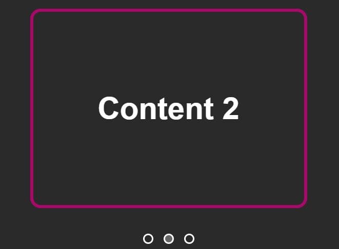
- Dots pagination, and arrows / thumbnails navigation.
- Lots of customization options and callbacks.
Basic usage:
1. Load the style.css for basic styles & layouts.
<link rel="stylesheet" href="css/style.css">
2. Load the animate.css for CSS3 animations between slides.
<link rel="stylesheet" href="animate.min.css">
3. The html.
<div id="demo" class="tf_slider">

  <div class="tf_container">
      <div class="tf_slide">Item 1</div>
      <div class="tf_slide">Item 2</div>
      <div class="tf_slide">Item 3</div>
      <div class="tf_slide">Item 4</div>
      <div class="tf_slide">Item 5</div>
      ...

      <span id="left"></span>
      <span id="right"></span>
      <div id="bullet-navs"></div>
  </div>

</div>
4. Include jQuery library and the jQuery Zenith.js plugin at the bottom of the web page.
<script src="jquery.min.js"></script>
<script src="js/zenith.js"></script>
5. Initialize the plugin to generate a responsive fullscreen content slider.
$('#demo').zenith({
  layout: 'slider',
  fullWidth: true
});
6. Default plugin options.
// ‘default’, ‘hand’, ‘screen’, ‘slider’
layout      : 'default',

// ‘horizontal’, or ‘vertical’
direction   : 'horizontal',

// Side transition animation.
// ‘Slide’, ‘Bounce’, ‘Fade’, ‘RotateDown’, ‘RotateUp’, ‘Zoom’, ‘Flip’
animation   : 'Slide',

// Slider section background. Accepts any color code.
background  : '',

// Default active slide
activeIndex : 0,

// Color of the circle, or square around the highlight icon
circleColor : 'cornsilkblue',

// Color of the highlight icon
iconColor   : '#fffff0',

// Icon Color of the currently active highlight
activeColor : 'crimson',

// Sets autoplay on/off.
autoplay    : true,

// Stops autoplay when mouse enters slider region.
autoplayStop : false,

// Pause autoplay when mouse enters slider region.
autoplayPause: true,

// Delay between slides.
autoplaySpeed: 3000,

// Transition duration of each slide.
slideSpeed  : 500,

// Show bullets navigation
bullets     : true,

// Bullets color
bulletsColor: '#f7f7f7',

// Active bullet color
bulletsAC   : 'cornflowerblue',

// Show/hide navigation arrows.
arrows      : true,

// Define your own markup
markup      : ['.tf_container', '.tf_slide'],

// Width of the slider
width       : '65%',

// Height of the slider
height      : '320px',

// Top-Bottom margin between zenith section and other sections.
margin      : '60px',

// Set slider to full width.
fullWidth   : false,

// Choose between some predefined slider container styles: ‘shadow’, ‘border’, ‘frame’
style       : 'shadow',

// Add your custom styles
customStyle : [],

// Change default bullets navigation with your custom markup.
customNavs  : ['#bullet-navs', 'li'],

// Position of the bullets pagination.
navPosition : 'bottom',

// Show/hide Thumbs navigation background.
thumbsBG    : true,

// Size of the thumb images on different screen sizes
thumbsSize  : {
  xsmall: 45,
  small: 65,
  medium: 92,
  large : 108,
  xlarge: 128
},

// Set navigation thumbs to be fixed in the slider
fixedThumbs : true
7. Events.
prevSlide   : function(){},
nextSlide   : function(){},
firstSlide  : function(){},
lastSlide   : function(){},
animationEnd: function(){},
This awesome jQuery plugin is developed by zutigrm. For more Advanced Usages, please check the demo page or visit the official website.