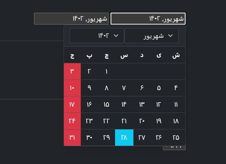
Bootstrap Date Picker with Range Support - jQuery bs-datepicker
| File Size: | 66.9 KB |
|---|---|
| Views Total: | 336 |
| Last Update: | |
| Publish Date: | |
| Official Website: | Go to website |
| License: | MIT |

bs-datepicker is a feature-rich jQuery date picker plugin for Bootstrap that supports both single date selection and date range picking.
It's ideal for building a modern, production-ready date & date range picker that respects Bootstrap's design language and works with your existing jQuery projects.
Features:
- Single and Range Selection: Pick individual dates or select start and end dates for booking systems, reports, and filters.
- Locale Support: Uses JavaScript's Intl API for localized month names, weekday labels, and date formatting in any language.
- Inline and Dropdown Modes: Render the calendar directly in your layout or show it as a dropdown on input focus.
- Configurable Week Start: Begin weeks on Monday or Sunday based on regional conventions.
- Multi-Month Display: Show multiple months side-by-side for easier range selection across month boundaries.
- Disabled Date Rules: Block dates before/after specific boundaries, set min/max ranges, or disable individual dates like holidays.
- Runtime Configuration: Change disabled dates, locale, and boundaries dynamically without reinitializing the plugin.
- Bootstrap Icons: Uses Bootstrap Icons for navigation and clear buttons with full customization support.
- Hidden Input Pattern: Generates hidden form inputs with ISO dates while displaying localized formatted text to users.
- Event System: Event hooks for tracking user interactions, date changes, and navigation actions.
Use Cases:
- Booking and Reservation Forms: Use the range selection mode for check-in/check-out date fields. Disable past dates and specific blocked dates dynamically.
- Multi-regional Web Applications: Deploy a single form but localize the datepicker's language and date format based on the user's locale preference.
- Dashboard and Reporting Tools: Use the inline mode with multiple months visible to let users select a reporting period directly on the page.
How To Use It:
1. Load the necessary JS & CSS files in your jQuery project. bs-datepicker requires jQuery and Bootstrap 5 CSS. You'll also need Bootstrap Icons for the navigation buttons.
<!-- Bootstrap 5 -->
<link rel="stylesheet" href="/path/to/cdn/bootstrap.min.css" />
<script src="/path/to/cdn/bootstrap.bundle.min.js"></script>

<!-- Bootstrap Icons CSS (OPTIONAL) -->
<link href="/path/to/cdn/bootstrap-icons.css" rel="stylesheet">

<!-- jQuery -->
<script src="/path/to/cdn/jquery.min.js"></script>

<!-- bs-datepicker plugin -->
<script src="/path/to/dist/bs-datepicker.min.js"></script>
2. Create a dropdown datepicker attached to a container div.
<div class="datepicker" id="singleDropdown">
  <input type="hidden" name="single">
</div>
$('#singleDropdown').bsDatepicker({
  // options here
});
3. You can also attach the date picker to a standard input field.
<input id="dp" type="text" class="form-control">
$('#dp').bsDatepicker({
  // options here
});
4. For booking forms or dashboard filters, you may want the calendar visible at all times. Set inline: true and range: true.
<div id="rangeInline" class="datepicker">
  <input type="hidden" name="start_date">
  <input type="hidden" name="end_date">
</div>
$('#rangeInline').bsDatepicker({
  range: true,
  inline: true,
  separator: ' to '
});
5. Replace default Bootstrap Icons with your own icon classes.
$('#rangeInline').bsDatepicker({
  icons: {
    prev: 'bi bi-arrow-left-circle',      // Previous month icon
    next: 'bi bi-arrow-right-circle',     // Next month icon
    prevYear: 'bi bi-skip-start',         // Previous year icon
    nextYear: 'bi bi-skip-end',           // Next year icon
    today: 'bi bi-house-door',            // Jump to today icon
    clear: 'bi bi-trash'                  // Clear selection icon
  },
  classes: {
    displayIcon: 'bi bi-calendar-check'   // Icon shown in dropdown button
  }
});
6. Switch the datepicker's language and date format on the fly without destroying and recreating the instance.
<select id="localeSelector">
  <option value="en-US">English (US)</option>
  <option value="de-DE">German</option>
  <option value="fr-FR">French</option>
  <option value="ja-JP">Japanese</option>
</select>

<div id="multiLang" class="datepicker"></div>
$('#multiLang').bsDatepicker({ locale: 'en-US' });

// Change locale when dropdown selection changes
$('#localeSelector').on('change', function() {
  var newLocale = $(this).val();
  $('#multiLang').bsDatepicker('setLocale', newLocale);
  // Calendar re-renders immediately with new month/weekday names
});
7. Available configuration options to customize your date picker.
locale(string): Defines the Intl locale for month and weekday names (e.g.,'de-DE'). Defaults to'de-DE'.range(boolean): Activates the start/end date selection mode. Defaults tofalse.inline(boolean): Renders the calendar directly into the container. No dropdown overlay is created. Defaults tofalse.startOnSunday(boolean): Forces the week to start on Sunday. Defaults tofalse(Monday).autoClose(boolean): Closes the dropdown immediately after a user picks a date (or completes a range). Defaults totrue.format(string | function): Sets the output format for legacy input modes. Options are'locale','iso', or a custom function. Defaults to'locale'.separator(string): Defines the character string between two dates in range mode. Defaults to–.zIndex(number): Sets the CSS z-index for the dropdown panel. Defaults to1080.months(number): Controls how many months render side-by-side. Defaults to1.placeholder(string): Sets the text shown in the visible display when no date is selected. Defaults to'Select period'.icons(object): Configures the icon classes.classes(object): Configures the CSS classes for the wrapper.disabled(object): Configures date blocking rules.
$('#dp').bsDatepicker({
  locale: 'de-DE',
  range: false,
  inline: false,
  startOnSunday: false,
  autoClose: true,
  format: 'locale',
  separator: ' – ',
  zIndex: 1080,
  months: 1,
  icons: {
    prevYear: 'bi bi-chevron-double-left',
    prev: 'bi bi-chevron-left',
    today: 'bi bi-record-circle',
    next: 'bi bi-chevron-right',
    nextYear: 'bi bi-chevron-double-right',
    clear: 'bi bi-x-lg'
  },
  classes: {
    display: 'form-control d-flex align-items-center justify-content-between',
    displayText: '',
    displayIcon: 'bi bi-calendar-event'
  },
  placeholder: 'Select period',
  // Disabled dates configuration
  // Forms:
  // - disabled: { before?: Date|string, after?: Date|string, min?: Date|string, max?: Date|string, dates?: (Date|string)[] }
  // Note: before => disables <= before, after => disables >= after
  disabled: null
});
8. API methods.
// Get the current value
// Returns an ISO string 'YYYY-MM-DD' (single) or ['start', 'end'] (range)
$('#dp').bsDatepicker('val');

// Set a single date value
// Accepts a Date object, ISO string, or null. This updates the UI immediately.
$('#dp').bsDatepicker('val', '2025-10-15');

// Set a date range value
// Pass an array with start and end values.
$('#dp').bsDatepicker('val', ['2025-10-01', '2025-10-07']);

// Get the current selection as native Date objects
// Returns a Date object, null, or an array [Date, Date] for ranges.
$('#dp').bsDatepicker('getDate');

// Set the current date using native Date objects
// This purges any currently disabled dates from the selection.
$('#dp').bsDatepicker('setDate', new Date(2025, 9, 15));

// Set a range using native Date objects
$('#dp').bsDatepicker('setDate', [new Date(2025, 0, 1), new Date(2025, 0, 31)]);

// Destroy the instance
// Removes the datepicker from the DOM and cleans up all event listeners.
$('#dp').bsDatepicker('destroy');

// Set disabled dates at runtime
// This configuration locks specific dates or ranges after initialization.
$('#dp').bsDatepicker('setDisableDates', {
  dates: ['2025-12-25'],
  before: new Date()
});

// Get the current disabled configuration
// Returns the object containing the active blocking rules.
$('#dp').bsDatepicker('getDisableDates');

// Set the minimum allowed date
// This updates the 'min' boundary and clears any invalid selection.
$('#dp').bsDatepicker('setMin', '2025-01-01');

// Toggle between single and range selection at runtime; preserves selection as start/single
$('#dp').bsDatepicker('setRange', 'true');

// Clear all disabled date rules
// This makes every date on the calendar selectable again.
$('#dp').bsDatepicker('clearDisableDates');

// Change the locale dynamically
// Switches the language and re-renders the calendar immediately.
$('#dp').bsDatepicker('setLocale', 'en-US');
9. Event handlers.
// Triggered after the datepicker is fully initialized
// detail: { range: boolean, inline: boolean, months: number }
$('#dp').on('init.bs.datepicker', function(e) {
  console.log('Initialized with months:', e.detail.months);
});

// Triggered when the dropdown opens
// detail: {}
$('#dp').on('show.bs.datepicker', function() {
  console.log('Calendar is now visible');
});

// Triggered when the dropdown closes
// detail: {}
$('#dp').on('hide.bs.datepicker', function() {
  console.log('Calendar is now hidden');
});

// Triggered after the calendar view renders (e.g., changing months)
// detail: { current: Date, range: boolean }
$('#dp').on('render.bs.datepicker', function(e) {
  console.log('Current view centered on:', e.detail.current);
});

// Triggered when a navigation button is clicked (prev/next/today)
// detail: { action: string, current: Date }
$('#dp').on('navigate.bs.datepicker', function(e) {
  console.log('User navigated via:', e.detail.action);
});

// Triggered when the date selection changes
// detail (Single): { value: Date|null }
// detail (Range): { value: [Date|null, Date|null] }
$('#dp').on('changeDate.bs.datepicker', function(e) {
  console.log('New selection:', e.detail.value);
});

// Triggered when the "Clear" button is clicked
// detail: {} (Note: This also triggers changeDate with null values)
$('#dp').on('clear.bs.datepicker', function() {
  console.log('Selection cleared');
});

// Triggered after the locale is changed via setLocale
// detail: { locale: string }
$('#dp').on('setLocale.bs.datepicker', function(e) {
  console.log('Locale switched to:', e.detail.locale);
});

// Triggered after disabled dates are updated
// detail: { disabled: object }
$('#dp').on('setDisableDates.bs.datepicker', function(e) {
  console.log('New disabled rules applied:', e.detail.disabled);
});

// Triggered after the minimum date is set
// detail: { min: Date|null }
$('#dp').on('setMin.bs.datepicker', function(e) {
  console.log('Min date updated:', e.detail.min);
});

// Triggered after the maximum date is set
// detail: { max: Date|null }
$('#dp').on('setMax.bs.datepicker', function(e) {
  console.log('Max date updated:', e.detail.max);
});

// Triggered after disabled dates are cleared
// detail: {}
$('#dp').on('clearDisableDates.bs.datepicker', function() {
  console.log('All disabled restrictions removed');
});
Alternatives:
- Flatpickr: A lightweight vanilla JavaScript datepicker with no dependencies.
- Air Datepicker: Another date picker option with inline and dropdown modes.
- Tempus Dominus: A Bootstrap-native datepicker built for Bootstrap 5.
- Best Date Picker: 10 Best Date And Time Picker JavaScript Plugins
FAQs:
Q: Can I use this without Bootstrap Icons?
A: Yes, but you must configure the icons option. You can replace the default bi classes with FontAwesome or custom SVG classes.
Q: How do I get the selected date in a specific format?
A: The val() method returns an ISO string (YYYY-MM-DD) by default. You can also use getDate() to retrieve the native JavaScript Date object and format it manually.
Q: Why are my disabled dates still clickable?
A: You need to pass the dates in the correct format. The plugin expects ISO strings (YYYY-MM-DD) or Date objects. Also, check that your min and max boundaries are set correctly.
Q: How do I prevent users from selecting weekends?
A: Use the disabled.dates option with a dynamically generated array of weekend dates. Loop through your target date range and push all Saturdays and Sundays to the array. Pass this array when initializing the datepicker.
Changelog:
v1.1.1 (2026-05-08)
- Improved small-device responsiveness for month tiles in inline and dropdown mode so a single calendar fits the viewport width.
- Refined header layout behavior on small screens to keep it in one line and prevent overflow in range mode.
- Optimized year/decade grid responsiveness on small devices (better column behavior and wrapping labels).
- Updated weekday rendering on small screens to use narrow localized labels and avoid broken line wraps.
v1.1.0 (2026-05-07)
- Introduced clickable header navigation with year and decade grid views.
- Added context-aware navigation steps for seamless browsing across date ranges.
- Updated event system and documentation to reflect new navigation actions.
v1.0.3 (2026-05-04)
- Updated default icon for 'clear' action to `bi-eraser`
v1.0.2 (2026-03-19)
- Added `setDisabled` public method
v1.0.1 (2026-02-12)
- Added public method `setRange` for toggling between single and range
This awesome jQuery plugin is developed by ThomasDev-de. For more Advanced Usages, please check the demo page or visit the official website.