Minimal CSS3 Animated jQuery Popover Plugin
| File Size: | 7.53 KB |
|---|---|
| Views Total: | 4961 |
| Last Update: | |
| Publish Date: | |
| Official Website: | Go to website |
| License: | MIT |
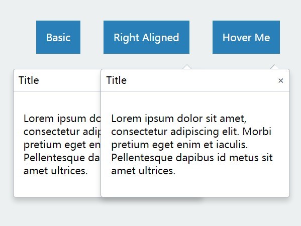
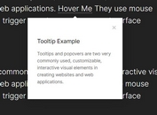
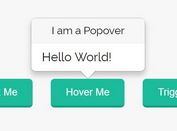
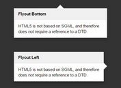
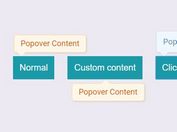
A very small jQuery plugin to show CSS3 animated popover messages on any DOM elements when clicked on or hovered over.
How to use it:
1. Add the required stylesheet into the head section of your html document.
<link href="dist/jquery-popover.css" rel="stylesheet">
2. Add the jQuery popover plugin's script to the page, after you've added jQuery.
<script src="//code.jquery.com/jquery-1.11.3.min.js"></script>
<script src="dist/jquery-popover-0.0.3.js"></script>
3. Create a popover triggered by a normal link. Make sure the data-target attribute matches up to the CSS class on the popover content DIV below.
<span class="popover-wrapper">
  <a href="#" data-role="popover" data-target="popover-target">Click Me</a>
  <div class="popover-modal popover-target">
    <div class="popover-body">
      <!-- contents here -->
    </div>
  </div>
</span>
3. Initialize the popover plugin.
$('[data-role="popover"]').popover();
4. That's it. You can add the CSS class '.right' to the popover wrapper to make it right aligned.
<span class="popover-wrapper right">
5. Optionally, you can also display a close link inside the popover by adding the data-toggle-role="close" attribute like so:
<span class="popover-wrapper">
  <a href="#" data-role="popover" data-target="popover-target">Click Me</a>
  <div class="popover-modal popover-target">
    <div class="popover-header">Title
      <a href="#" data-toggle-role="close" style="float: right">×</a>
    </div>
    <div class="popover-body popover-body-padded">
      <div>Hi</div>
    </div>
  </div>
</span>
6. Change the trigger event to 'hover'. It means the popover is triggered by mouse hover instead.
$('[data-role="popover"]').popover({
   trigger: 'hover' // click | hover
});
This awesome jQuery plugin is developed by goodybag. For more Advanced Usages, please check the demo page or visit the official website.
