Versatile jQuery Tooltip / Popover / Modal Plugin - iml.js
| File Size: | 10 KB |
|---|---|
| Views Total: | 2929 |
| Last Update: | |
| Publish Date: | |
| Official Website: | Go to website |
| License: | MIT |
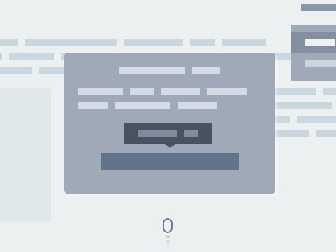
iml.js (Interface Micro Library) is a simple yet multi-functional jQuery plugin helps you create fully customizable and themeable tooltip, popover and modal popups with plain html / html5.
How to use it:
1. Copy and include the JavaScript file iml.js, and the style sheet iml-styles.css in your project
<link href="css/iml-styles.css" rel="stylesheet">
<script src="//code.jquery.com/jquery-1.11.3.min.js"></script>
<script src="js/iml.js"></script>
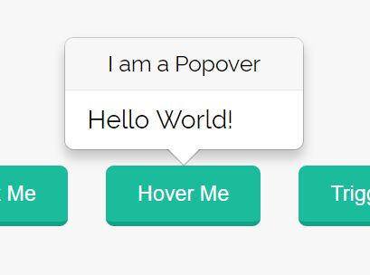
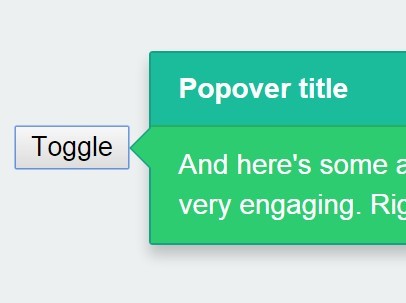
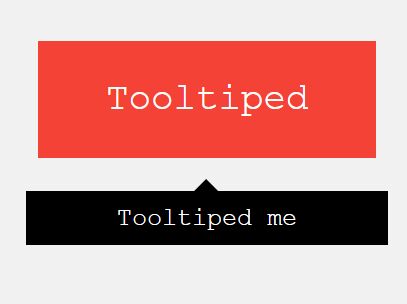
2. Create a tooltip.
<a class="btn btn-default" href="#"
data-interface="tooltip"
data-position="top-right"
data-content="<strong>I am a tooltip</strong>"
data-shift="10"
data-radius = "2px"
data-trigger="click"
data-triggeroff="click"
data-theme="success"
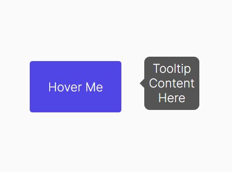
>Hover me</a>
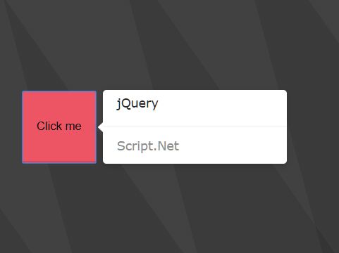
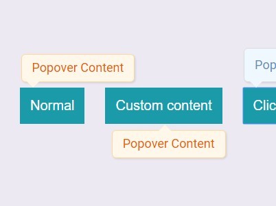
3. Create a popover.
<a class="btn btn-default"  href="#"
    data-interface = "popover"
    data-position = "top"
    data-title = "Top"
    data-theme="white"
    data-content = "I am a popover"
    data-shift = "10"
    data-defineClass = "bord"
    data-radius = "3px"
    data-trigger="click"
    data-triggeroff="click"
  >Click me</a>
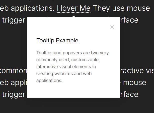
4. Create a modal window.
<a class="btn btn-default" href="#" id="link"
    data-interface="modal"
    data-width="600px"
    data-height="400px"
  >Launch</a>

<div class="modal" data-modal="MyModal">
  <div class="modal_title">Modal title</div>
  <div class="modal_content">Modal content</div>
  <div class="close">X</div>
</div>
$('#link').modal("[data-modal='MyModal']");
5. All HTML5 data attributes.
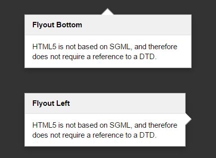
data-trigger-on: Trigger eventsdata-trigger-off: Trigger eventsdata-shift: The number of pixels to indent the element using tooltip/popover.data-content: Custom content. Supports both html and plain text.data-title: Popover title.data-position: 'top','top-left','top-right','right','right-top','right-bottom','bottom','bottom-right','bottom-left','left','left-top','left-bottom'data-theme: 'black','smoke','white','error','success'data-radius: Border radius for tooltip and popverdata-delay: delay time for tooltip and popverdata-fadeIn: fade in time for tooltip and popverdata-fadeOut: fade out time for tooltip and popverdata-setClass: additional CSS class for tooltip and popverdata-background: background color of the modaldata-height: height of the modaldata-width: width of the modaldata-fadeIn-modal: fade in time for modaldata-fadeOut-modal: fade out time for modaldata-fadeIn-bg: fade in time for modal backgrounddata-fadeOut-bg: fade out time for modal background
This awesome jQuery plugin is developed by NikitaMusikhin. For more Advanced Usages, please check the demo page or visit the official website.