Flexible Modern Tooltip Plugin For jQuery - jTippy
| File Size: | 26.7 KB |
|---|---|
| Views Total: | 2554 |
| Last Update: | |
| Publish Date: | |
| Official Website: | Go to website |
| License: | MIT |
jTippy is a flexible, modern jQuery tooltip plugin for creating customizable, themeable tooltips on the web app. The tooltips are fully controllable through HTML data attributes.
By default, the plugin automatically exacts tooltip content from the regular title attribute of your element. You can also define your own tooltip content via JavaScript call.
More features:
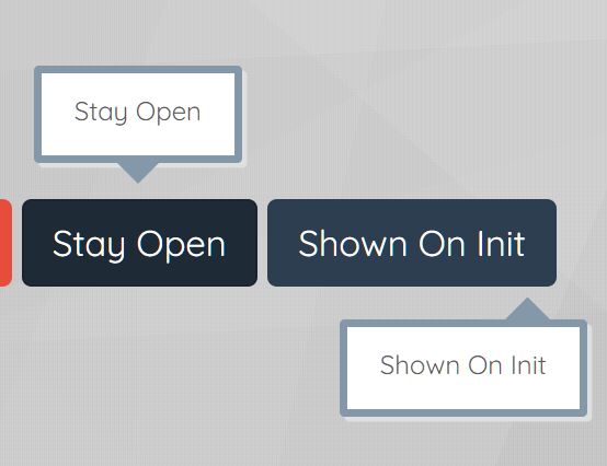
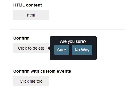
- Custom trigger event: hover, click, focus, hoverfocus, etc.
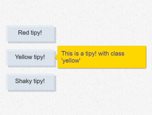
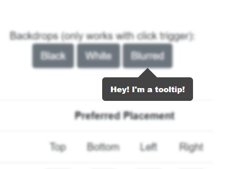
- Custom background overlay: dark, light, blur.
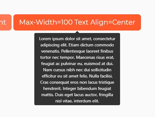
- 4 sizes: tiny, small, medium, and large.
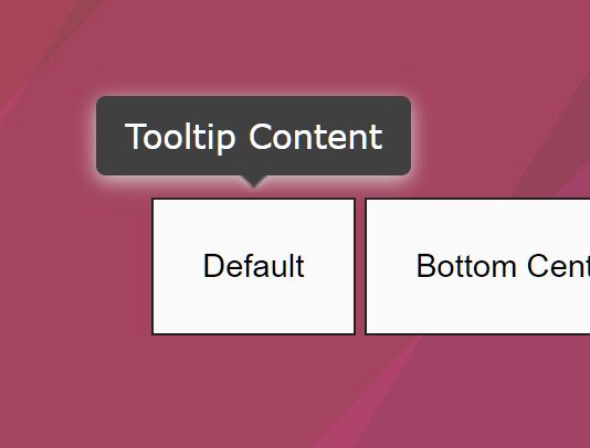
- 5 position options: auto, top, right, bottom, left.
- 6 built-in themes: Black, Lt-Gray, White, Blue, Green, and Red.
How to use it:
1. Install the jtippy with NPM.
# NPM
$ npm install jtippy --save
2. Or by loading the following JavaScript & CSS files in the document.
<link rel="stylesheet" href="jTippy-master/jTippy.min.css">
<script src="/path/to/cdn/jquery.min.js"></script>
<script src="jTippy-master/jTippy.min.js"></script>
3. Initialize the jTippy plugin and we're ready to go.
$('[data-toggle="tooltip"]').jTippy();
4. Add the data-toggle="tooltip" attribute to the target element and define the tooltip in the title attribute and done.
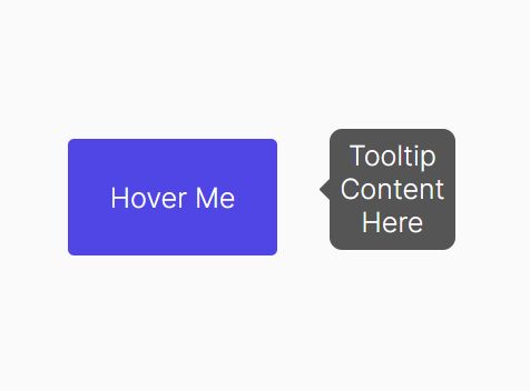
<a href="#"
   data-toggle="tooltip"
   title="Tooltip Content Here">
   Hover Me
</a>
5. Customize the tooltip by overriding the default settings as follows:
$('[data-toggle="tooltip"]').jTippy({

  // tooltip content
  title: '',

  // custom trigger event
  // 'click', 'hover', 'focus', 'hoverfocus'
  trigger: 'hoverfocus',

  // 'auto','top','bottom','left','right'
  position: 'auto',

  // 'black', 'lt-gray', 'white', 'blue', 'green', 'red'
  theme: 'black',

  // 'tiny', 'small', 'medium', 'large'
  size: 'small',

  // 'black', 'white', 'blurred'
  backdrop: false,

  // 'black', 'white', 'blurred'
  backdrop: false,

  // extra CSS class(es)
  class: '',

  // close other tooltips
  singleton: true,

  // close the tooltip by clicking outside
  close_on_outside_click: true

});
6. You can also pass the options via HTML data-OPTION attribute:
<a href="#"
   data-toggle="tooltip"
   data-OPTION="VALUE">
   Hover Me
</a>
7. Event handlers.
$('[data-toggle="tooltip"]').jTippy()
.on('jt-show', function(e, tooltip){
  // after shown
}).on('jt-hide', function(e){
  // after hidden
});
8. Set the options gloabally.
$.jTippy.defaults.OPTION = VALUE;
9. Close the tooltip manually.
$('[data-toggle="tooltip"]').jTippy('hide');
Changelog:
v1.7.2 (2019-10-16)
- Pass button and jtippy instance to title function
v1.6.1 (2019-10-03)
- Reposition on DOM change, hide if trigger element hidden, and allow text wrap
v1.6.0 (2019-09-22)
- Added hide method and fixed tooltip param
v1.4.6 (2019-07-10)
- Allow focus tooltips to remain when a new one is opened
- Fix show on focus when trigger is hoverfocus
- Remove hackjob fix which closes tooltips on click as long as they aren't triggered by a click
- Attempt to fix some tooltips getting stuck by allowing the hide on click function to run for all types (as long as close_on_outside_click is true)
v1.3.96 (2019-05-01)
- If clicked element disappears, hide jTippy
v1.3.95 (2019-02-16)
- Bugfix
2019-01-17
- v1.3.8: Additional check
2018-11-15
- bugfixed
2018-11-14
- fix positioning
This awesome jQuery plugin is developed by HTMLGuyLLC. For more Advanced Usages, please check the demo page or visit the official website.