Simple and Accessible Modal Plugin with jQuery and HTML5
| File Size: | 7.54 KB |
|---|---|
| Views Total: | 4792 |
| Last Update: | |
| Publish Date: | |
| Official Website: | Go to website |
| License: | MIT |
A simple, flexible and accessible jQuery / HTML5 modal dialog plugin which uses ARIA attributes and roles to provide a universal experience on various screen readers and devices. Based on HTML5 data attributes and dialog element.
Basic usage:
1. Include jQuery library and the jQuery Accessible Modal Window plugin on the web page when needed.
<script src="//code.jquery.com/jquery.min.js"></script>
<script src="jquery-accessible-modal-window-aria.js"></script>
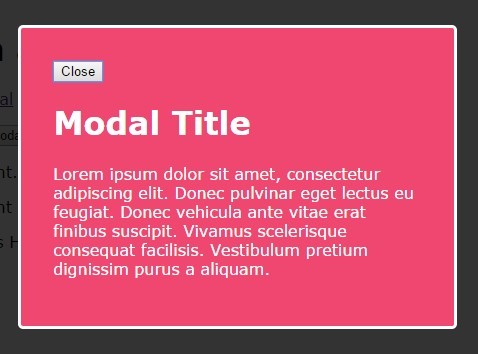
2. Create a link to launch a modal dialog that loads content from inline text using data-modal-text attribute.
<a href="#" class="js-modal"
   data-modal-text="Modal Content"
   data-modal-title="Modal Title"
   data-modal-close-text="Close"
   data-modal-close-title="Close this modal">
   Click me
</a>
3. Create a button to launch a modal dialog that loads content from inline elements wrapped in a DIV element with an unique ID.
<button class="js-modal"
        data-modal-content-id="modal-id"
        data-modal-title="Modal Title"
        data-modal-close-text="Close"
        data-modal-close-title="Close this modal">
        Click me
</button>

<div id="modal-id" class="hidden">Modal Content</div>
4. Apply your own CSS styles to the modal dialog.
<a href="#" class="js-modal"
   data-modal-text="Modal Content"
   data-modal-title="Modal Title"
   data-modal-close-text="Close"
   data-modal-close-title="Close this modal">
   Click me
</a>
5. When you open the modal, the class no-scroll is added on the body. If you want to remove scroll, add the following CSS snippet to your CSS.
.no-scroll {
  overflow: hidden;
}
6. All HTML5 data attributes.
data-modal-text: modal textdata-modal-content-id: modal IDdata-modal-title: modal titledata-modal-close-text: text for close buttondata-modal-close-title: title attribute of close buttondata-modal-background-click="disabled": disable the possibility to click outside the modal window to close it.data-modal-close-img: a path to a valid image for the close buttondata-modal-focus-id: when opening a modal, provides focus to the matching IDdata-modal-aria-modal: adds attributes aria-modal="true" to the code of the modal.data-modal-remove-role-dialog: removes role="dialog" of the code of the modaldata-modal-use-role-alertdialog: instructs the modal to use role="alertdialog"data-modal-remove-dialog-tag: instructs the modal to use div instead of using dialog tag
Changelog:
2020-11-25
- v1.11.1
2019-09-01
- v1.11.0
2019-08-28
- Don't list hidden type inputs in focus trap
2018-03-22
- Add class <prefix>-modal__wrapper to container (role="document")
2017-12-24
- Add class="js-modal-close" (on any element) to close modal
2017-09-09
- Added several options to create different modals
2017-08-19
- Fix issue on VO/Mac
2017-07-11
- js update
2017-06-09
- Add attribute data-modal-focus-id
2017-06-08
- Add attribute aria-haspopup
2017-05-16
- Update text on modal overlay
2017-03-23
- Add aria-modal="true" to dialog element
2017-03-22
- Fix selector bug (issue with jQuery 2.x/3.x)
2017-03-19
- Added attribute data-modal-close-img (image for close button)
2017-03-06
- Add type="button" to button
2017-02-18
- Fixed a bug in variables
2016-11-03
- Fixed a bug in variables
2016-10-21
- Fixed a bug in variables
2016-04-19
- Added class for close text
2016-04-17
- Fixed duplicate id in content modal
2016-02-13
- indentation fix
2016-02-05
- Big refactoring
2015-12-17
- Add possibility to remove scroll on body when modal is opened
This awesome jQuery plugin is developed by nico3333fr. For more Advanced Usages, please check the demo page or visit the official website.