Clean & Flexible Tooltip Plugin For jQuery - Tooltipster
| File Size: | 109 KB |
|---|---|
| Views Total: | 10642 |
| Last Update: | |
| Publish Date: | |
| Official Website: | Go to website |
| License: | MIT |
Tooltipster is a clean and lightweight jQuery Tooltip Plugin for creating extremely flexible, HTML5 validated, touch-enabled tooltips on any DOM element.
More Features:
- 5 awesome animations.
- 5 built-in themes.
- Auto reposition tooltips if scrolled outside of the viewport.
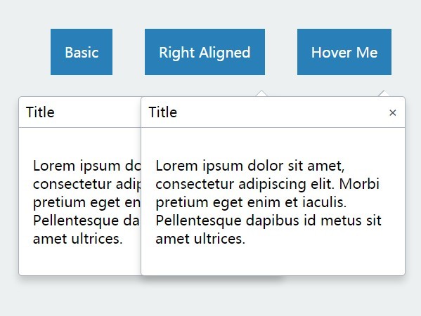
- Supports HTML tooltip content.
- Allows multiple tooltips on a single element.
- Custom trigger events. Not only Hover.
Installation:
# NPM
$ npm install tooltipster

# Bower
$ bower install tooltipster
How to use it:
1. Include necessary JavaScript and CSS files in your document.
<!-- Core Stylesheet -->
<link rel="stylesheet" href="/path/to/dist/css/tooltipster.bundle.min.css" />

<!-- OPTIONAL Themes -->
<link rel="stylesheet" href="/path/to/dist/css/plugins/tooltipster/sideTip/themes/tooltipster-sideTip-borderless.min.css" />
<link rel="stylesheet" href="/path/to/dist/css/plugins/tooltipster/sideTip/themes/tooltipster-sideTip-light.min.css" />
<link rel="stylesheet" href="/path/to/dist/css/plugins/tooltipster/sideTip/themes/tooltipster-sideTip-noir.min.css" />
<link rel="stylesheet" href="/path/to/dist/css/plugins/tooltipster/sideTip/themes/tooltipster-sideTip-punk.min.css" />
<link rel="stylesheet" href="/path/to/dist/css/plugins/tooltipster/sideTip/themes/tooltipster-sideTip-shadow.min.css" />

<!-- jQuery -->
<script src="/path/to/cdn/jquery.slim.min.js"></script>

<!-- JavaScript -->
<script src="/path/to/dist/js/tooltipster.bundle.min.js"></script>
2. Load a tooltip plugin as per your needs:
- SVG: Add SVG Support
- Discovery: Allows groups of tooltips
- Follower: Make the tooltip follow your cursor
- scrollableTip: Help create scrollable tooltips
- SelectableText: Make a tooltip appear when you select / highlight some text
<!-- SVG Plugin -->
<script src="./dist/js/plugins/tooltipster/SVG/tooltipster-SVG.min.js"></script>

<!-- Discovery Plugin -->
<script src="./tooltipster-discovery/tooltipster-discovery.min.js"></script>

<!-- Follower Plugin -->
<link rel="stylesheet" href="./tooltipster-follower/dist/css/tooltipster-follower.min.css" />
<script src="./tooltipster-follower/dist/js/tooltipster-follower.min.js"></script>

<!-- scrollableTip Plugin -->
<script src="./tooltipster-scrollableTip/tooltipster-scrollableTip.min.js"></script>

<!-- SelectableText Plugin-->
<script src="./tooltipster-selectableText/tooltipster-selectableText.js"></script>
3. Call the plugin with default options.
$(document).ready(function() {
  $('.tooltip').tooltipster();
});
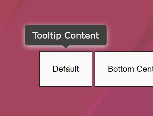
4. Attach the tooltip to an element you specify and insert custom tooltip content into the title attribute as follows:
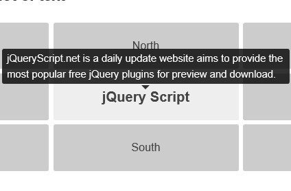
<a href="https://www.jqueryscript.net"
   class="tooltip"
   title="Tooltip Content Here">
   jQueryScript.Net
</a>
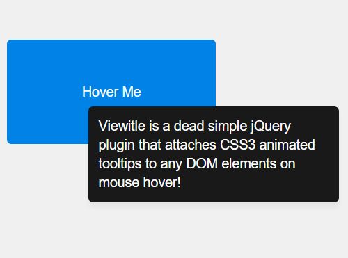
5. Or load any content into the tooltip:
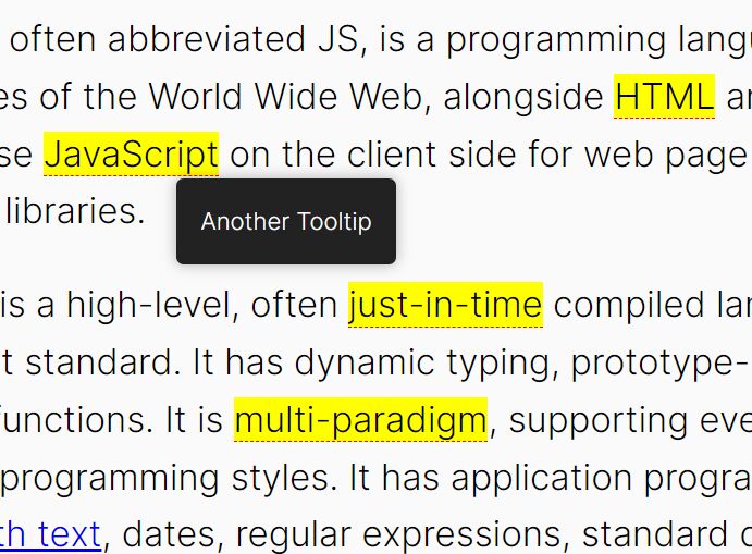
<span class="tooltip" data-tooltip-content="#tooltip_content">
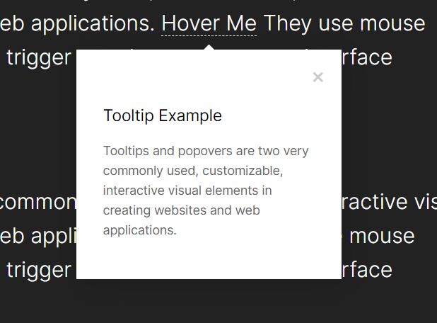
Hover Me
</span>
<div class="tooltip_templates">
<span id="tooltip_content">
ANY HTML HERE
</span>
</div>
.tooltip_templates {
  display: none;
}
$('.tooltip').tooltipster({
  // if you have two tooltips that have the same data-tooltip-content attribute
  contentCloning: true
});
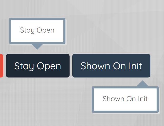
6. Customize the tooltip with the following options.
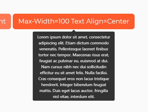
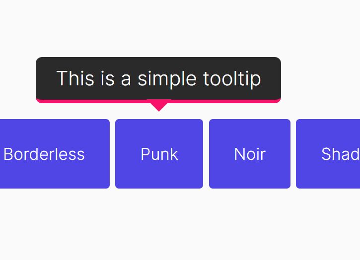
// fade, grow, swing, slide, fall
animation: 'fade',

// Sets the duration of the animation, in milliseconds.
// If you wish to provide different durations for the opening and closing animations, provide an array of two different values.
animationDuration: 350,

// If set, this will override the content of the tooltip.
content: null,

// If the content of the tooltip is provided as a string,
// it is displayed as plain text by default.
contentAsHTML: false,

// If you provide a jQuery object to the 'content' option,
// this sets if it is a clone of this object that should actually be used.
contentCloning: true,

// Debug mode
debug: true,

// Delay how long it takes (in milliseconds) for the tooltip to start animating in.
delay: 200,

// Upon touch interaction, this is the delay before the tooltip starts its opening and closing animations when the 'hover' trigger is used (*).
// If you wish to specify different delays for opening and closing, you may provide an array of two different values.
delayTouch: [300, 500],

// fired only once at instantiation
functionInit: null

// fired before the tooltip opens
functionBefore: null

// fired when the tooltip and its contents have been added to the DOM.
functionReady: null

// fired once the tooltip has been closed and removed from the DOM.
functionAfter: null

// A custom function that does not modify the content but that can format it for display.
// It gets the two first usual arguments and also the content as third argument.
// It must return the value that will be displayed in the tooltip, either a string or a jQuery-wrapped HTML element.
functionFormat: null,

// The minimum version of Internet Explorer to run on.
IEmin: 6,

// Give users the possibility to interact with the tooltip.
interactive: false,

// Allows you to put multiple tooltips on a single element.
multiple: false,

// will default to document.body, or must be an element positioned at (0, 0)
// in the document, typically like the very top views of an app.
parent: null,

// The names of plugins to be used by Tooltipster.
plugins: ['sideTip'],

// Repositions the tooltip if it goes out of the viewport when the user scrolls the page, in order to keep it visible as long as possible.
repositionOnScroll: false,

// Specifies if a TITLE attribute should be restored on the HTML element after a call to the 'destroy' method.
// This attribute may be omitted, or be restored with the value that existed before Tooltipster was initialized, or be restored with the stringified value of the current content.
// Note: in case of multiple tooltips on a single element, only the last destroyed tooltip may trigger a restoration.
restoration: 'none',

// Sets if the tooltip should self-destruct after a few seconds when its origin is removed from the DOM.
// This prevents memory leaks.
selfDestruction: true,

// Set a theme that will override the default tooltip appearance.
// You may provide an array of strings to apply several themes at once (see the themes section).
// Default, Light, Borderless, Punk, Noir, Shadow
theme: [],

// How long (in ms) the tooltip should live before closing.
timer: 0,

// Sets how often the tracker should run (see trackOrigin and trackTooltip), in milliseconds.
// The tracker runs even if trackOrigin and trackTooltip are false to check if the origin has not been removed while the tooltip was open, so you shouldn't set too high or too low values unless you need to.
trackerInterval: 500,

// Repositions the tooltip if the origin moves or is resized. As this option may have an impact on performance, we suggest you enable it only if you need to.
trackOrigin: false,

// Repositions the tooltip if its size changes.
// When the size change results from a call to the 'content' method, the tooltip is already repositioned without the need to enable this option.
// As this option may have an impact on performance, we suggest you enable it only if you need to.
trackTooltip: false,

// Sets when the tooltip should open and close. 'hover' and 'click' correspond to predefined sets of built-in triggers, while 'custom' lets you create your own, for a completely customized behavior.
// click, mouseenter, touchstart, tap, click, mouseleave, originClick, scroll, tap, touchleave
trigger: 'hover',

triggerClose: {
  click: false,
  mouseleave: false,
  originClick: false,
  scroll: false,
  tap: false,
  touchleave: false
},

triggerOpen: {
  click: false,
  mouseenter: false,
  tap: false,
  touchstart: false
},

// Plays a subtle animation when the content of the tooltip is updated (if the tooltip is open).
// You may create custom animations in your CSS files.
// Set to null to disable the animation.
updateAnimation: 'rotate',

// Set the z-index of the tooltip.
zIndex: 9999999,

// mouse follower plugin options
minWidth: 0,
maxWidth: null,
offset: [15,-15],
// top-left, top-center, top-right, left-center
// left-right, bottom-left, bottom-center, bottom-right
anchor: 'top-left',
7. API methods.
// instance.methodName(arg);
// or $('element').tooltipster(methodName, arg);

instance.close([callback])
instance.content([myNewContent])
instance.destroy()
instance.disable()
instance.elementOrigin()
instance.elementTooltip()
instance.enable()
instance.instance()
instance.on()
instance.one()
instance.off()
instance.triggerHandler()
instance.open([callback])
instance.option(optionName [, optionValue])
instance.reposition()
instance.status()
8. Events.
// instance.on(event, function);
// or $.tooltipster.on(event, function);
instance
  .on('init', doSomething)
  .on('before', doSomething)
  .on('after', doSomething)
  .on('close', doSomething)
  .on('closing', doSomething)
  .on('created', doSomething)
  .on('destroy', doSomething)
  .on('destroyed', doSomething)
  .on('dismissable', doSomething)
  .on('format', doSomething)
  .on('geometry', doSomething)
  .on('state', doSomething)
  .on('ready', doSomething)
  .on('reposition', doSomething)
  .on('repositioned', doSomething)
  .on('scroll', doSomething)
  .on('start', doSomething)
  .on('startcancel', doSomething)
  .on('startend', doSomething)
  .on('updated', doSomething)
Changelog:
2022-05-24
- Update Doc
- Update Demo
2020-06-06
- v4.2.8: Fixed distance option
2019-08-20
- v4.2.7: Fix a commonJS issue
2018-01-30
- v4.2.7: Fix a commonJS issue
2018-01-30
- v4.2.6
2017-04-29
- Fixed: Cannot read property 'trigger' of null
2017-03-22
- v4.2.3
2017-03-05
- loop fix
2017-03-04
- use closing animation upon self destruction
2017-01-22
- Fixed: Fails on reading `tagName` of `undefined`.
2016-10-20
- stop repositioning upon the opening of virtual keyboards
2016-09-23
- Fixed Tooltipster dimensions
2016-08-20
- Fixed for IE
2016-07-18
- Added the data-tooltip-content attribute
2016-07-09
- iOS8+ fix
2016-06-22
- SVG fixes
2016-06-14
- update
v3.3.0 (2014-11-12)
- Added closeOnClick and positionTrackerCallback options
- Added the restoration method
v3.2.4 (2014-05-15)
- give the option method a setter capability
v3.2.3 (2014-05-02)
- Removed fixedWidth, added minWidth
v3.2.1 (2014-04-07)
- Logging a warning instead of throwing an error when initiating a non-multiple tooltip on an element that already has one
v3.2.1 (2014-04-05)
- Adapted the onlyOne option to work fine with the multiple option
v3.2.0 (2014-04-05)
- Implemented the 'multiple' option
v3.1.4 (2014-03-20)
- update
v3.1.3 (2014-03-20)
- fixed vertical positioning on area targets
v3.1.2 (2014-03-18)
- Added a callback parameter to show and hide API methods
v3.1.0 (2014-02-25)
- Added a callback parameter to show and hide API methods
v3.0.5 (2014-01-27)
- Wrong offset bug fix
v3.0.2 (2014-01-14)
- Wrong offset bug fix
v3.0.1 (2014-01-10)
- version update
v3.0.0 (2013-12-31)
- Prevent onlyOne from closing non-autoclosing tooltips.
v2.2.3 (2013-10-31)
- Fixed functionInit and broken minified version.
v2.2.2 (2013-6-01)
- Fixing various bugs and confirming fix for select elements inside tooltips
v2.1.4 (2013-6-01)
- Smarter detection between non-touch/touch devicesC
- ontent option can now accept jQuery objects
- Content update method now works on icons
v2.1.3 (2013-2-13)
- Refining and testing disable/enable API methods
This awesome jQuery plugin is developed by calebjacob. For more Advanced Usages, please check the demo page or visit the official website.