Accessible Content Toggle Plugin - jQuery Toggle-Panel
| File Size: | 7.69 KB |
|---|---|
| Views Total: | 462 |
| Last Update: | |
| Publish Date: | |
| Official Website: | Go to website |
| License: | MIT |
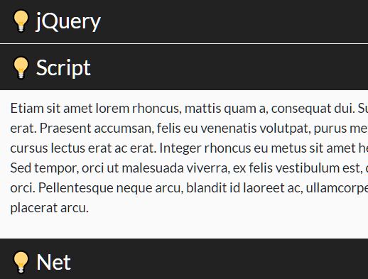
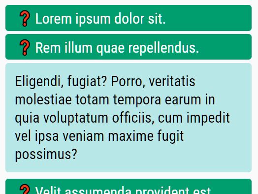
Toggle-Panel is a lightweight jQuery plugin that provides an elegant way to create accessible and mobile-friendly toggleable content (like spoilers and accordions) on the page, with support for ARIA attributes, roles, and keyboard interactions.
More Features:
- Custom toggle mode: Slide, Toggle, or a function.
- Auto closes all panels on mobile devices.
- Auto set focus on the opened panel.
- Custom trigger events: click or mouseover.
- Custom ARIA labels.
How to use it:
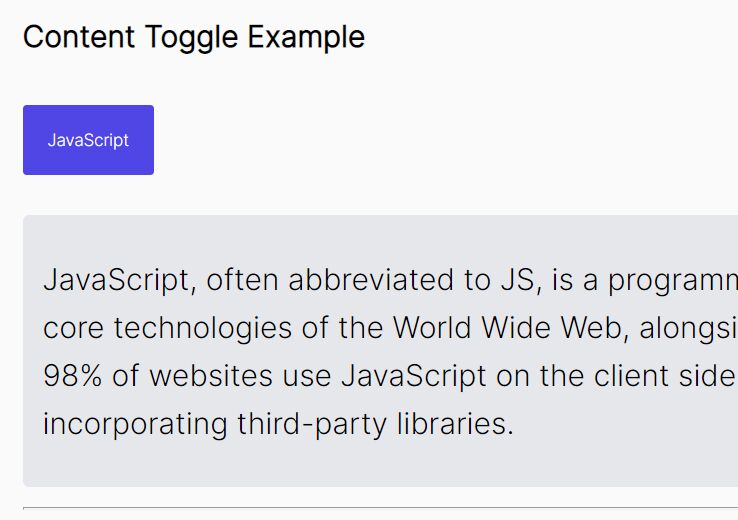
1. Enable a button to show/hide a DIV element.
<button type="button" id="trigger-example">Toggle Panel-Example</button>
<div id="panel-example" class="panel">
  Content To Toggle
</div>
2. Hide the DIV element on page load.
.panel {
  display: none;
}

.tgp__panel--is-opened {
  display: block !important;
}
3. Determine whether to open the DIV panel on page load.
<button type="button" data-tgp-panel-id="trigger-example" data-tgp-opened="true">Toggle Panel-Example</button>
<div id="panel-example" class="panel">
  Content To Toggle
</div>
4. Load the Toggle-Panel plugin after jQuery.
<script src="/path/to/cdn/jquery.min.js"></script>
<script src="/path/to/jquery.toggle-panel.js"></script>
5. Initialize the plugin and done.
$('#trigger-example').togglePanel({
  // options here
});
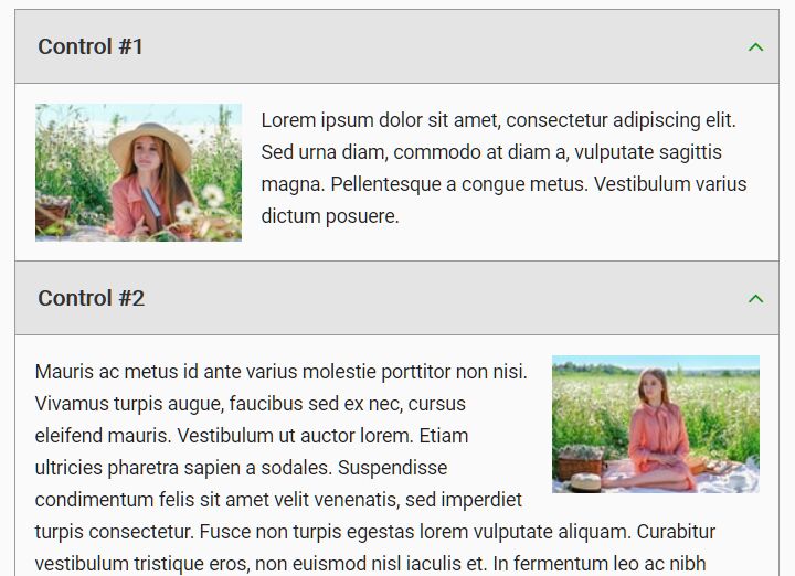
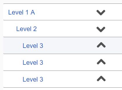
6. Use this plugin to create an accessible accordion interface.
<div id="wrapper">
  <div>
    <button type="button" id="trigger-1">Toggle Panel 1</button>
    <div id="panel-1" class="panel">
      Accordion 1
    </div>
  </div>
  <div>
    <button type="button" id="trigger-2">Toggle Panel 2</button>
    <div id="panel-2" class="panel">
      Accordion 2
    </div>
  </div>
  <div>
    <button type="button" id="trigger-3">Toggle Panel 3</button>
    <div id="panel-3" class="panel">
      Accordion 1
    </div>
  </div>
</div>
$('button').togglePanel({
  panel: 'next',
  mode: 'toggle',
  wrapper: $('#wrapper'),
  connect: true,
});
7. All default plugin options.
$('#trigger-example').togglePanel({

  // CSS class prefix
  prefix : 'tgp',

  // wrapper of connected panels
  wrapper: false,

  // if true, only one panel can be opened
  connect: false,

  // next panel or an unique panel ID
  panel: 'next',

  // trigger event: 'click' or 'mouseover'
  event: 'click',

  // If 'panel' setting = "function", this function will be called
  findPanel: function() {},

  // 'slide', 'toggle', or 'custom'
  mode: 'slide',

  // auto move focus to the opened panel
  autoFocus: true,

  // allow the trigger button to close its panel
  selfClose: true,

  // return focus to the trigger after closing
  returnFocus: true,

  // close panel after mouse leaving with delay
  autoHide: false,

  // delay in ms
  delay: 300,

  // disable clicks on the first levels
  disableFirstLevel: false,

  // remove titles from trigger buttons
  removeTitle: false,

  // close all panels on mobile devices
  smallScreenBreakpoint: 767,

  // labels for accessibility
  panelLabel: '',
  closeLabel: 'Collapse',
  openLabel: 'Expand',

  // If 'mode' setting = 'custom', these functions will be called
  customShow: function() {},
  customHide: function() {},

});
8. Callbacks.
$('#trigger-example').togglePanel({

  onShow: function () {},
  onShowEnd: function () {},
  onHide: function () {},
  onHideEnd: function () {}

});
9. API methods.
// remove auto focus on init
$('button[id^=trigger]').trigger('no-autofocus.tgp');

// show panel
$('button[id^=trigger]').trigger('show.tgp');

// hide panel
$('button[id^=trigger]').trigger('hide.tgp');

// destroy
$('button[id^=trigger]').trigger('destroy.tgp');
This awesome jQuery plugin is developed by cyril-lamotte. For more Advanced Usages, please check the demo page or visit the official website.