Nested Sliding Content Toggle Plugin - jQuery KV-JSAccordions
| File Size: | 8.57 KB |
|---|---|
| Views Total: | 1001 |
| Last Update: | |
| Publish Date: | |
| Official Website: | Go to website |
| License: | MIT |
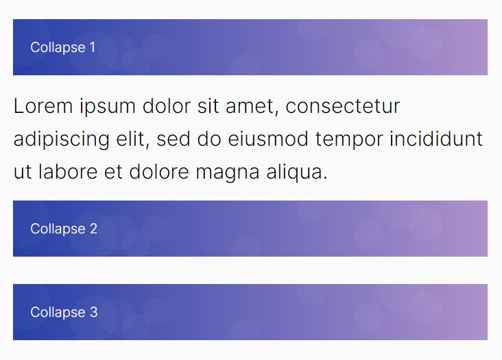
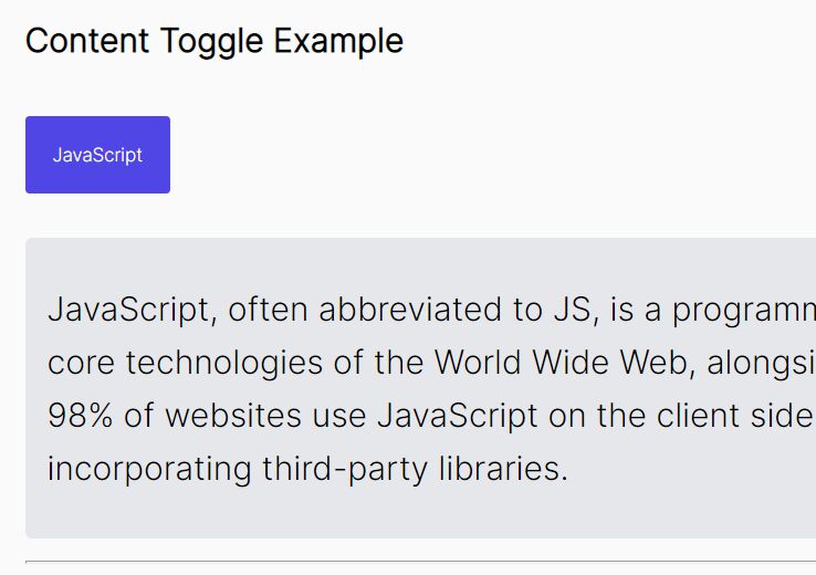
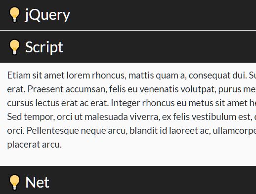
A super tiny and easy to use jQuery content toggle plugin to toggle the visibility of web contents just like an accordion.
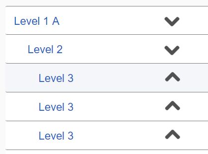
Click/tap the header to expand and collapse panels with a sliding effect.
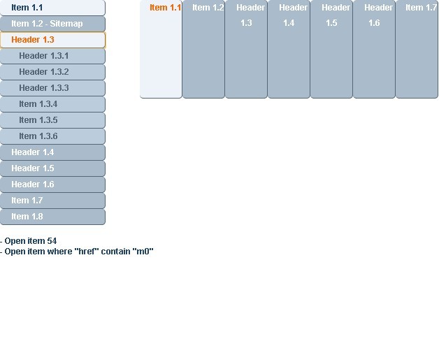
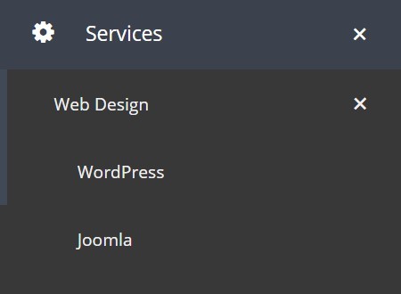
Supports the unlimited number of nested panels and without having to write any JavaScript & CSS codes.
How to use it:
1. To use the plugin, include jQuery JavaScript library and the KV-JSAccordions plugin's files on the page.
<link href="/path/to/kv-jsaccordions.min.css" rel="stylesheet" />
<script src="/path/to/cdn/jquery.min.js"></script>
<script src="/path/to/kv-jsaccordions.min.js"></script>
2. The HTML for the accordion headers & panels. Note that the panel ID must match the value of the data-panel-id attribute:
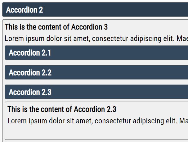
<h4><span class="accordion-item" data-panel-id="panel1">Accordion 1</span></h4>
<div class="accordion-panel" id="panel1">
  <h4>This is the content of Accordion 1</h4>
</div>

<h4><span class="accordion-item" data-panel-id="panel2">Accordion 2</span></h4>
<div class="accordion-panel" id="panel2">
  <h4>This is the content of Accordion 2</h4>
</div>

<h4><span class="accordion-item" data-panel-id="panel3">Accordion 3</span></h4>
<div class="accordion-panel" id="panel3">
  <h4>This is the content of Accordion 3</h4>
</div>
3. Make an accordion panel opened on init by adding the CSS class active to the header.
<h4><span class="accordion-item active" data-panel-id="panel2">Accordion 2</span></h4>
<div class="accordion-panel" id="panel2">
  <h4>This is the content of Accordion 2</h4>
</div>
4. To create nested accordions, just add the sub-accordions the accordion panels and done.
<h4><span class="accordion-item active" data-panel-id="panel2">Accordion 2</span></h4>
<div class="accordion-panel" id="panel2">
  <h4>This is the content of Accordion 2</h4>
  <h4><span class="accordion-item" data-panel-id="panel2-1">Accordion 2.1</span></h4>
    <div class="accordion-panel" id="panel2-1">
      <h4>This is the content of Accordion 2.1</h4>
    </div>
</div>
5. Override the default styles of the accordion to fit your web design.
.accordion-item {
  background: #34495E;
  color: #fff;
  border: 0.5px solid #868686;
  border-radius: 3px;
  padding: 5px 8px;
  display: block;
}

.accordion-item:hover {
  background: #2C3E50;
  border-color: #757575;
}

.accordion-panel {
  background: #f0f0f0;
  padding: 0px 5px;
  margin-bottom: 5px;
}

.accordion-panel.active {
  border: 0.5px solid #535353;
  border-radius: 3px;
}

.accordion-panel p {
  margin: 5px 0px;
}
This awesome jQuery plugin is developed by kvaganyan. For more Advanced Usages, please check the demo page or visit the official website.