Fully Accessible Tabs/Accordion/Toggle Plugin - jQuery TabaKordion
| File Size: | 24.4 KB |
|---|---|
| Views Total: | 915 |
| Last Update: | |
| Publish Date: | |
| Official Website: | Go to website |
| License: | MIT |
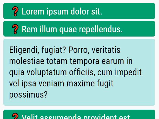
TabaKordion is a jQuery plugin used to create fully accessible tabs, accordions, and spoiler content using ARIA attributes.
How to use it:
1. To get started, download and load the jquery.TabaKordion.js script after jQuery.
<script src="/path/to/cdn/jquery.min.js"></script>
<script src="/path/to/dist/jquery.TabaKordion.min.js"></script>
2. Initialize the plugin.
$(function() {
  $('.tabakordion').TabaKordion();
});
3. Create a content toggle control that can be used to hide and show regions using aria-expanded. aria-controls is used to maintain markup associations. Keyboard interactions:
- Tab: Move between triggers.
- Enter or Space: Toggle display of hide/show regions.
<a href="#showhide-region" id="showhide" class="tabakordion showhide">
  Show/Hide
</a>
<div id="showhide-region">
  Any Content Here
</div>
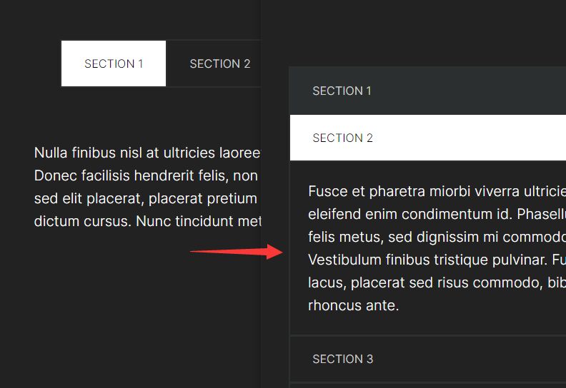
4. Create a tabs UI that contains tabs and their associated content panels. Keyboard interactions:
- Tab: only the active tab is in the tab order. The user reaches the tabbed panel component by pressing the tab key until the active tab title receives focus.
- Left Arrow: with focus on a tab, pressing the left arrow will move focus to the previous tab in the tab list and activate that tab. Pressing the left arrow when the focus is on the first tab in the tab list will move focus and activate the last tab in the list.
- Right Arrow: with focus on a tab, pressing the right arrow will move focus to the next tab in the tab list and activate that tab. Pressing the right arrow when the focus is on the last tab in the tab list will move focus to and activate the first tab in the list.
- Up arrow: behaves the same as left arrow in order to support vertical tabs
- Down arrow: behaves the same as right arrow in order to support vertical tabs
- Control+Up Arrow: with focus anywhere within the tab panel, pressing Control+Up Arrow will move focus to the tab for that panel.
- Control+PageUp: When focus is inside of a tab panel, pressing Control+PageUp moves focus to the tab of the previous tab in the tab list and activates that tab. When focus is in the first tab panel in the tab list, pressing Control+PageUp will move focus to the last tab in the tab list and activate that tab.
- Control+PageDown: When focus is inside of a tab panel, pressing Control+PageDown moves focus to the tab of the next tab in the tab list and activates that tab. When focus is in the last tab panel in the tab list, pressing Control+PageUpwill move focus to the first tab in the tab list and activate that tab.
<div class="tabakordion tabs">
  <ul>
    <li id="tab1" class="tab" aria-controls="panel1">
      <a href="#panel1">Tab 1</a>
    </li>
    <li id="tab2" class="tab selected" aria-controls="panel2">
      <a href="#panel2">Tab 2</a>
    </li>
    <li id="tab3" class="tab" aria-controls="panel3">
      <a href="#panel3">Tab 3</a>
    </li>
  </ul>
  <div id="panel1" class="panel" aria-labelledby="tab1">
    Tab 1 Content
  </div>
  <div id="panel2" class="panel" aria-labelledby="tab2">
    Preselected panel
  </div>
  <div id="panel3" class="panel" aria-labelledby="tab3">
    Tab 3 Content
  </div>
</div>
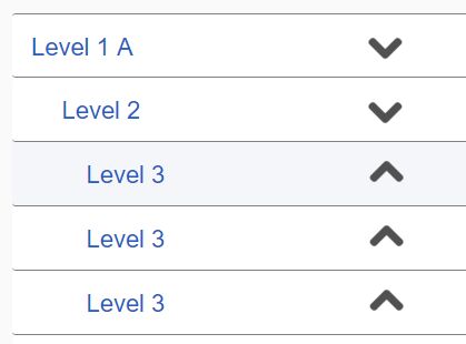
5. Create an accordion component. The markup must have a role of tablist and have aria-multiselectable="true". This will enable an assistive technology, such as screen reader, to convey that the tablist is an accordion or a multiselectable tablist. This will also tell the user that the keyboard navigation matches an accordion and not a tablist. Keyboard interactions:
- Tab - When focus is on an accordion header, pressing the Tab key moves focus in the following manner:
- If interactive glyphs or menus are present in the accordion header, focus moves to each in order.
- When the corresponding panel is expanded (its
aria-expandedstate is 'true'), then focus moves to the first focusable element in the panel. - If the panel is collapsed (its aria-expanded state is 'false' or missing), OR, when the last interactive element of a panel is reached, the next Tab key press moves focus as follows:
- If a subsequent accordion panel is already expanded, focus moves to the first focusable element in this subsequent panel.
- If no subsequent accordion panel is expanded, focus moves to the first focusable element outside the accordion component.
- Left arrow
- When focus is on the accordion header, a press of up/left arrow keys moves focus to the previous logical accordion header.
- When focus reaches the first header, further up/left arrow key presses optionally wrap to the first header.
- Right arrow
- When focus is on the accordion header, a press of down/right moves focus to the next logical accordion header.
- When focus reaches the last header, further down/right arrow key presses optionally wrap to the first header
- Up arrow - behaves the same as left arrow
- Down arrow - behaves the same as right arrow
- Control+Up arrow - Moves focus from anywhere in the accordion content to its associated accordion header or tab respectively.
- Control+PageUp -
- When focus is inside of an accordion pane, pressing Control+PageUp moves focus to the accordion header of the previous accordion pane.
- When focus is in the first accordion header content, pressing Control+PageUp optionally moves focus to the last accordion header.
- Focus will simply move to the header and will require Enter/Space to expand/collapse the accordion pane.
- Control+PageDown -
- When focus is inside of an accordion pane, pressing Control+PageDown moves focus to the header of the accordion pane.
- When focus is in the last accordion header content, pressing Control+PageDown optionally moves focus to the first accordion header.
- In the case of an accordion, focus simply moves to the header and requires Enter/Space to expand/collapse the accordion pane.
- End - When focus is on the accordion header, an End key press moves focus to the last accordion header.
- Home - When focus is on the accordion header, a Home key press moves focus to the first accordion header.
- Enter/Space - When focus is on an accordion header, pressing Enter/Space toggles the expansion of the corresponding panel.
- If collapsed, the panel is expanded, and its aria-expanded state is set to 'true'.
- If expanded, the panel is collapsed and its aria-expanded state is set to 'false'.
- Shift+Tab - Generally the reverse of Tab.
- Alt+Delete -
- When deletion is allowed, with focus anywhere within the tab panel or tab, pressing Alt+Delete will delete the current tab and tab panel from the tabbed interface control. If additional tabs remain in the tabbed interface, focus goes to the next tab in the tab list. If no additional tabs remain, then focus moves to the last place that held focus in the previous tab panel.
- An alternative to providing a keystroke to close a tab is to provide a context menu that is associated with the tab title. When focus is on the tab, pressing Shift-F10 or pressing the right mouse button will open a context menu with the close choice.
- A warning should be given to the user before allowing the delete to occur.
<div class="tabakordion accordion nomultiselect">
  <h3 id="tab1" class="tab" aria-controls="panel1">Accordion 1</h3>
  <div id="panel1" class="panel" aria-labelledby="tab1">
    Accordion 1
  </div>
  <h3 id="tab2" class="tab" aria-controls="panel2">Accordion 2</h3>
  <div id="panel2" class="panel" aria-labelledby="tab2">
    Accordion 2
  </div>
  <h3 id="tab3" class="tab" aria-controls="panel3">Accordion 3</h3>
  <div id="panel3" class="panel" aria-labelledby="tab3">
    Accordion 3
  </div>
</div>
This awesome jQuery plugin is developed by tariqkhan-co-uk. For more Advanced Usages, please check the demo page or visit the official website.