Convert Bootstrap Tabs Into Accordions In Mobile View
| File Size: | 3.35 KB |
|---|---|
| Views Total: | 33897 |
| Last Update: | |
| Publish Date: | |
| Official Website: | Go to website |
| License: | MIT |
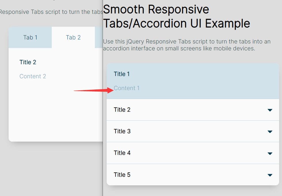
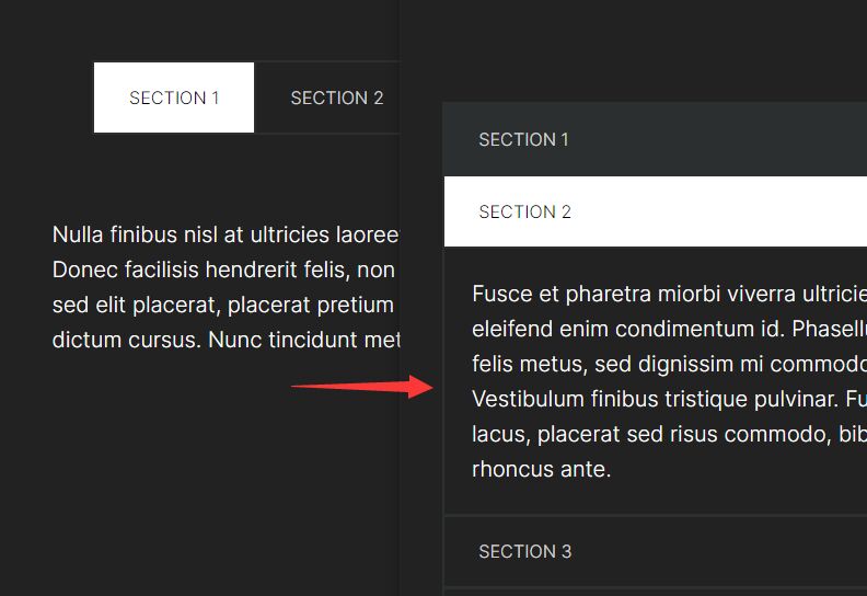
This is a really simple jQuery script to make the regular Bootstrap tabs fully responsive and mobile friendly. The plugin automatically converts the Bootstrap tabs component into a collapsible and expandable accordion interface when the screen size is smaller than a specific breakpoint.
How to use it:
1. Download and insert the accordion.js script into your Bootstrap page.
<link rel="stylesheet" href="/path/to/bootstrap.min.css">
<script src="/path/to/jquery.min.js"></script>
<script src="/path/to/bootstrap.min.js"></script>
<script src="accordion.js"></script>
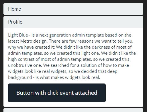
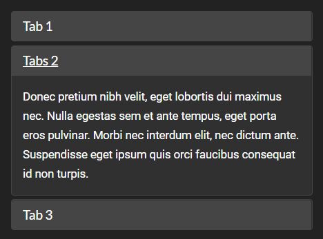
2. Create the Bootstrap tabs.
<ul id="tabs" class="nav nav-tabs">
  <li class="active"><a data-toggle="tab" href="#t1">Tab 1</a></li>
  <li><a data-toggle="tab" href="#t2">Tabs 2</a></li>
  <li><a data-toggle="tab" href="#t3">Tab 3</a></li>
</ul>
<div class="tab-content">
  <div id="t1" class="tab-pane fade in active">
    Content 1
  </div>
  <div id="t2" class="tab-pane fade">
    Content 2
  </div>
  <div id="t3" class="tab-pane fade">
    Content 3
  </div>
</div>
3. Create an empty accordion on the web page.
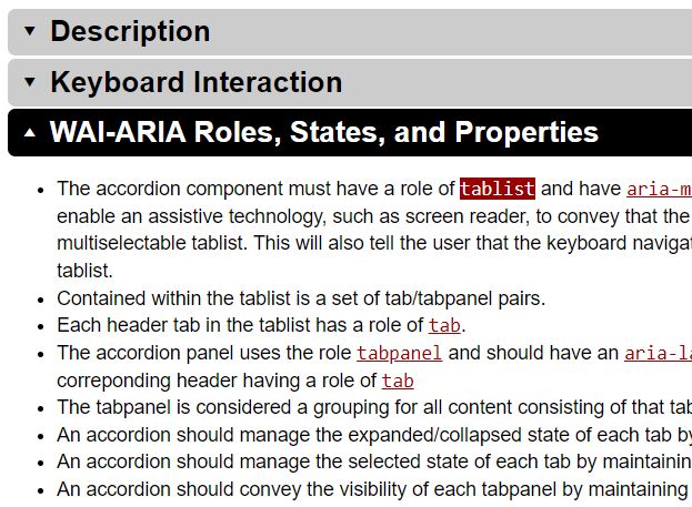
<div class="panel-group" id="accordion" role="tablist" aria-multiselectable="true"></div>
<!-- /Bootstrap Accordion -->
</div>
4. Initialize the plugin and specify the max screen size as these:
getAccordion("#tabs",768);
This awesome jQuery plugin is developed by espinpl. For more Advanced Usages, please check the demo page or visit the official website.