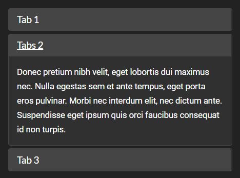
Smooth Responsive Tabs/Accordion UI With jQuery
| File Size: | 7.36 KB |
|---|---|
| Views Total: | 3731 |
| Last Update: | |
| Publish Date: | |
| Official Website: | Go to website |
| License: | MIT |
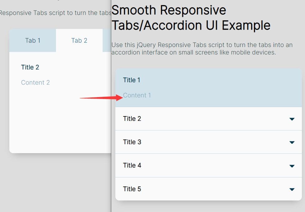
Tabs can be an extremely convenient and useful interface element, if designed right. However, when building responsive websites that work on small screens like mobile devices, tab based interfaces can become a major problem, particularly when it's hard to modify their appearance through CSS.
You could try modifying the HTML code of your tabs by inserting media queries. However, this is a very difficult task since you need to manually change the HTML which is kind of insane when you think about it.
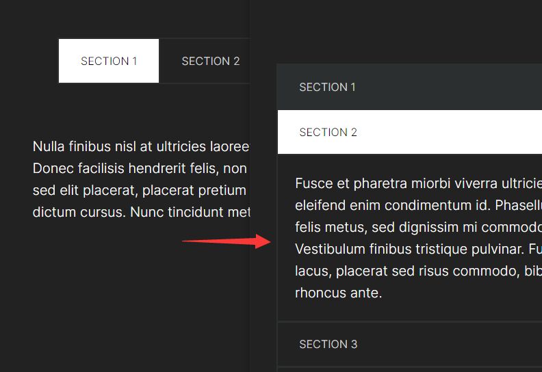
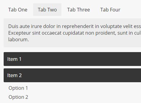
Alternatively, you can use the jQuery Responsive Tabs script that I'm about to present in this tutorial to turn the tabs into an accordion interface on small screens like mobile devices so you can use all the space for more important information.
How to use it:
1. Add button-based tab navigation and tabbed content to the tabs UI following the HTML structure as shown below.
<section class="accordion">

  <!-- Tabs -->
  <section class="accordion-tabs">
    <button class="accordion-tab accordion-active" data-actab-group="0" data-actab-id="0">Tab 1</button>
    <button class="accordion-tab" data-actab-group="0" data-actab-id="1">Tab 2</button>
    <button class="accordion-tab" data-actab-group="0" data-actab-id="2">Tab 3</button>
    ... more tabs here ...
  </section>

  <!-- Tabbed Content -->
  <section class="accordion-content">
    <article class="accordion-item accordion-active" data-actab-group="0" data-actab-id="0">
      <h4 class="accordion-item__label">Title 1</h4>
      <div class="accordion-item__container">
        <p>Content 1</p>
      </div>
    </article>
    <article class="accordion-item" data-actab-group="0" data-actab-id="1">
      <h4 class="accordion-item__label">Title 2</h4>
      <div class="accordion-item__container">
        <p>Content 2</p>
      </div>
    </article>
    <article class="accordion-item" data-actab-group="0" data-actab-id="2">
      <h4 class="accordion-item__label">Title 3</h4>
      <div class="accordion-item__container">
        <p>Content 3</p>
      </div>
    </article>
    ... more tabbed content here ...
  </section>

</section>
2. The primary CSS styles for the tabs UI.
.accordion {
  width: 96%;
  overflow: hidden;
  background: white;
  border-radius: 10px;
  box-shadow: 0 10px 20px -10px rgba(0, 0, 0, 0.3);
}

.accordion-tabs {
  display: none;
}

.accordion-tabs :focus {
  outline: none;
}

.accordion-item {
  border-bottom: 1px solid #c1d7e2;
}

.accordion-item:last-child {
  border: none;
}

.accordion-item__label {
  position: relative;
  margin: 0;
  padding: 20px;
  cursor: pointer;
  transition: padding 0.2s ease;
}

.accordion-item__label::after {
  content: "";
  position: absolute;
  top: -4px;
  right: 20px;
  bottom: 0;
  width: 6px;
  height: 6px;
  margin: auto;
  transform: rotate(45deg);
  opacity: 1;
  transition: opacity 0.1s ease;
  border-radius: 2px;
  border: 5px solid transparent;
  border-color: transparent #003852 #003852 transparent;
}

.accordion-item__label:hover {
  background: #c1d7e2;
}

.accordion-item__container {
  height: 0;
  padding: 0 20px;
  overflow: hidden;
  opacity: 0;
  transition: padding 0.2s ease, opacity 0.5s 0.15s ease;
}

.accordion-active {
  background: #d2e2ea;
}

.accordion-active .accordion-item__label {
  padding-bottom: 0;
  color: #003852;
  cursor: inherit;
}

.accordion-active .accordion-item__label:hover {
  background: none;
}

.accordion-active .accordion-item__label::after {
  opacity: 0;
}

.accordion-active .accordion-item__container {
  height: auto;
  padding: 20px;
  opacity: 1;
}

.accordion-active .accordion-item__container p,
.accordion-active .accordion-item__container h4 {
  color: #7baac1;
}

.accordion-active .accordion-item__container p:first-child,
.accordion-active .accordion-item__container h4:first-child, {
  margin-top: 0;
}

.accordion-active .accordion-item__container p:last-child,
.accordion-active .accordion-item__container h4:last-child, {
  margin-bottom: 0;
}
3. Turn the tabs UI into an accordion when the screen size is smaller than 600px using CSS media queries.
@media (min-width: 600px) {
  .accordion {
    width: 100%;
    max-width: 600px;
  }
}

@media (min-width: 600px) {
  .accordion-tabs {
    display: flex;
    background: #d2e2ea;
  }
  .accordion-tabs .accordion-tab {
    flex: 1;
    padding: 20px;
    font: inherit;
    border: none;
    cursor: pointer;
    color: #003852;
    background: #d2e2ea;
    transition: background 0.1s ease;
  }
  .accordion-tabs .accordion-tab:hover {
    background: #c1d7e2;
  }
  .accordion-tabs .accordion-tab:last-child {
    border-right: 0;
  }
  .accordion-tabs .accordion-tab.accordion-active {
    color: #006b99;
    background: white;
  }
  .accordion-item {
    display: none;
    min-height: 260px;
    padding: 30px;
    border: none;
    background: white;
  }
  .accordion-item__label,
  .accordion-item__container {
    padding: 0;
    transition: inherit;
  }
  .accordion-item__label {
    margin-bottom: 20px;
  }
  .accordion-item.accordion-active {
    display: block;
  }
  .accordion-item.accordion-active .accordion-item__container {
    padding: 0;
  }
}
4. Load the necessary jQuery library (slim build) at the end of the document.
<script src="/path/to/cdn/jquery.slim.min.js"></script>
5. Enable the tabs (accordion headers) to switch between tabbed content (accordion panels).
$(document).ready(function () {
  console.log("document ready");

  const labels = document.querySelectorAll(".accordion-item__label");
  const tabs = document.querySelectorAll(".accordion-tab");

  function toggleShow() {
    const target = this;
    const item = target.classList.contains("accordion-tab") ?
      target :
      target.parentElement;
    const group = item.dataset.actabGroup;
    const id = item.dataset.actabId;

    tabs.forEach(function (tab) {
      if (tab.dataset.actabGroup === group) {
        if (tab.dataset.actabId === id) {
          tab.classList.add("accordion-active");
        } else {
          tab.classList.remove("accordion-active");
        }
      }
    });

    labels.forEach(function (label) {
      const tabItem = label.parentElement;

      if (tabItem.dataset.actabGroup === group) {
        if (tabItem.dataset.actabId === id) {
          tabItem.classList.add("accordion-active");
        } else {
          tabItem.classList.remove("accordion-active");
        }
      }
    });
  }

  labels.forEach(function (label) {
    label.addEventListener("click", toggleShow);
  });

  tabs.forEach(function (tab) {
    tab.addEventListener("click", toggleShow);
  });

});
This awesome jQuery plugin is developed by ChrisBup. For more Advanced Usages, please check the demo page or visit the official website.