Keyboard Accessible Accordion Plugin - wfAccordion
| File Size: | 174 KB |
|---|---|
| Views Total: | 2026 |
| Last Update: | |
| Publish Date: | |
| Official Website: | Go to website |
| License: | MIT |
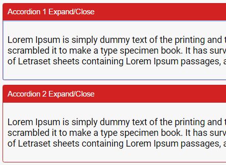
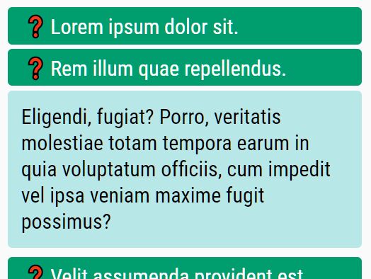
The wfAccordion plugin makes it easy to help developers create responsive and accessible accordions for sectioned content or FAQs.
How It Works:
- Enhance triggers and panels with ARIA attributes:
aria-expanded,aria-hidden,aria-disabled. - Create unique IDs for use in ARIA relationships:
aria-controls,aria-labelledby. - Create ARIA relationships between headers and panels.
- Update ARIA states on click/tap.
- Follows the best practices laid out in WAI-ARIA Authoring Practices 1.2 for Accordions.
- Enhance a given placeholder element with a <button> for better keyboard support.
- Compatible with both jQuery and Vanilla JavaScript.
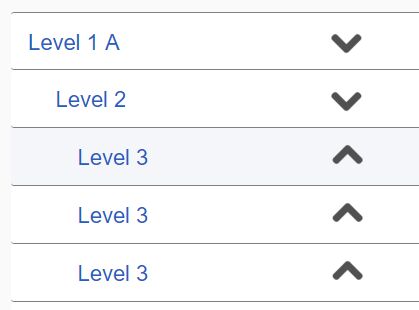
Keyboard support:
- Open/close accordion panels using up / down arrows as well as Ctrl + Page Up / Page Down keys
- Focus the first accordion using End key.
- Focus the last accordion using Home key.
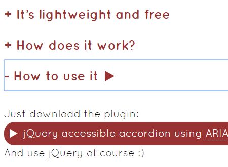
How To Use It:
1. To get started, download and import the wfAccordion.
<!-- jQuery -->
<script src="/path/to/jquery.min.js"></script>
<script src="/path/to/wf.accordion.js"></script>
<!-- Vanilla JavaScript -->
<script src="/dist/wf.accordion.min.js" defer></script>
// ES Module
import 'webfactory-accordion/dist/wf.accordion.min';
2. Build the HTML structure for the accordion.
<div class="wf-accordion-group js-accordion-group">
<div class="wf-accordion js-accordion">
<div class="wf-accordion__header js-accordion__header">
<h3 class="wf-accordion__trigger js-accordion__trigger">This is an accordion</h3>
</div>
<div class="wf-accordion__panel js-accordion__panel">
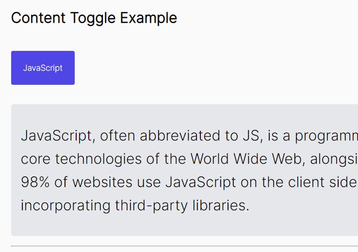
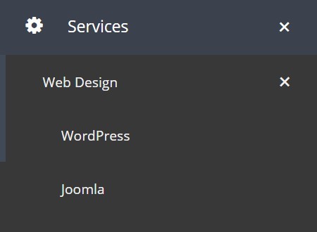
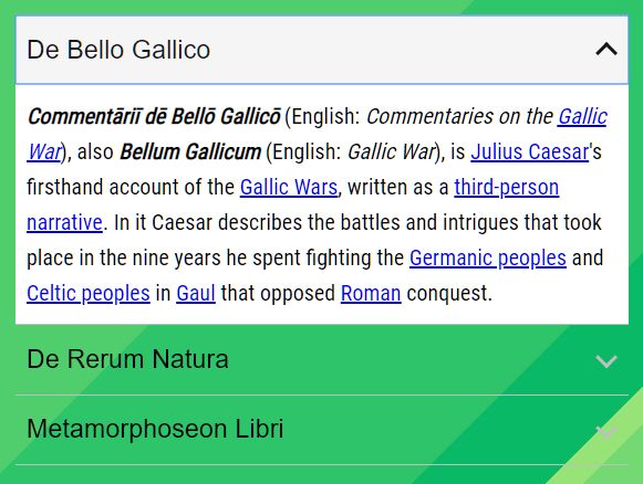
<p>Accordions are a common design pattern in web design. They are often used to hide large chunks of content from the user intially. The aim is to provide a general overview of the content to the user, so that he can decide which part of it is interesting to him and can expand the content via interaction.</p>
</div>
</div>
<div class="wf-accordion js-accordion" data-wf-accordion-expanded="">
<div class="wf-accordion__header js-accordion__header">
<h3 class="wf-accordion__trigger js-accordion__trigger">This accordion is expanded initially</h3>
</div>
<div class="wf-accordion__panel js-accordion__panel">
<p>Add "data-wf-accordion-expanded" to the accordion's root element to expand its panel initially.</p>
</div>
</div>
<div class="wf-accordion js-accordion" data-wf-accordion-disabled="">
<div class="wf-accordion__header js-accordion__header">
<h3 class="wf-accordion__trigger js-accordion__trigger">This accordion has been disabled by adding "data-wf-accordion-disabled" to its root element</h3>
</div>
<div class="wf-accordion__panel js-accordion__panel">
<p>Add "data-wf-accordion-disabled" to the accordion's root element to disable it.</p>
</div>
</div>
<div class="wf-accordion js-accordion">
<div class="wf-accordion__header js-accordion__header">
<h3 class="wf-accordion__trigger js-accordion__trigger">
<span class="some-important-modifier-class">This accordion's trigger element has <em>nested</em> <strong>elements</strong> (e.g. a <code>strong</code> or <code>span</code>)</span>
</h3>
</div>
<div class="wf-accordion__panel js-accordion__panel">
<p>You can use nested elements inside the element with <code>.js-accordion__trigger</code>.</p>
</div>
</div>
<div class="wf-accordion js-accordion">
<div class="wf-accordion__header js-accordion__header">
<div class="wf-accordion__trigger js-accordion__trigger">
<h3>This accordion's trigger element has a nested heading that will become the parent element of the button.</h3>
</div>
</div>
<div class="wf-accordion__panel js-accordion__panel">
<p>To result in valid HTML, the final DOM needs to avoid nesting block-level elements in buttons.</p>
</div>
</div>
</div>
3. Initialize the accordion.
$(function(){
  // jQuery Only
  $('.js-accordion-group').wfAccordion();
});
4. Apply your own CSS styles to the accordion.
/**
* Accordion example styles
*/

.wf-accordion-group {
  margin-top: 15px;
}

/* All elements succeeding an accordion group use margin-top to create white space */
.wf-accordion-group+* {
  margin-top: 30px;
}

/* All accordions have borders… */
.wf-accordion {
  border-top: 1px solid #929292;
  border-bottom: 1px solid #929292;
}

/* …unless they directly succeed another accordion, in which case we reset the top-border
to avoid duplicate white space */
.wf-accordion+.wf-accordion {
  border-top-width: 0;
}

.wf-accordion__header {
  color: #616161;
}

/* Please note: The trigger element is a <button> create via JS. To achieve consistent aesthetics,
 the native button styles have to be resetted here */
.wf-accordion__trigger {
  /* baseline resets */
  background: transparent;
  border-width: 0;
  border-radius: 0;
  box-sizing: border-box;
  cursor: pointer;
  display: inline-block;
  font-size: inherit;
  letter-spacing: inherit;
  line-height: inherit;
  margin: 0;
  padding: 0;
  text-align: left;
  text-decoration: none;
  /* end of baseline resets */

  /* additional styles for the demo */
  display: block;
  font-family: Arial, sans-serif;
  padding: 10px 1.25em 10px 8px;
  position: relative;
  width: 100%;
}

.wf-accordion__trigger::after {
  content: '';
  border: solid #929292;
  border-width: 0 2px 2px 0;
  height: 0.5em;
  position: absolute;
  right: 10px;
  top: 50%;
  transform: translateY(-60%) rotate(45deg);
  width: 0.5em;
}

.wf-accordion__trigger[aria-disabled=true] {
  cursor: not-allowed;
  opacity: 0.5;
}

.wf-accordion__trigger[aria-expanded=true]::after {
  transform: translateY(-30%) rotate(-135deg);
}

.wf-accordion__trigger:hover,
.wf-accordion__trigger:focus {
  background: #f5f5f5;
  color: #161616;
}

.wf-accordion__trigger:hover::after,
.wf-accordion__trigger:focus::after {
  border-color: #161616;
}

.wf-accordion__panel {
  background-color: #fff;
  padding: 10px 8px;
}

.wf-accordion__panel[aria-hidden=true] {
  display: none;
}
5. Available configurations.
$('.js-accordion-group').wfAccordion({

  // default selectors
  accordionGroup: '.js-accordion-group',
  accordionRoot: '.js-accordion',
  accordionHeader: '.js-accordion__header',
  accordionTrigger: '.js-accordion__trigger',
  accordionPanel: '.js-accordion__panel',

  // disables the automated hash update when triggering an accordion
  disableHashUpdate: false,

});
Changelog:
2023-06-07
- Fix slugging when nesting accordions.
-
- Add recursive expanding of accordions on hashupdate.
v4.0.2 (2023-02-09)
- Ensure valid HTML IDs are generated from strings
v4.0 (2023-01-27)
- Drop jQuery dependency
- Change initialisation
- Handle nested HTML in accordion trigger placeholders
- Handle headings as (or nested in) accordion trigger placeholders
2021-07-07
- Set accordion trigger button type to 'button'
2021-07-01
- Remove accordion URL hash when accordion is collapsed
- Support trigger placeholders with nested HTML
2021-02-17
- Throw event when all DOM manipulations are finished
2019-08-24
- Avoid race condition and simplify selector
This awesome jQuery plugin is developed by webfactory. For more Advanced Usages, please check the demo page or visit the official website.