3D Book Flipping Modal Popup With jQuery And CSS3
| File Size: | 2.48 KB |
|---|---|
| Views Total: | 17265 |
| Last Update: | |
| Publish Date: | |
| Official Website: | Go to website |
| License: | MIT |
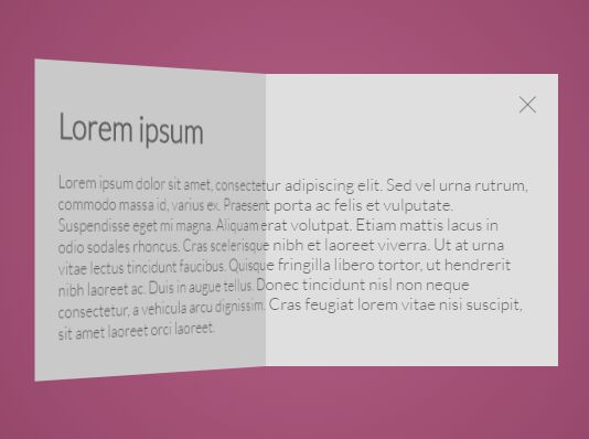
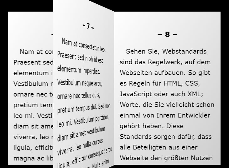
A jQuery and CSS3 based modal popup which allows to reveal the hidden content with a 3D book flipping animation.
How to use it:
1. Create a button to toggle the modal popup.
<div class="button">
  <img src="cover.png">
</div>
2. Add front/back content into the modal popup.
<div class="modal">
  <div class="front">
    <img src="cover.jpg">
  </div>
  <div class="back">
    <div class="content">
      <h1>Content</h1>
      <p>Content</p>
    </div>
  </div>
  <div class="opened">
    <div class="content">
      <h1>Content</h1>
      <p>Content</p>
    </div>
    <div class="close"></div>
  </div>
</div>
3. Create a wrapper element for the 3D flipping animation.
<div class="wrapper"></div>
4. The primary CSS/CSS3 styles for the modal popup and its toggle button.
.button {
  background-image: -webkit-radial-gradient(circle, #e2f0cb, #9bd151);
  background-image: -moz-radial-gradient(circle, #e2f0cb, #9bd151);
  background-image: -ms-radial-gradient(circle, #e2f0cb, #9bd151);
  background-image: radial-gradient(circle, #e2f0cb, #9bd151);
  width: 265px;
  height: 265px;
  box-sizing: border-box;
  text-align: center;
  padding-top: 5px;
  cursor: pointer;
  box-shadow: 0 0 21px rgba(50, 49, 79, 0.3);
  transition: all .4s;
}

.button:hover { box-shadow: 0 0 30px rgba(50, 49, 79, 0.5); }

.modal {
  width: 530px;
  height: 265px;
  perspective: 2000px;
  z-index: 2;
  position: absolute;
  top: calc(50% - 132.5px);
  left: calc(50% - 265px);
  display: none;
}

.shadow { box-shadow: 0 0 30px rgba(50, 49, 79, 0.5); }

.wrapper {
  background: rgba(50, 49, 79, 0.5);
  width: 100%;
  height: 100%;
  position: absolute;
  top: 0;
  left: 0;
  display: none;
}

.front, .back, .opened {
  height: 265px;
  position: absolute;
  box-sizing: border-box;
}

.front {
  background-image: -webkit-radial-gradient(circle, #e2f0cb, #9bd151);
  background-image: -moz-radial-gradient(circle, #e2f0cb, #9bd151);
  background-image: -ms-radial-gradient(circle, #e2f0cb, #9bd151);
  background-image: radial-gradient(circle, #e2f0cb, #9bd151);
  width: 265px;
  text-align: center;
  padding-top: 5px;
  cursor: pointer;
  z-index: 3;
  backface-visibility: hidden;
  transform-origin: 0% 50%;
  box-shadow: 0 0 21px rgba(50, 49, 79, 0.5);
  transform: rotateY(-180deg);
}

.back, .opened {
  width: 530px;
  padding: 35px 25px;
  clip: rect(auto, auto, auto, 265px);
}

.back {
  background: #f2f2f2;
  transform-origin: 50% 50%;
  transform: rotateY(-180deg);
}

.back .content { transform: rotateY(180deg); }

.opened { background: #f2f2f2; }

.close {
  position: absolute;
  top: 15px;
  right: 15px;
  cursor: pointer;
  width: 25px;
  height: 25px;
  background: url(http://i63.tinypic.com/1671taq.png) no-repeat center;
  background-size: cover;
  opacity: .6;
}

.front-open { animation: front 1.1s forwards ease-in-out; }

.back-open { animation: back 1.1s forwards ease-in-out; }

.opened-open { animation: opened 1.1s forwards ease-in-out; }

.front-close { animation: front 1.1s forwards reverse ease-in-out; }

.back-close { animation: back 1.1s forwards reverse ease-in-out; }

.opened-close { animation: opened 1.1s forwards reverse ease-in-out; }
5. The core CSS3 animations for the 3D flipping effect.
@keyframes
front {  0% {
 transform: rotateY(0deg);
 left: 132.5px;
}
 100% {
 transform: rotateY(-180deg);
 left: 265px;
}
}

@keyframes
back {  0% {
 transform: rotateY(0deg);
 left: -132.5px;
 background: #4d4d4d;
}
 100% {
 transform: rotateY(-180deg);
 left: 0;
 background: #f2f2f2;
}
}

@keyframes
opened {  0% {
 left: -132.5px;
 background: #a6a6a6;
}
 100% {
 left: 0;
 background: #f2f2f2;
}
}
6. Don't forget to include the latest version of jQuery library at the bottom of the webpage.
<script src="//code.jquery.com/jquery-2.2.2.min.js"></script>
7. The core JavaScript to active the 3D flipping modal popup.
$('.button').click(function() {
  $(this).hide();
  $('.front').addClass('front-open');
  $('.back').addClass('back-open');
  $('.opened').addClass('opened-open');
  $('.modal').show();
  setTimeout(function() {
    $('.modal').addClass('shadow');
  }, 1000);
  setTimeout(function() {
    $('.front').removeClass('front-open');
    $('.back').removeClass('back-open');
    $('.opened').removeClass('opened-open');
  }, 1200);
  $('.wrapper').delay(500).fadeIn();
});

$('.close').click(function() {
  $('.wrapper').fadeOut(300);
  $('.modal').removeClass('shadow');
  $('.front').addClass('front-close');
  $('.back').addClass('back-close');
  $('.opened').addClass('opened-close');
  setTimeout(function() {
    $('.modal').hide();
    $('.button').show();
    $('.front').removeClass('front-close');
    $('.back').removeClass('back-close');
    $('.opened').removeClass('opened-close');
  }, 1100)
})

$('.wrapper').click(function() {
  $('.wrapper').fadeOut(300);
  $('.modal').removeClass('shadow');
  $('.front').addClass('front-close');
  $('.back').addClass('back-close');
  $('.opened').addClass('opened-close');
  setTimeout(function() {
    $('.modal').hide();
    $('.button').show();
    $('.front').removeClass('front-close');
    $('.back').removeClass('back-close');
    $('.opened').removeClass('opened-close');
  }, 1100)
})
This awesome jQuery plugin is developed by nastasia. For more Advanced Usages, please check the demo page or visit the official website.