3D Full Page Scrolling Effect With jQuery - PageScroll3D
| File Size: | 12.1 KB |
|---|---|
| Views Total: | 6211 |
| Last Update: | |
| Publish Date: | |
| Official Website: | Go to website |
| License: | MIT |
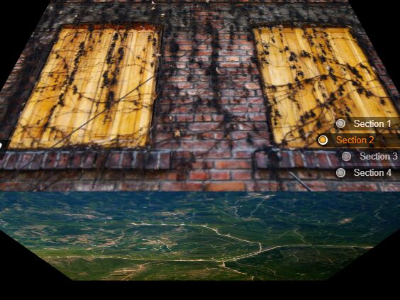
PageScroll3D is a fancy jQuery plugin to create a responsive, fullscreen, vertical page slider where your users are able to scroll through page sections with a 3D cube rotation effect.
How to use it:
1. Load the necessary jQuery library and jQuery mousewheel plugin in your html document.
<script src="/path/to/jquery.min.js"></script>
<script src="/path/to/jquery.mousewheel.min.js"></script>
2. Download and load the PageScroll3D plugin's files in the document.
<link rel="stylesheet" href="jquery.pageScroll3d.min.css">
<script defer src="jquery.pageScroll3d.min.js"></script>
3. Add sectioned pages to the document following the markup structure like this:
<main class="main-content">
  <section>
    <h1>Section 1</h1>
  </section>
  <section>
    <h1>Section 2</h1>
  </section>
  <section>
    <h1>Section 3</h1>
  </section>
  <section>
    <h1>Section 4</h1>
  </section>
</main>
4. Initialize the plugin on document ready and done.
$(document).ready(function() {

  $('.main-content').scroll3D();

});
5. Apply your own CSS styles to the 3D page slider.
.s3d__side {
  background-size: cover;
  background-position: 50% 50%;
  background-repeat: no-repeat;
}

.s3d__side.active h1 { left: -1%; }

.s3d__side:nth-child(1) { background-image: url("1.jpg"); }

.s3d__side:nth-child(2) { background-image: url("2.jpg"); }

.s3d__side:nth-child(3) { background-image: url("3.jpg"); }

.s3d__side:nth-child(4) { background-image: url("41.jpg"); }

.s3d__side h1 {
  display: inline-block;
  position: absolute;
  left: -100%;
  bottom: 10%;
  padding: .2% 1.5% .2% 2.5%;
  background: -webkit-linear-gradient(180deg, rgba(0, 0, 0, 0.7), rgba(0, 0, 0, 0.6));
  background: linear-gradient(-90deg, rgba(0, 0, 0, 0.7), rgba(0, 0, 0, 0.6));
  color: #fff;
  text-shadow: 1px 1px 0 rgba(0, 0, 0, 0.8);
  border-radius: 1px;
  -webkit-transition: left 1s cubic-bezier(0.175, 0.885, 0.32, 1.05);
  transition: left 1s cubic-bezier(0.175, 0.885, 0.32, 1.05);
}
Change log:
2018-01-29
- desrtoy fix
This awesome jQuery plugin is developed by Leon1258. For more Advanced Usages, please check the demo page or visit the official website.