Expanding Fullscreen Tiles with jQuery and CSS3
| File Size: | 2.57 KB |
|---|---|
| Views Total: | 3651 |
| Last Update: | |
| Publish Date: | |
| Official Website: | Go to website |
| License: | MIT |
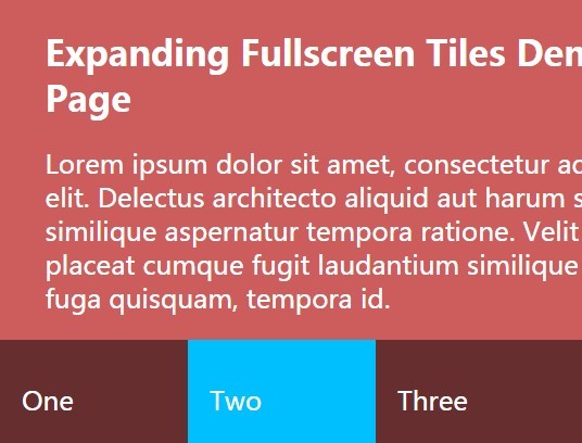
A tutorial on creating a tiles grid that expands/morphs into a fullscreen modal-style content panel using CSS3 and a little bit JavaScript (jQuery).
How to use it:
1. Create a tiles grid from an Html unordered list.
<ul class="tiles">
  <li class="tiles-tile" data-tile="1">
    <h2>One</h2>
  </li>
  <li class="tiles-tile" data-tile="2">
    <h2>Two</h2>
  </li>
  <li class="tiles-tile" data-tile="3">
    <h2>Three</h2>
  </li>
  <li class="tiles-tile" data-tile="4">
    <h2>Four</h2>
  </li>
</ul>
2. Add content to the tiles.
<ul class="content">
  <li class="content-item" id="1">
    <div class="content-wrap">
      <h3>Tile 1</h3>
      <p>Content 1</p>
    </div>
  </li>
  <li class="content-item" id="2">
    <div class="content-wrap">
      <h3>Tile 2</h3>
      <p>Content 2</p>
    </div>
  </li>
  <li class="content-item" id="3">
    <div class="content-wrap">
      <h3>Tile 3</h3>
      <p>Content 3</p>
    </div>
  </li>
  <li class="content-item" id="4">
    <div class="content-wrap">
      <h3>Tile 4</h3>
      <p>Content 4</p>
    </div>
  </li>
</ul>
3. Style the tiles.
.tiles {
  position: fixed;
  z-index: 5;
  bottom: 0;
  display: flex;
  width: 100%;
}

.tiles-tile {
  flex: 1;
  padding: 20px;
  transition: all .25s ease-out;
  background: rgba(0, 0, 0, 0.5);
  cursor: pointer;
}

.tiles-tile.active:nth-child(1) { background: tomato; }

.tiles-tile.active:nth-child(2) { background: deepskyblue; }

.tiles-tile.active:nth-child(3) { background: lightseagreen; }

.tiles-tile.active:nth-child(4) { background: crimson; }

.tiles-tile:hover:nth-child(1) { background: tomato; }

.tiles-tile:hover:nth-child(2) { background: deepskyblue; }

.tiles-tile:hover:nth-child(3) { background: lightseagreen; }

.tiles-tile:hover:nth-child(4) { background: crimson; }
4. Style the content panels.
.content {
  z-index: 10;
  height: 100vh;
  position: fixed;
  top: 0;
}

.content-item {
  position: absolute;
  top: 0;
  left: 0;
  width: 100vw;
  height: 100vh;
  z-index: 10;
  display: flex;
  align-items: center;
  padding: 12vw;
  transform: scale(0);
  transition: all 0.65s cubic-bezier(0.23, 1, 0.32, 1);
}

.content-item.active { transform: scale(1); }

.content-item.active .content-wrap {
  transform: scale(1);
  opacity: 1;
}

.content-item:nth-child(1) {
  transform-origin: 0% 100%;
  background: tomato;
}

.content-item:nth-child(2) {
  transform-origin: 33% 100%;
  background: deepskyblue;
}

.content-item:nth-child(3) {
  transform-origin: 66% 100%;
  background: lightseagreen;
}

.content-item:nth-child(4) {
  transform-origin: 100% 100%;
  background: crimson;
}

.content-item .content-wrap {
  transform: scale(0.7);
  opacity: 0;
  transition: all 0.8s 0.4s cubic-bezier(0.23, 1, 0.32, 1);
}
5. The JavaScript to enable the expanding tiles. Make sure the JS snippet as shown below is loaded after jQuery library, but before the closing body tag.
var tileBtn = $('li.tiles-tile');
var allContent = $('li.content-item');
var contentWrap = $('.content-wrap');

tileBtn.on('click touchstart', function() {
  var self = $(this);
  var match = self.attr('data-tile');
  var allContent = $('li.content-item');
  var content = $('li#' + match);

  self.toggleClass('active');

  content.toggleClass('active');

 contentWrap.css({'transition-delay': '.35s'});

  return false;
});

$(window).on('click touchstart', function() {
  if (allContent.hasClass('active') && tileBtn.hasClass('active')) {
    allContent.removeClass('active');
    setTimeout(function() {
      tileBtn.removeClass('active');
    }, 400);
    contentWrap.css({'transition-delay': '.0s'});

  }
})
This awesome jQuery plugin is developed by arjancodes. For more Advanced Usages, please check the demo page or visit the official website.