Animate Input Text While Typing
| File Size: | 6.28 KB |
|---|---|
| Views Total: | 1516 |
| Last Update: | |
| Publish Date: | |
| Official Website: | Go to website |
| License: | MIT |
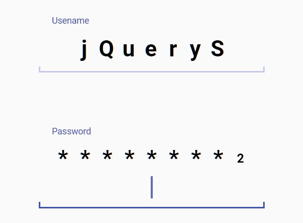
A fancy text typing animation for text fields where the characters show up with a motion using CSS3 transforms and transitions.
See Also:
- Animate Characters In Text Field While Typing - jQuery typingEffect
- Make Characters Fly Out While Typing - jQuery airChars
How to use it:
1. Create text fields as follows:
<div tabindex="1" class="motion_field">
  <label>Usename</label>
  <input disabled>
</div>
<div tabindex="2" class="motion_field password">
  <label>Password</label>
  <input disabled>
</div>
2. Load the necessary jQuery library in the document.
<script src="/path/to/cdn/jquery.slim.min.js"></script>
3. The main script to enable the character typing animation on the text fields.
$(document).on('keypress', '.motion_field', function(e) {
  var _this = $(this);
  if (e.keyCode != 13) {
    var str = String.fromCharCode(e.keyCode);
    $(_this).find('input').val($(_this).find('input').val() + str);
    $(_this).append('<b class=new_char>' + str + '</b>');
    if ($(_this).hasClass('password')) {
      $(_this).find('b:not(:last-of-type)').replaceWith('<b>*</b>').delay(400).queue(function() {
        $(_this).find('b:last-of-type').addClass('hide_char').delay(400).queue(function() {
          $(_this).find('b.hide_char').removeClass('hide_char').addClass('hided_char').html('*');
        });
      });
    }
  }
});

$(document).on('keydown', '.motion_field', function(e) {
  if (e.keyCode == 8 || e.keyCode == 46) {
    e.preventDefault();
    var _this = $(this);
    $(_this).find('b:last-of-type').addClass('hide_char remove_char');
    setTimeout(function() {
      $(_this).children('b:last-of-type').remove();
    }, 200);
    $(_this).find('input').val($(_this).find('input').val().slice(0, -1));
  }
});
4. The main CSS & CSS3 rules for the character typing animation.
@-webkit-keyframes pop_char {
  from {
    bottom: -.5em;
    opacity: 0;
    -webkit-transform: scale(0.8);
            transform: scale(0.8);
  }
}

@keyframes pop_char {
  from {
    bottom: -.5em;
    opacity: 0;
    -webkit-transform: scale(0.8);
            transform: scale(0.8);
  }
}

@-webkit-keyframes hide_char {
  to {
    -webkit-transform: scale(0.5);
            transform: scale(0.5);
  }
}

@keyframes hide_char {
  to {
    -webkit-transform: scale(0.5);
            transform: scale(0.5);
  }
}

@-webkit-keyframes hided_char {
  from {
    -webkit-transform: scale(0.5);
            transform: scale(0.5);
  }
}

@keyframes hided_char {
  from {
    -webkit-transform: scale(0.5);
            transform: scale(0.5);
  }
}

@-webkit-keyframes blink_cursor {
  from {
    opacity: 0;
  }
}

@keyframes blink_cursor {
  from {
    opacity: 0;
  }
}

.motion_field {
  display: inline-block;
  position: relative;
  font-family: 'Roboto';
  font-size: 2.2em;
  min-width: 6em;
  min-height: 2.2em;
  padding: .4em .6em;
  text-align: center;
  cursor: text;
}

.motion_field:before {
  content: '';
  display: block;
  position: absolute;
  right: 0;
  bottom: 0;
  left: 0;
  height: .2em;
  border: .08em solid #C5CAE9;
  border-top-width: 0;
}

.motion_field:after {
  content: '';
  display: inline-block;
  position: relative;
  width: .08em;
  height: 1em;
  top: .2em;
}

.motion_field:focus {
  outline: none;
}

.motion_field:focus:before {
  border-color: #3F51B5;
}

.motion_field:focus:after {
  background-color: #3F51B5;
  -webkit-animation: blink_cursor .5s alternate infinite;
          animation: blink_cursor .5s alternate infinite;
}

.motion_field input {
  display: none;
}

.motion_field label {
  display: block;
  font-size: .4em;
  font-weight: 400;
  text-align: left;
  color: #3F51B5;
  padding-bottom: 1em;
}

.motion_field b {
  position: relative;
  display: inline-block;
  font-weight: 700;
  bottom: 0;
  width: 1em;
  text-align: center;
  -webkit-transition: all .4s;
  transition: all .4s;
}

.motion_field b.new_char {
  -webkit-animation: pop_char .4s;
          animation: pop_char .4s;
}

.motion_field b.hide_char {
  -webkit-animation: hide_char .4s;
          animation: hide_char .4s;
}

.motion_field b.hided_char {
  -webkit-animation: hided_char .4s;
          animation: hided_char .4s;
}

.motion_field b.remove_char {
  width: 0;
}
This awesome jQuery plugin is developed by saadeghi. For more Advanced Usages, please check the demo page or visit the official website.