jQuery & CSS3 Based Card Deck Drop Down List
| File Size: | 3.09 KB |
|---|---|
| Views Total: | 4999 |
| Last Update: | |
| Publish Date: | |
| Official Website: | Go to website |
| License: | MIT |
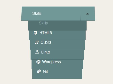
A cool animated card deck-style drop down list built on top of jQuery and CSS3 transitions & transforms.
How to use it:
1. Create a drop down list following the markup structure like this.
<div class="card-drop">
  <a class="toggle" href="#"><span class="label-active">Skills</span></a>
  <ul>
    <li class="active"> <a data-label="Skills" href="#">Skills</a> </li>
    <li> <a data-label="Html5" href="#">HTML5</a> </li>
    <li> <a data-label="CSS3" href="#">CSS3</a> </li>
    <li> <a data-label="Linux" href="#">Linux</a> </li>
    <li> <a data-label="Wordpress" href="#">Wordpress</a> </li>
    <li> <a data-label="Git" href="#">Git</a> </li>
  </ul>
</div>
2. The required CSS/CSS3 rules to style the drop down list.
.card-drop {
max-width: 300px;
position: relative;
margin: 0 auto;
-webkit-perspective: 800px;
-moz-perspective: 800px;
-ms-perspective: 800px;
-o-perspective: 800px;
perspective: 800px;
}
.card-drop a {
display: block;
width: 100%;
background-color: salmon;
padding: 20px 0 20px 20px;
height: 60px;
text-decoration: none;
color: #fff;
background-color: #5f8181;
border-bottom: 1px solid #4e6a6a;
-webkit-transition: all 0.3s ease-out;
-moz-transition: all 0.3s ease-out;
-o-transition: all 0.3s ease-out;
transition: all 0.3s ease-out;
}
.card-drop a i {
display: inline-block;
width: 20px;
}
.card-drop > a.toggle {
position: relative;
z-index: 300;
-webkit-backface-visibility: hidden;
-moz-backface-visibility: hidden;
-ms-backface-visibility: hidden;
-o-backface-visibility: hidden;
backface-visibility: hidden;
-webkit-transform-style: preserve-3d;
-moz-transform-style: preserve-3d;
-ms-transform-style: preserve-3d;
-o-transform-style: preserve-3d;
transform-style: preserve-3d;
-webkit-transform-origin: 50% 0%;
-moz-transform-origin: 50% 0%;
-ms-transform-origin: 50% 0%;
-o-transform-origin: 50% 0%;
transform-origin: 50% 0%;
-webkit-transition: 0.1s linear;
-moz-transition: 0.1s linear;
-o-transition: 0.1s linear;
transition: 0.1s linear;
background-color: #729797;
}
.card-drop > a.toggle:active {
-webkit-transform: rotateX(60deg);
-moz-transform: rotateX(60deg);
-ms-transform: rotateX(60deg);
-o-transform: rotateX(60deg);
transform: rotateX(60deg);
}
.card-drop > a.toggle.active:before { content: "\f0d8"; }
.card-drop > a.toggle:before {
border-left: 1px solid #4E6A6A;
color: #344646;
content: "";
display: block;
font-family: 'FontAwesome';
font-size: 1.3em;
height: 59px;
line-height: 60px;
position: absolute;
right: 0;
text-align: center;
text-shadow: 0 1px 0 rgba(255, 255, 255, 0.3);
top: 0;
width: 60px;
}
.card-drop ul {
position: absolute;
height: 100%;
top: 0;
display: block;
width: 100%;
}
.card-drop ul li {
margin: 0 auto;
-webkit-transition: all, 0.3s ease-out;
-moz-transition: all, 0.3s ease-out;
-o-transition: all, 0.3s ease-out;
transition: all, 0.3s ease-out;
position: absolute;
top: 0;
z-index: 0;
width: 100%;
}
3. Include the necessary jQuery library at h
.card-drop ul li a:hover {
background-color: #6a9090;
color: #dce5e5;
}
.card-drop ul li.active a {
color: #95b1b1;
background-color: #547272;
cursor: default;
}
.card-drop ul li.closed a:hover {
cursor: default;
background-color: #5f8181;
}
3. Include the necessary jQuery library at the bottom of the document.
<script src="//ajax.googleapis.com/ajax/libs/jquery/2.1.1/jquery.min.js"></script>
4. The Javascript to enable the cool card deck drop down list.
$(document).ready(function(){
(function($){

var cards = $(".card-drop"),
toggler = cards.find(".toggle"),
links = cards.find("ul>li>a"),
li = links.parent('li'),
count = links.length,
width = links.outerWidth();

console.info(count);

console.info(width);
console.info(toggler);
console.info(links);
console.info(li);
console.info(cards );

links.parent("li").each(function(i){
$(this).css("z-index" , count - i); //invert the index values
});

function setClosed(){
li.each(function(index){
$(this).css("top" , index *2)

.css("width" , width - index *20)
.css("margin-left" , (index*20)/2)
.css("margin-left" , (index*20)/2);
});

li.addClass('closed');
toggler.removeClass("active");
}
setClosed();

toggler.on("mousedown" , function(){
var $this = $(this);

console.info(this);
if($this.is(".active")){
setClosed();
}else{

$this.addClass("active");
li.removeClass('closed');

li.each(function(index){
 $(this).css("top" , 60 * (index + 1))
 .css("width" ,"70%")
 .css("margin-left" , "40px");
});
}
});

links.on("click" , function(e){
var $this = $(this),
label = $this.data("label");
icon = $this.children("i").attr("class");

li.removeClass('active');
if($this.parent("li").is("active")){
$this.parent('li').removeClass("active");
}else{
$this.parent("li").addClass("active");
}
toggler.children("span").text(label);
toggler.children("i").removeClass().addClass(icon);
setClosed();
e.preventDefault;
});

})(jQuery);
});
This awesome jQuery plugin is developed by Brady Sammons. For more Advanced Usages, please check the demo page or visit the official website.