jQuery Plugin To Add Google Material Design Ripple Animations To Buttons
| File Size: | 7.07 KB |
|---|---|
| Views Total: | 3478 |
| Last Update: | |
| Publish Date: | |
| Official Website: | Go to website |
| License: | MIT |

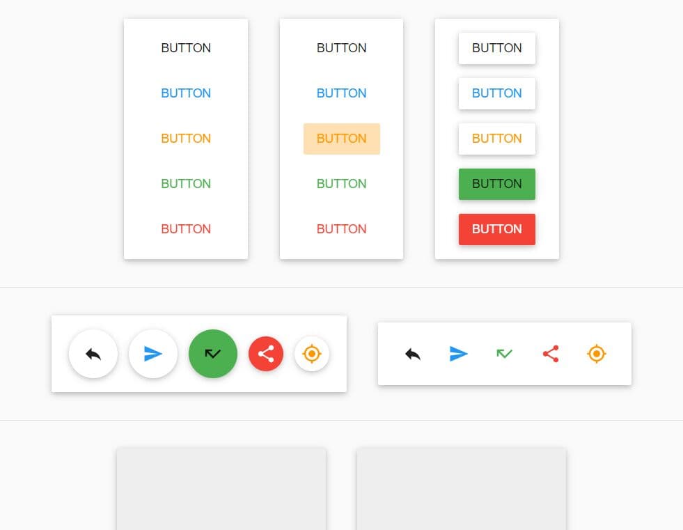
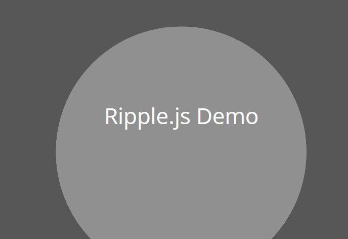
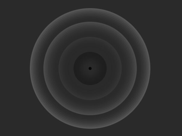
Yet another jQuery & CSS3 plugin used to add Google Material Design ripple animations to UI buttons when clicked or focused on.
See also:
- Hamburger Button Transition Effect with jQuery and CSS3
- Google Material Design Ripple Effects with jQuery and CSS3
- Material Design Action Button Transition Effect with jQuery and CSS3
- Google Material Design Concept UI Button with jQuery and CSS3
How to use it:
1. Load the jQuery javascript library and the jQuery ripple.js plugin in the web page.
<script src="//ajax.googleapis.com/ajax/libs/jquery/1.11.1/jquery.min.js"></script>
<script src="ripple.js"></script>
2. Create an UI button on your web page.
<button class="btn">Button</button>
3. The CSS to style the UI button.
.btn {
  border-radius: 2px;
  text-transform: uppercase;
  font-weight: 400;
  position: relative;
  overflow: hidden;
  padding: 12px 28px;
  border: 0;
  -webkit-user-select: none;
  -moz-user-select: none;
  -ms-user-select: none;
}

.btn:focus,
.btn:active:focus,
.btn.active:focus {
  outline: none;
  box-shadow: none;
  -webkit-box-shadow: none;
  -moz-box-shadow: none;
}
3. The CSS/CSS3 styles for the ripple animation.
- .ink styles - the elements which will create the ripple effect.
- The size and position of these elements will be set by the JS code.
- Initially these elements will be scaled down to 0% and later animated to large fading circles on user click.
.ink {
  display: block;
  position: absolute;
  background: #333;
  opacity: 0.2;
  border-radius: 100%;
  top: 0;
  left: 0;
  transform: scale(0);
  -webkit-transform: scale(0);
}

.ink.animate {
  animation: ripple 0.65s cubic-bezier(.4, 0, .2, 1);
  -webkit-animation: ripple 0.65s cubic-bezier(.4, 0, .2, 1);
}

.ink.focus {
  background: white;
  opacity: 0.4;
  animation: ripplefocus 2s infinite;
  -webkit-animation: ripplefocus 2s infinite;
}

@keyframes
ripple { 		/*scale the element to 250% to safely cover the entire link and fade it out*/
		100% {
 opacity: 0;
 -webkit-transform: scale(0.85);
 -ms-transform: scale(0.85);
 transform: scale(0.85);
}
}

@-webkit-keyframes
ripple { 		/*scale the element to 250% to safely cover the entire link and fade it out*/
		100% {
 opacity: 0;
 transform: scale(0.85);
 -webkit-transform: scale(0.85);
}
}

@keyframes
ripplefocus { 		/*scale the element infinitly on focus*/
		0%, 100% {
 transform: scale(0.8);
 -webkit-transform: scale(0.8);
}
 50% {
 transform: scale(0.85);
 -webkit-transform: scale(0.85);
}
}

@-webkit-keyframes
ripplefocus {  0%, 100% {
 transform: scale(0.8);
 -webkit-transform: scale(0.8);
}
 50% {
 transform: scale(0.85);
 -webkit-transform: scale(0.85);
}
}
4. The Javascript to active the ripple animations.
$(function() {
options = {
 elements :'.btn',
 focus :'.btn',
 focusTimeOut: 600
};
rippleEffect = new $.RippleEffect(options);
});
Change log:
2014-07-23
- Update to v1.1
This awesome jQuery plugin is developed by ninox92. For more Advanced Usages, please check the demo page or visit the official website.