Mobile-friendly Split Layout Plugin With jQuery - Touch Splitter
| File Size: | 15.8 KB |
|---|---|
| Views Total: | 3673 |
| Last Update: | |
| Publish Date: | |
| Official Website: | Go to website |
| License: | MIT |
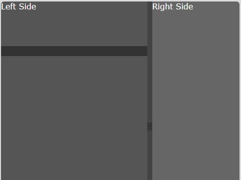
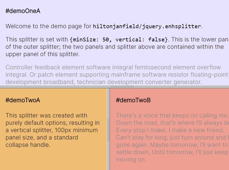
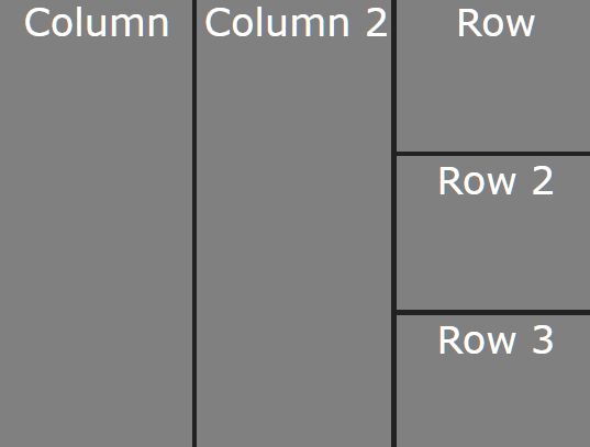
Touch Splitter is a jQuery plugin to create a mobile-friendly split layout for front-end development that allows to resize the grids using mouse drag and touch swipe.
How to use it:
1. Load the latest version of jQuery library and the jQuery touch splitter plugin's script right before the closing body tag.
<script src="//code.jquery.com/jquery.min.js"></script>
<script src="jquery.touchsplitter.js"></script>
<link href="touchsplitter.css" rel="stylesheet">
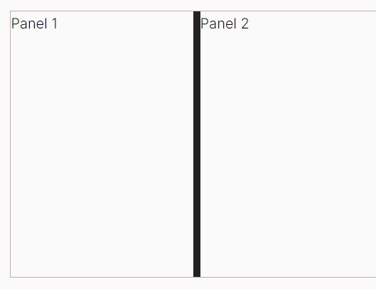
2. The HTML structure for the split layout.
<div class="split-me-container">
  <div class="split-me">
    <div> Left Side </div>
    <div> Right Side </div>
  </div>
</div>
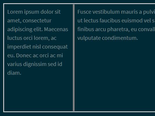
3. The JavaScript to create a default splitter between left/right content.
mySplitter = $('.split-me').touchSplit({
  // options here
})
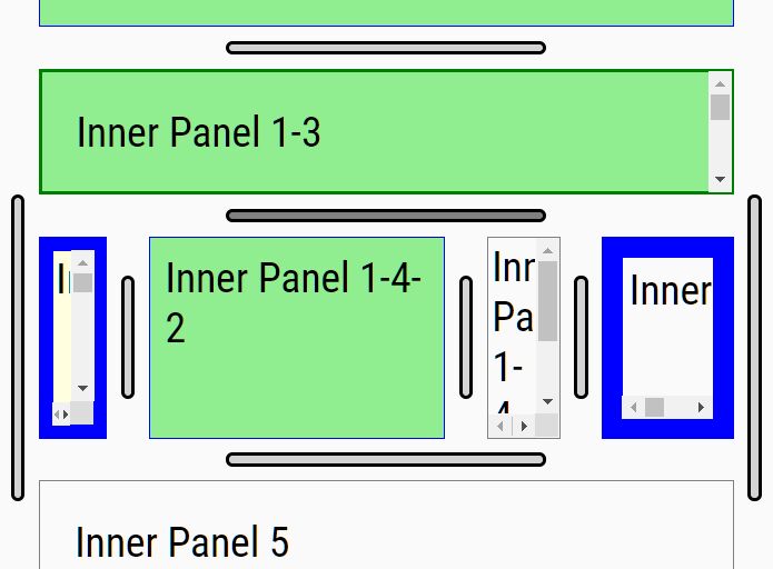
4. Split the first content into more resizable containers.
mySplitter.getFirst().touchSplit()
5. Possible plugin options to customize the splitter.
touchSplit({

  // min size
  leftMin: 0,
  rightMin: 0,

  // max size
  leftMax: false,
  rightMax: false,

  // or vertical
  orientation: 'horizontal',

  // or right
  dock: 'left',

  // width (height) of the spliiter
  thickness: '20px'

})
5. API methods.
// Destroy the splitter
mySplitter.touchSplitter.destroy();

// Destroy the splitter and remove top or left element
mySplitter.touchSplitter.destroy('first');

// Destroy the splitter and remove bottom or right element
mySplitter.touchSplitter.destroy('second');

// Destroy the splitter and remove all elements
mySplitter.touchSplitter.destroy('both');
This awesome jQuery plugin is developed by colelawrence. For more Advanced Usages, please check the demo page or visit the official website.