Enhanced Draggable Splitter jQuery Plugin - enhsplitter.js
| File Size: | 23.6 KB |
|---|---|
| Views Total: | 2084 |
| Last Update: | |
| Publish Date: | |
| Official Website: | Go to website |
| License: | MIT |
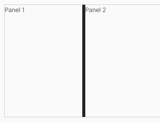
enhsplitter.js is a feature-rich jQuery plugin for creating draggable splitters (also known as split layout or split view) to separate content on your webpage.
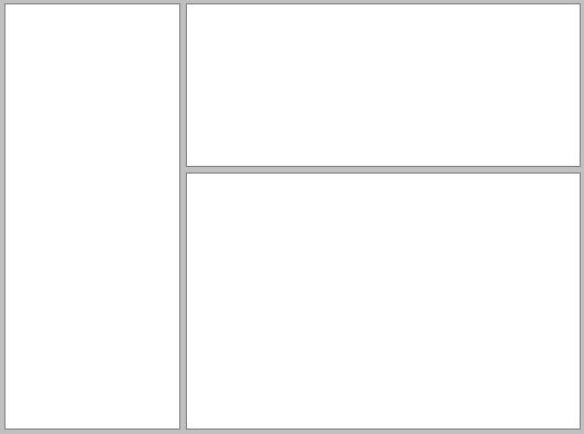
With this plugin, you can split any content area on the page horizontally or vertically, and users can drag the splitter to resize the adjacent content areas. Can be used in a variety of web applications to create split views, resizable panes, and complex frames.
See Also:
How to use it:
1. To get started, include the jQuery enhsplitter.js on the webpage.
<!-- jQuery is required -->
<script src="/path/to/cdn/jquery.slim.min.js"></script>

<!-- enhsplitter.js plugin -->
<script src="js/jquery.enhsplitter.js"></script>
<link href="css/jquery.enhsplitter.css" rel="stylesheet"/>
2. Initialize the plugin to insert a draggable splitter between two DIV elements as follows:
<div id="panels">
  <div>
    Pane 1
  </div>
  <div>
    Pane 2
  </div>
</div>
$(function(){
  $('#panels').enhsplitter();
});
3. Available options to customize the splitter.
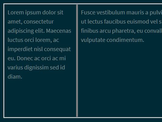
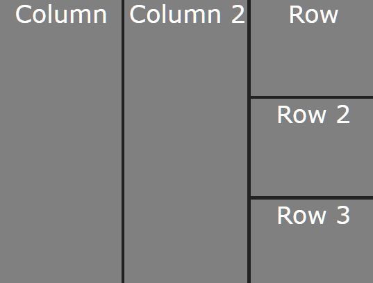
- vertical: Determines whether the splitter is vertical or horizontal.
- minSize, leftMinSize, rightMinSize, topMinSize, bottomMinSize: Defines the minimum sizes for each panel, in pixels.
- maxSize, leftMaxSize, rightMaxSize, topMaxSize, bottomMaxSize: Defines the maximum sizes for each panel, in pixels.
- position: Sets the starting size for the left or top panel. Position can be defined in pixels by passing an number
{position: 125}, or a string with a 'px' suffix{position: '125px'}, or as a percentage as a string with a '%' suffix.{position: '25%'}. Strings without a suffix will be assumed to be in pixels. - invisible: Turns the splitter invisible. The splitter will still work, there will simply be no visible control. This is similar to the splitter functionality in JetBrains IDEs.
- handle: Defines how the the collapse is drawn.
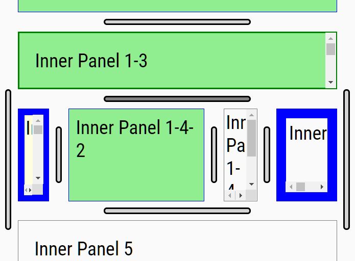
'default'is currently equivalent to 'stripes' but may change in the future.'stripes'draws a striped handle, as shown in the first two examples above. 'bar' draws a narrow grey bar, as shown in the third example above.'block'draws a wide grey block that fills the width of the splitter.'dots'draws five small equidistant dots with no border.'lotsofdots'draws a series of small dots.'none'hides the handle completely, disabling it. This effect is also achieved when setting{invisible: true};it is not necessary to set both.<user-defined>- Identifier for any CSS class you create. By adding new .splitter-handle- classes (see the CSS file), you can create custom styles without overriding the standard ones. - collapse: Determines which direction (['left'|'right'|'up'|'down'|'none']) the panel collapses when the handle is clicked. Setting {collapse: 'none'} leaves the handle visible while disabling its functionality, leaving the handle and hover/active effects in place for standard dragging.
- fixed: Fixes the splitter in place by disabling dragging. This option does not affect the collapse handle. This option is useful for creating fixed width navigation, tool, or other bars. When the options {position: 150, minSize: 0, fixed: true} are used together, it creates a splitter with a narrow panel (in this case 150px) that cannot be resized, but is completely hidden when the collapse handle is clicked (and vice versa).
- height: Specifies the height of the container. Any CSS value can be used; numbers with no suffix will be treated as pixel values. In the instance that the both the container and parent heights have not been specified, the CSS on the container will cause the height to become 0. If this happens, height will default to 10em.
- splitterSize: Specifies the size of the splitter bar, allowing some limited customization for individual splitters without custom CSS. Ideal when paired with
{invisible: true}, also useful for increasing the splitter size on mobile sites (for easier use on touch devices). Any CSS value can be used; numbers with no suffix will be treated as pixel values. - onDragStart: Event handler called when a user starts dragging a splitter.
- onDragEnd: Event handler called when a user stops dragging a splitter.
- onDrag: Event handler called after a user moves a splitter.
$('#panels').enhsplitter({
  vertical: true,
  position: '50%',
  leftMinSize: 100,
  leftMaxSize: null,
  rightMinSize: 100,
  rightMaxSize: null,
  invisible: false,
  handle: 'default',
  fixed: false,
  collapse: 'left',
  height: null,
  splitterSize: null,
  onDragStart: function (event, splitter_container) { ... },
  onDragEnd: function (event, splitter_container) { ... },
  onDrag: function (event, splitter_container) { ... },
});
$(function(){
  $('#panels').enhsplitter();
});
4. API methods.
// Changes the splitter position to the location specified (with range checks).
$('#panels').enhsplitter('move', [number (px)|string (px|%)])

// Forces a refresh of the container size and splitter location (with range checks).
$('#panels').enhsplitter('refresh')

// Resets the splitter location to it's starting position.
$('#panels').enhsplitter('reset')

// Collapses the splitter as if the collapse handle was clicked.
$('#panels').enhsplitter('collapse')

// Returns the splitter to it's pre-collapsed position.
$('#panels').enhsplitter('uncollapse')

// Sets whether the splitter is visible or not. This is equivalent to (but opposite from) the invisible option, visually hiding the splitter but leaving it usable.
$('#panels').enhsplitter('visible', [true|false])

// Equivalent to the handle option, changes the handle style on the fly.
$('#panels').enhsplitter('handle', ['default'|'bar'|'block'|'none'|<user-defined>])

// Removes the splitter container, splitter panels, and splitter bar, returning the DOM to its previous layout.
$('#panels').enhsplitter('destroy');
This awesome jQuery plugin is developed by hiltonjanfield. For more Advanced Usages, please check the demo page or visit the official website.