Awesome Swing Out Modal with jQuery and CSS3
| File Size: | 4.85 KB |
|---|---|
| Views Total: | 4846 |
| Last Update: | |
| Publish Date: | |
| Official Website: | Go to website |
| License: | MIT |
This is jQuery & CSS3 based modal component that helps you create a beautiful, responsive modal popup with an awesome swing out animation when triggered.
How to use it:
1. Include the Font Awesome 4 for modal close icon (OPTIONAL).
<link rel="stylesheet" href="font-awesome.min.css">
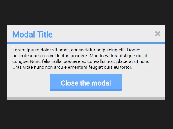
2. Create the modal with a trigger button on the webpage.
<div class="container">
  <div class="btn open">
    Lanuch a modal
  </div>
  <div class="circle"></div>
  <div class="modal">
    <div class="modal-container">
      <div class="title">
        Modal Title
        <i class="fa fa-times close"></i>
      </div>
      <div class="modal-content">
        Modal Content
      </div>
      <div class="btn close">
        Close the modal
      </div>
    </div>
  </div>
</div>
3. Style the modal.
.btn.open, .modal .btn.close, .circle, .modal {
  position: absolute;
  top: 50%;
  left: 50%;
  transform: translate(-50%, -50%);
}

.modal {
  background: #ECECEC;
  border-radius: 3px;
  box-shadow: 0 8px 0 0 #bebebe;
  padding: 0;
}

.modal .title {
  color: #4E9CFF;
  font-size: 28px;
  font-weight: bold;
  margin-top: -5px;
  padding: 10px 15px 10px 20px;
  border-bottom: 5px solid #4E9CFF;
  margin: -15px -20px 12px;
}

.modal .title i {
  float: right;
  color: #1e1e1e;
  opacity: .3;
  transition: all .2s ease;
  cursor: pointer;
}

.modal .title i:hover { opacity: .5; }

.modal .modal-content {
  float: none;
  clear: both;
  font-size: 16px;
}

.modal .modal-content { line-height: 1.3; }

.modal .btn.close {
  top: 78%;
  height: 50px;
  padding: 15.5px;
  font-size: 24px;
  background: #6dadff;
  box-shadow: 0 8px 0 0 #4E9CFF;
  cursor: pointer;
  transition: all .3s ease;
}

.modal .btn.close:hover {
  box-shadow: 0 5px 0 0 #4496ff;
  margin-top: 3px;
}

.modal .btn.close:active {
  box-shadow: 0 0 0 0 #2f8bff;
  margin-top: 8px;
}

.modal-container { display: none; }
4. Create the modal swing out animation using CSS3 transitions and @keyframes.
.circle {
  border-radius: 100%;
  height: 2px;
  width: 2px;
  background: #F47265;
  opacity: .3;
  z-index: 2;
  transition: all .8s ease;
}

.in { animation: in 1s ease; }

.out { animation: out 1s ease; }

@keyframes
in {  0% {
 height: 0;
 width: 0;
 z-index: 0;
}
 30% {
 top: 20%;
 z-index: 0;
}
 60% {
 z-index: 1000;
}
 100% {
 top: 50%;
 z-index: 1000;
 height: 250px;
 width: 550px;
}
}

@keyframes
out {  0% {
 top: 50%;
 z-index: 1000;
 height: 250px;
 width: 550px;
}
 30% {
 top: 80%;
 z-index: 1000;
 padding: 0;
}
 60% {
 z-index: 0;
}
 90%, 100% {
 height: 0;
 width: 0;
 z-index: 0;
}
}

.circle-active {
  height: 700px;
  width: 700px;
  opacity: 0;
}

.circle-hide { opacity: 0 !important; }
5. Make sure you have jQuery library loaded in the webpage.
<script src="//code.jquery.com/jquery-2.1.4.min.js"></script>
6. A little jQuery script to help out with clicked states.
$( ".open" ).click(function() {
  $(".modal").removeClass("out");
  $(".modal").addClass("in");
  setTimeout(function() {
    $(".modal").css("z-index", "1000");
    $(".modal").css("height", "250px");
    $(".modal").css("width", "550px");
    $(".modal").css("padding", "20px");
  }, 700);
  setTimeout(function() {
    $(".modal-container").fadeIn("slow");
  }, 900);
  $(".circle").addClass("circle-active");
  setTimeout(function() {
    $(".circle").removeClass("circle-active");
    $(".circle").addClass("circle-hide");
  }, 800);
});

$( ".close" ).click(function() {
  $(".modal-container").fadeOut("fast");
  $(".circle").removeClass("circle-hide");
  setTimeout(function() {
    $(".modal").removeClass("in");
    $(".modal").addClass("out");
  }, 150);
  setTimeout(function() {
    $(".modal").css("z-index", "0");
    $(".modal").css("height", "0");
    $(".modal").css("width", "0");
    $(".modal").css("padding", "0");
  }, 150);
});
This awesome jQuery plugin is developed by MichaelRyanSmith. For more Advanced Usages, please check the demo page or visit the official website.