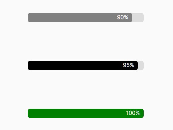
Create Stylish Animated Progress Bars with jQuery and CSS3
| File Size: | 2.44 KB |
|---|---|
| Views Total: | 5284 |
| Last Update: | |
| Publish Date: | |
| Official Website: | Go to website |
| License: | MIT |
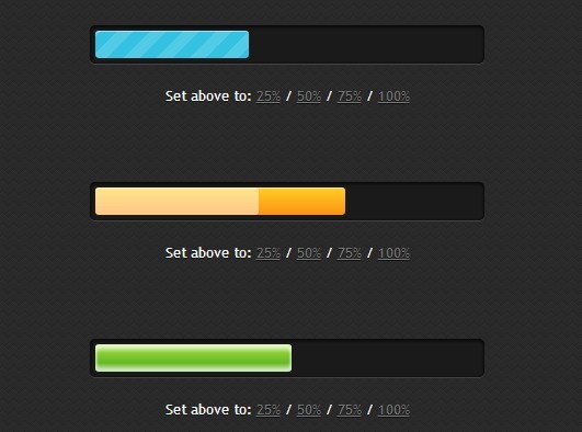
In this article we're going to create a stylish progress bar animated with CSS3 and a little jQuery magic.
How to use it:
1. Create a progress bar with controls as follows. Use CSS width property to specify the initial percentage of the progress bar.
<div class="progress-bar blue stripes"> <span style="width: 60%"></span> </div>

<a href="#" class="quarter">25%</a>
<a href="#" class="half">50%</a>
<a href="#" class="three-quarters">75%</a>
<a href="#" class="full">100%</a> </p>
2. The required CSS/CSS3 rules to animate the progress bar.
.progress-bar {
  background-color: #1a1a1a;
  height: 25px;
  padding: 5px;
  width: 350px;
  margin: 70px 0 20px 0;
  -moz-border-radius: 5px;
  -webkit-border-radius: 5px;
  border-radius: 5px;
  -moz-box-shadow: 0 1px 5px #000 inset, 0 1px 0 #444;
  -webkit-box-shadow: 0 1px 5px #000 inset, 0 1px 0 #444;
  box-shadow: 0 1px 5px #000 inset, 0 1px 0 #444;
}

.progress-bar span {
  display: inline-block;
  height: 100%;
  background-color: #777;
  -moz-border-radius: 3px;
  -webkit-border-radius: 3px;
  border-radius: 3px;
  -moz-box-shadow: 0 1px 0 rgba(255, 255, 255, .5) inset;
  -webkit-box-shadow: 0 1px 0 rgba(255, 255, 255, .5) inset;
  box-shadow: 0 1px 0 rgba(255, 255, 255, .5) inset;
  -webkit-transition: width .4s ease-in-out;
  -moz-transition: width .4s ease-in-out;
  -ms-transition: width .4s ease-in-out;
  -o-transition: width .4s ease-in-out;
  transition: width .4s ease-in-out;
}

.blue span { background-color: #34c2e3; }

.stripes span {
  -webkit-background-size: 30px 30px;
  -moz-background-size: 30px 30px;
  background-size: 30px 30px;
  background-image: -webkit-gradient(linear, left top, right bottom, color-stop(.25, rgba(255, 255, 255, .15)), color-stop(.25, transparent), color-stop(.5, transparent), color-stop(.5, rgba(255, 255, 255, .15)), color-stop(.75, rgba(255, 255, 255, .15)), color-stop(.75, transparent), to(transparent));
  background-image: -webkit-linear-gradient(135deg, rgba(255, 255, 255, .15) 25%, transparent 25%, transparent 50%, rgba(255, 255, 255, .15) 50%, rgba(255, 255, 255, .15) 75%, transparent 75%, transparent);
  background-image: -moz-linear-gradient(135deg, rgba(255, 255, 255, .15) 25%, transparent 25%, transparent 50%, rgba(255, 255, 255, .15) 50%, rgba(255, 255, 255, .15) 75%, transparent 75%, transparent);
  background-image: -ms-linear-gradient(135deg, rgba(255, 255, 255, .15) 25%, transparent 25%, transparent 50%, rgba(255, 255, 255, .15) 50%, rgba(255, 255, 255, .15) 75%, transparent 75%, transparent);
  background-image: -o-linear-gradient(135deg, rgba(255, 255, 255, .15) 25%, transparent 25%, transparent 50%, rgba(255, 255, 255, .15) 50%, rgba(255, 255, 255, .15) 75%, transparent 75%, transparent);
  background-image: linear-gradient(135deg, rgba(255, 255, 255, .15) 25%, transparent 25%, transparent 50%, rgba(255, 255, 255, .15) 50%, rgba(255, 255, 255, .15) 75%, transparent 75%, transparent);
  -webkit-animation: animate-stripes 3s linear infinite;
  -moz-animation: animate-stripes 3s linear infinite;
}
 @-webkit-keyframes
animate-stripes { 0% {
background-position: 0 0;
}
100% {
background-position: 60px 0;
}
}
 @-moz-keyframes
animate-stripes { 0% {
background-position: 0 0;
}
100% {
background-position: 60px 0;
}
}
3. Include the jQuery javascript library at the bottom of the page.
<script src="//ajax.googleapis.com/ajax/libs/jquery/2.1.1/jquery.min.js"></script>
4. The jQuery script for the progress bar controls.
<script>
$(document).ready(function(){
$('.quarter').click(function(){
  $(this).parent().prev().children('span').css('width','25%');
  });
$('.half').click(function(){
  $(this).parent().prev().children('span').css('width','50%');
  });
$('.three-quarters').click(function(){
  $(this).parent().prev().children('span').css('width','75%');
  });
$('.full').click(function(){
  $(this).parent().prev().children('span').css('width','100%');
  });
});
</script>
This awesome jQuery plugin is developed by my-dna. For more Advanced Usages, please check the demo page or visit the official website.