Easy Accessible jQuery Tabs Plugin - accTabs
| File Size: | 70.5 KB |
|---|---|
| Views Total: | 1124 |
| Last Update: | |
| Publish Date: | |
| Official Website: | Go to website |
| License: | MIT |
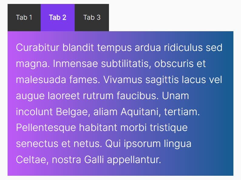
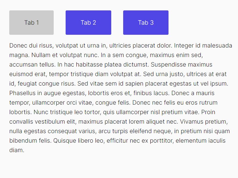
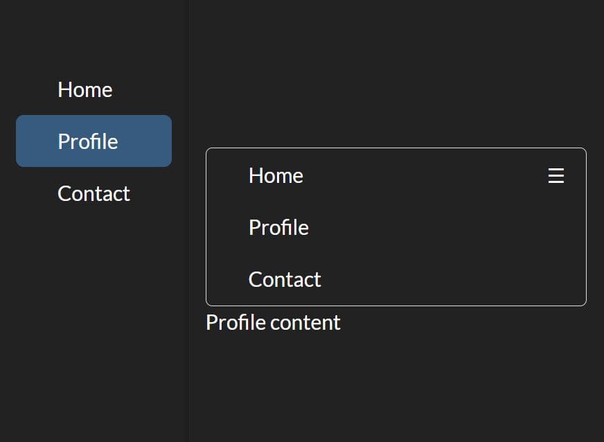
accTabs is a really simple jQuery plugin for rendering a fully accessible tabs component that uses WAI-ARIA roles and state markups to provide an universal experience on various devices and screen readers.
How to use it:
1. To get started, you first need to include the jQuery accTabs plugin after jQuery library.
<script src="//code.jquery.com/jquery-1.11.3.min.js"></script>
<script src="jquery.accTabs.js"></script>
2. And then build the markup structure for the tabs component as follow.
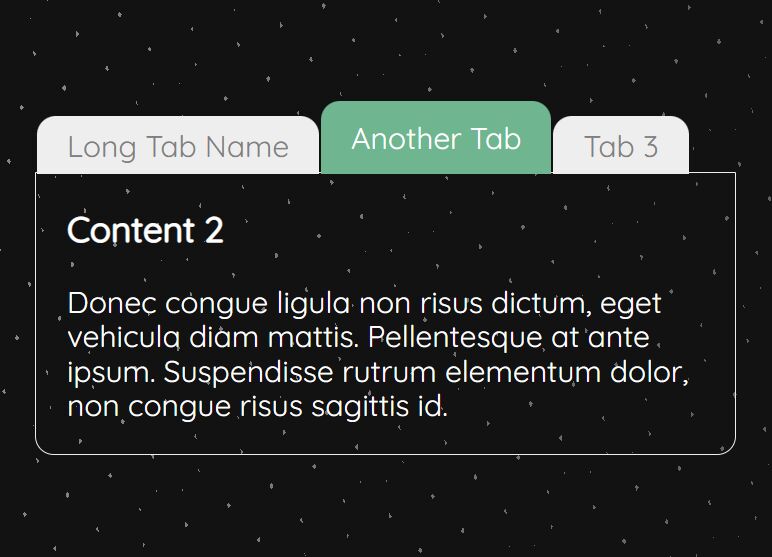
<div class="tabs demo">
  <h3>Tabs title one</h3>
  <div>
    <p>Tabs Panel One</p>
  </div>
  <h3>Tabs title two</h3>
  <div>
    <p>Tabs Panel Two</p>
  </div>
  <h3>Tabs title three</h3>
  <div>
    <p>Tabs Panel Three</p>
  </div>
</div>
3. Just call the function on the top element and the plugin will do the rest.
$(".demo").accTabs();
4. Style the tabs component using your own CSS styles.
/* Tabs control text */
.js-tabs_control-text {
direction: ltr;
left: -999em;
position: absolute;
}
/* Tabs control */
.js-tabs .js-tabs_control {
float: left;
list-style: none;
margin: 0;
padding: 0;
position: relative;
z-index: 1000;
}
.js-tabs .js-tabs_control li {
background: #ddd;
border-width: 1px 1px 0;
float: left;
margin: 0 10px 0 0;
padding: 0;
position: relative;
}
.js-tabs .js-tabs_control button {
background: transparent;
border: none;
cursor: pointer;
padding: 8px 0.5em 10px;
position: relative;
outline: 0;
text-decoration: none;
}
.js-tabs .js-tabs_control button:hover, .js-tabs .js-tabs_control button:focus, .js-tabs .js-tabs_control button:active {
border-color: #000;
text-decoration: underline;
}
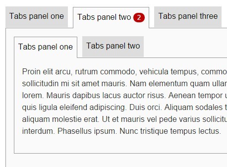
.js-tabs .js-tabs_control .badge {
background-color: #C00000;
border-radius: 10px;
font-size: 80%;
color: #fff;
display: inline-block;
margin-left: 5px;
padding: 0 8px;
text-decoration: none;
}
/* Selected tabs control */
.js-tabs .js-tabs_control .js-tabs_control-item--active, .js-tabs .js-tabs_control .js-tabs_control-item--active:focus, .js-tabs .js-tabs_control .js-tabs_control-item--active:active {
background: #fafafa;
border: 1px solid #999;
border-bottom: none;
color: #333;
top: 1px;
z-index: 1000;
}
/* Tabs panel */
.js-tabs .js-tabs_panel {
background-color: #fafafa;
border: 1px solid #999;
color: #333;
clear: left;
display: block;
overflow: auto;
position: relative;
padding: 0 1em 1em;
visibility: visible;
z-index: 5;
}
.js-tabs .js-tabs_panel:focus { outline: 1px dotted #999; }
5. Default plugin settings.
$(".demo").accTabs({
  // Specify which tab to open by default using 0-based position
  defaultTab: 0,

  // Callback when the plugin is created
  callbackCreate: function() {},

  // Callback when the plugin is destroyed
  callbackDestroy: function() {},

  // A class applied to the target element
  containerClass: 'js-tabs',

  // A class applied to the active tab control
  controlActiveClass: 'js-tabs_control-item--active',

  // An explanation of how the tabs operate, which is prepended to the tabs content
  controlsText: 'Use the tab and enter or arrow keys to move between tabs',

  // Class to apply to the controls text element
  controlsTextClass: 'js-tabs_control-text',

  // A class applied to the active panel
  panelActiveClass: 'js-tabs_panel--active',

  // Class to apply the controls list
  tabControlsClass: 'js-tabs_control',

  // Ids for tab controls should start with the following string
  tabControlId: 'js-tabs_control-item--',

  // Class to be applied to the tab panel
  tabPanelClass: 'js-tabs_panel',

  // Ids for tab panels should start with the following string
  tabPanelId: 'js-tabs_panel--',

  // Callback when the tab is activated
  callbackTabActivated: function() {}

});
This awesome jQuery plugin is developed by nomensa. For more Advanced Usages, please check the demo page or visit the official website.