Responsive Vertical Bootstrap 5 Tabs/Pills With jQuery And CSS
| File Size: | 3.98 KB |
|---|---|
| Views Total: | 3821 |
| Last Update: | |
| Publish Date: | |
| Official Website: | Go to website |
| License: | MIT |
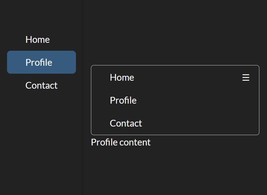
This is a responsive, mobile-friendly, vertical tabs/pills component built with jQuery, CSS/CSS3, and Bootstrap 5 framework.
It can collapse the vertical pills into a hamburger button on small screens, where you can switch between tabbed content from a dropdown menu.
See Also:
How to use it:
1. Load the required jQuery library and Bootstrap 5 framework.
<link rel="stylesheet" href="/path/to/cdn/bootstrap.min.css" />
<script src="/path/to/cdn/jquery.slim.min.js"></script>
<script src="/path/to/cdn/bootstrap.bundle.min.js"></script>
2. The HTML structure for the vertical tabs/pills.
<div class="d-flex align-items-start responsive-tab-menu">
  <!-- Tabs/Pills -->
  <ul class="nav flex-column nav-pills nav-tabs-dropdown me-3" id="v-pills-tab" role="tablist"
      aria-orientation="vertical">
      <li class="nav-item">
        <a class="nav-link text-start active" href="#" id="v-pills-home-tab" data-bs-toggle="pill" data-bs-target="#v-pills-home" role="tab" aria-controls="v-pills-home" aria-selected="true">
          Home
        </a>
      </li>
      <li class="nav-item">
        <a class="nav-link text-start" href="#" id="v-pills-profile-tab" data-bs-toggle="pill" data-bs-target="#v-pills-profile" role="tab" aria-controls="v-pills-profile" aria-selected="false">
          Profile
        </a>
      </li>
      <li class="nav-item">
        <a class="nav-link text-start" href="#" id="v-pills-contact-tab" data-bs-toggle="pill" data-bs-target="#v-pills-contact" role="tab" aria-controls="v-pills-profile" aria-selected="false">
          Contact
        </a>
      </li>
  </ul>
  <!-- Tabbed Content -->
  <div class="tab-content responsive-tab-content" id="v-pills-tabContent">
    <div class="tab-pane fade show active" id="v-pills-home" role="tabpanel" aria-labelledby="v-pills-home-tab" tabindex="0">
      Home content
    </div>
    <div class="tab-pane fade" id="v-pills-profile" role="tabpanel" aria-labelledby="v-pills-profile-tab" tabindex="0">
      Profile content
    </div>
    <div class="tab-pane fade" id="v-pills-contact" role="tabpanel" aria-labelledby="v-pills-profile-tab" tabindex="0">
      Contact content
    </div>
  </div>
</div>
3. The necessary CSS styles for the responsive tabs/pills.
.responsive-tab-menu .nav-pills .nav-link.active,
.responsive-tab-menu .nav-pills .show>.nav-link {
  color: unset;
}

@media (max-width: 767px) {

  .responsive-tab-content,
  .responsive-tab-menu {
    display: block !important;
  }

  .nav-pills.nav-tabs-dropdown,
  .nav-tabs-dropdown {
    border: 1px solid #dddddd;
    border-radius: 5px;
    overflow: hidden;
    position: relative;
  }

  .nav-pills.nav-tabs-dropdown::after,
  .nav-tabs-dropdown::after {
    content: "☰";
    position: absolute;
    top: 8px;
    right: 15px;
    z-index: 2;
    pointer-events: none;
  }

  .nav-pills.nav-tabs-dropdown.open a,
  .nav-tabs-dropdown.open a {
    position: relative;
    display: block;
  }

  .nav-pills.nav-tabs-dropdown li,
  .nav-tabs-dropdown li {
    display: block;
    padding: 0;
    vertical-align: bottom;
  }

  .nav-pills.nav-tabs-dropdown > li > a,
  .nav-tabs-dropdown > li > a {
    position: absolute;
    top: 0;
    left: 0;
    margin: 0;
    width: 100%;
    height: 100%;
    display: inline-block;
    border-color: transparent;
  }

  .nav-pills.nav-tabs-dropdown > li > a:focus,
  .nav-tabs-dropdown > li > a:focus,
  .nav-pills.nav-tabs-dropdown > li > a:hover,
  .nav-tabs-dropdown > li > a:hover,
  .nav-pills.nav-tabs-dropdown > li > a:active,
  .nav-tabs-dropdown > li > a:active {
    border-color: transparent;
  }

  .nav-pills.nav-tabs-dropdown > li >a.active,
  .nav-tabs-dropdown > li > a.active {
    display: block;
    border-color: transparent;
    position: relative;
    z-index: 1;
    background: #222;
  }

  .nav-pills.nav-tabs-dropdown > li.active > a:focus,
  .nav-tabs-dropdown > li.active > a:focus,
  .nav-pills.nav-tabs-dropdown > li.active > a:hover,
  .nav-tabs-dropdown > li.active > a:hover,
  .nav-pills.nav-tabs-dropdown > li.active > a:active,
  .nav-tabs-dropdown > li.active > a:active {
    border-color: transparent;
  }
}
4. Enable the responsive tabs dropdown.
$('.nav-tabs-dropdown')
  .on("click", ".nav-link:not('.active')", function (event) {
    $(this).closest('ul').removeClass("open");
  })
  .on("click", ".nav-link.active", function (event) {
    $(this).closest('ul').toggleClass("open");
  });
This awesome jQuery plugin is developed by medhirajsharma. For more Advanced Usages, please check the demo page or visit the official website.